
How a 14th-century English monk can improve your decision making
Why do we overcomplicate decisions, even when the answer is obvious? A 14th-century monk might hold the key to better, faster, and more rational thinking in today’s risk-obsessed world.

"File:William of Ockham.png" by self-created (Moscarlop) is licensed under CC BY-SA 3.0
Nearly everyone has been in a situation that required us to form a hypothesis or draw a conclusion to make a decision with limited information. This kind of decision-making crops up in all aspects of life, from personal relationships to business. However, there is one cognitive trap that we can easily fall into from time to time. We tend to overcomplicate reasoning when it’s not necessary.
I've seen this happen many times in business settings. We've all been trained never to walk into the boss's office without a stack of data to support our recommendations. It's why kids make up elaborate stories when asked how the peanut butter got in the game console. It's often why we feel the need to present multiple outlier scenarios on a SWOT analysis just to prove we've done the legwork. However, this type of cognitive swirl adds time in meetings, creates inefficiencies, and can be just plain distracting.
We all do this, including me. Scratch that. Especially me. As a professional risk manager, it’s my job to draw conclusions, often from sparse, incomplete, or inconclusive data. I have to constantly work to ensure my analyses are realistic, focusing on probable outcomes and not every conceivable possibility. It’s a natural human tendency to overcomplicate reasoning, padding our thoughts and conclusions with unlikely explanations.
Recognizing and controlling this tendency can significantly improve our ability to analyze data and form hypotheses, leading to better decisions.
You may be wondering - what does this have to do with a 14th-century monk?
Enter William of Ockham
William of Ockham was a 14th-century English monk, philosopher, and theologian most famous for his contributions to the concept of efficient reasoning. He believed that when observing the world around us, collecting empirical data, and forming hypotheses, we should do it in the most efficient manner possible. In short, if you are trying to explain something, avoid superfluous reasons and wild assumptions.
Later philosophers took William’s tools of rational thought and named them Ockham’s Razor. You've likely heard this term in business settings and it is often interpreted to mean, "The simplest answer is likely the correct answer." This interpretation misses the fact that Ockham was more interested in the process of decision-making than the decision itself.
In the philosophical context, a razor is a principle that allows a person to eliminate unlikely explanations when thinking through a problem. Razors are tools of rational thought that allow us to shave off (hence, “razor”) unlikely explanations. Razors help us get closer to a valid answer.
The essence of Ockham’s Razor is this:
pluralitas non est ponenda sine necessitate, or
plurality should not be posited without necessity
Don’t make more assumptions than necessary. If you have a limited amount of data with two or more hypotheses, you should favor the hypothesis that uses the least amount of assumptions.
Three Examples
Example #1: Nail in my tire

Images: Left; NASA | Right: Craig Dugas; CC BY-SA 2.0
Observation: I walked to my car this morning, and one of my tires was flat. I bent down to look at the tire and saw a huge rusty nail sticking out. How did this happen?
Hypothesis #1: Space junk crashed down in the middle of the night, knocking up debris from a nearby construction site. The crash blasted nails everywhere, landing in a road. I must have run over a nail. The nail punctured the tire, causing a leak, leading to a flat tire.
Hypothesis #2: I ran over a nail in the road. The nail punctured the tire, causing a leak. The leak led to a flat tire.
It’s a silly example, but people make these kinds of arguments all the time. Notice that both hypotheses arrive at the same conclusion: running over a nail in the road caused the flat. In the absence of any other data about space junk or construction sites, applying Ockham’s Razor tells us we should pick the hypothesis that makes the least amount of assumptions. Hypothesis #1 adds three more assumptions to the conclusion than Hypothesis #2, without evidence. Without any more information, take the shortest path to the conclusion.
Here’s another one. It’s just as outlandish as the previous example, but unfortunately, people believe this.
Example #2: Government surveillance
"Cell tower" by Ervins Strauhmanis is licensed under CC BY 2.0
Observation: The US government performs electronic surveillance on its citizens.
Hypothesis #1: In partnership with private companies, the US government developed secret technology to create nanoparticles that have 5G transmitters. No one can see or detect these nanoparticles because they’re so secret and so high-tech. The government needs a delivery system, so the COVID-19 pandemic and subsequent vaccines are just false flags to deliver these nanoparticles, allowing the government to create a massive 5G network, enabling surveillance.
Hypothesis #2: Nearly all of us have a “tracking device” in our possession at all times, and it already has a 5G (or 4G) chip. We primarily use it to look at cat videos and recipes. The US government can track us, without a warrant, at any time they want. They’ve had this capability for decades.
Both hypotheses end in the same place. Absent any empirical data, which one makes fewer assumptions? Which one takes fewer leaps of faith to arrive at a conclusion?
One more, from the cybersecurity field:
Example 3: What’s the primary cause of data breaches?
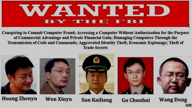
FBI Wanted Poster | Source: fbi.gov
Observation: We know data breaches happen to companies, and we need to reflect this event on our company’s risk register. Which data breach scenario belongs on our risk register?
Hypothesis #1: A malicious hacker or cybercriminal can exploit a system vulnerability, causing a data breach.
Hypothesis #2: PLA Unit 61398 (Chinese Army cyber warfare group) can develop and deploy a zero-day vulnerability to exfiltrate data from our systems, causing a data breach.
Never mind the obvious conjunction fallacy; absent any data that points us to #2 as probable, #1 makes fewer assumptions.
Integrating Ockham’s Razor into your decision making
Ockham’s Razor is an excellent mental tool to help us reduce errors and shave down unnecessary steps when forming hypotheses and drawing conclusions. It can also be a useful reminder to help us avoid the pitfalls of cognitive bias and other factors that might cloud our judgment, including fear or shame.
Here’s how to use it. When a conclusion or hypothesis must be drawn, use all available data but nothing more. Don’t make additional deductions. Channel your 10th-grade gym teacher when he used to tell you what “assumptions” do.
You can apply Ockham’s Razor in all problems where data is limited, and a conclusion must be drawn. Some common examples are: explaining natural phenomena, risk analysis, risk registers, after-action reports, post-mortem analysis, and financial forecasts. Can you imagine the negative impacts that superfluous assumption-making could have in these scenarios?
Closely examine your conclusions and analysis. Cut out the fluff and excess. Examine the data and form hypotheses that fit, but no more (and no less - don’t make it simpler than it needs to be). Just being aware of this tool can reduce cognitive bias when making decisions.

Black Swans and risk blindness
Black Swans aren't about rare events—they're about the risks we refuse to see. Here's how to spot your inner Thanksgiving turkey and avoid being blindsided by the next big shock.

I’ve noticed something unusual lately. There seems to be an increase in the number of events people are declaring Black Swans and the ensuing philosophic tug-of-war of detractors saying they’re wrong. At first, I thought people were just going for clickbait headlines, but I now feel something else is going on. We are experiencing a sort of collective risk blindness: we’re unable or unwilling to see emerging risk in front of us.
Keep in mind that the Black Swan is not a metaphor for sudden, surprise, high impact/low probability or catastrophic events. It’s a metaphor for risk blindness. Recall the parable of the Thanksgiving turkey:
Consider a turkey that is fed every day. Every single feeding will firm up the bird's belief that it is the general rule of life to be fed every day by friendly members of the human race 'looking out for its best interests,' as a politician would say. On the afternoon of the Wednesday before Thanksgiving, something unexpected will happen to the turkey. It will incur a revision of belief.”
- Nassim Taleb, “The Black Swan”
The Thanksgiving turkey is blind to risk. Cognitive bias, over-reliance on historical data, and not considering new, emerging risk led to it being surprised when it was served for dinner.
Both risk in general and Black Swans are observer-dependent. It’s in the eye of the beholder. 9/11 was a Black Swan to most of us, but not to John O’Neill. An accidental half-billion dollar wire transfer, Texas power outages, Gamestop stock volatility, and COVID-19 have all recently been declared Black Swans by some, but to others, the above examples were no surprise at all.
It’s no wonder that we’re starting to resemble Thanksgiving turkeys, unable to spot emerging risk. Risk blindness is why we are starting to see Black Swans everywhere. It seems tied to COVID-19 and all the recent political and social turmoil that’s happening. Every new big event seems surprising, and it shouldn’t be. Fighting cognitive bias, separating possible from probable, and looking beyond historical trends to see emerging threats takes work.
I’m tired. We’re all tired.
How do we ensure we’re not blind risk turkeys?
Recognize your built-in biases. Confirmation bias, anchoring, the availability effect, and overconfidence are present in every person. They cloud the decision-making process - especially when risk is involved. The corresponding Wikipedia article has a great list. Bias is an impediment to rational decision-making under uncertainty.
Diversification: Diversify your risk-seeking behavior. In other words, don’t put all your eggs in one basket.
Resiliency: Identify areas where you tend to be risk-averse and ensure you have resiliency. This could be extra liquidity, a plan B, some proactive measures, or just a recognition that you are overexposed in a particular area.
Think about how any of the above applies in your personal and professional life, weigh it against current events, what’s to come, and how you can take steps to reduce risk. For me, this is avoiding speculative investments, diversification, thinking about where I live and the risk that comes with it, thinking about insurance (do I have the right kind, in the right amounts), and ensuring that I have a plan B for critical decisions.
Footnote
I did a quick on-a-napkin brainstorming session of signficant 30-year risks that are top of mind. I’m thinking about each one and considering the following: a) how might my cognitive bias prevent me from seeing other risks? b) am I resilient to these risks, and c) if not, would diversification help me?
30 year Black Swan List (2021-2031)
(Risks that the collective “we” are blind to)
Cryptographic protocols go poof: A significant number of computer-based cryptographic protocols are unexpectedly and suddenly cracked or broken, leading to substantial financial, societal, and governmental repercussions. This could be from some kind of universal vulnerability, a monumental leap forward in computing power, artificial intelligence capabilities, or something else.
West Coast US Tsunami: Devastating tsunami on the US West Coast, most likely from an earthquake on the Cascadia subduction zone.
Extraterrestrial life is discovered: I don’t think microbe fossils on Mars would cause an adverse event, but if proof of extraterrestrial life is found to a degree that it causes large groups of people to question their religious views, there could be financial market shockwaves, panic selling, civic unrest, etc.
Another pandemic: COVID-19 scale pandemics are generally considered 100-year events, so another one in the next 30 years would shock many people. (Although those versed in probability theory know that another pandemic can happen today and still could be a 100-year event).
Twin pandemics: Speaking of pandemics, another one right now or two at the same time in the next 30 years is plausible.
Cryptocurrency is vaporized: Overnight (or very suddenly), the value of cryptocurrency (e.g. Bitcoin) plummets to near nothing. It could be from sudden government regulation, some kind of intentional devaluing, panic selling, the first event I listed (cryptographic protocols are broken), coordinated cyberattack/theft, or something else.
“Derecho” enters the popular lexicon: Devastating straight-line wind storms (as opposed to rotating - e.g. tornado, hurricane) become more frequent, extreme, damaging, and appear in places we’re not accustomed to seeing them. This is part of a trend of an increase in extreme weather globally.
Insurrection in the US: January 6, 2021 was just the beginning. Right-wing extremists perpetuate violent uprisings or terrorist attacks. Both the violence and subsequent law enforcement/military response cause financial, commerce, and civic repercussions.

Probability & the words we use: why it matters
When someone says there's a "high risk of breach," what do they really mean? This piece explores how fuzzy language sabotages decision-making—and how risk analysts can replace hand-wavy terms with probabilities that actually mean something.

The medieval game of Hazard
So difficult it is to show the various meanings and imperfections of words when we have nothing else but words to do it with. -John Locke
A well-studied phenomenon is that perceptions of probability vary greatly between people. You and I perceive the statement “high risk of an earthquake” quite differently. There are so many factors that influence this disconnect: one’s risk tolerance, events that happened earlier that day, cultural and language considerations, background, education, and much more. Words sometimes mean a lot, and other times, convey nothing at all. This is the struggle of any risk analyst when they communicate probabilities, forecasts, or analysis results.
Differences in perception can significantly impact decision making. Some groups of people have overcome this and think and communicate probabilistically - meteorologists and bookies come to mind, but other areas such as business, lag far behind. My position has always been that if business leaders can start to think probabilistically, like bookies, significantly better risk decisions can be made, yielding an advantage over their competitors. I know from experience, however, that I need to first convince you there’s a problem.
The Roulette Wheel

A pre-COVID trip to Vegas reminded me of the simplicity in betting games and their usefulness in explaining probabilities. Early probability theory was developed to win at dice games, like hazard - a precursor to craps - not to advance the field of math.
Imagine this scenario: we walk into a Las Vegas casino together and I place $2,000 on black on the roulette wheel. I ask you, “What are my chances of winning?” How would you respond? It may be one of the following:
You have a good chance of winning
You are not likely to win
That’s a very risky bet, but it could go either way
Your probability of winning is 47.4%
Which answer above is most useful when placing a bet? The last one, right? But, which answer is the one you are most likely to hear? Maybe one of the first three?
All of the above could be typical answers to such a question, but the first three reflect attitudes and personal risk tolerance, while the last answer is a numerical representation of probability. The last one is the only one that should be used for decision making; however, the first three examples are how humans talk.
I don’t want us all walking around like C3PO, quoting precise odds of successfully navigating an asteroid field at every turn, but consider this: not only is “a good chance of winning” not helpful, you and I probably have a different idea of what “good chance” means!
The Board Meeting
Let’s move from Vegas to our quarterly Board meeting. I've been in many situations where metaphors are used to describe probabilities and then used to make critical business decisions. A few recent examples that come to mind:
We'll probably miss our sales target this quarter.
There's a snowball's chance in hell COVID infection rates will drop.
There's a high likelihood of a data breach on the customer database.
Descriptors like the ones above are the de facto language of forecasting in business: they're easy to communicate, simple to understand, and do not require a grasp of probability - which most people struggle with. There's a problem, however. Research shows that our perceptions of probability vary widely from person to person. Perceptions of "very likely" events are influenced by many factors, such as gender, age, cultural background, and experience. Perceptions are further influenced by the time of day the person is asked to make the judgment, a number you might have heard recently that the mind anchors to, or confirmation bias (a tendency to pick evidence that confirms our own beliefs).
In short, when you report “There's a high likelihood of a data breach on the customer database” each Board member interprets “high likelihood” in their own way and makes decisions based on the conclusion. Any consensus about how and when to respond is an illusion. People think they’re on the same page, but they are not. The CIA and the DoD noticed this problem in the 1960’s and 1970’s and set out to study it.
The CIA’s problem
One of the first papers to tackle this work is a 1964 CIA paper, Words of Estimative Probability by Sherman Kent. It's now declassified and a fascinating read. Kent takes the reader through how problems arise in military intelligence when ambiguous phrases are used to communicate future events. For example, Kent describes a briefing from an aerial reconnaissance mission.

Aerial reconnaissance of an airfield
Analysts stated:
"It is almost certainly a military airfield."
"The terrain is such that the [redacted] could easily lengthen the runways, otherwise improve the facilities, and incorporate this field into their system of strategic staging bases. It is possible that they will."
"It would be logical for them to do this and sooner or later they probably will."
Kent describes how difficult it is to interpret these statements meaningfully; not to mention, make strategic military decisions.
The next significant body of work on this subject is "Handbook for Decision Analysis" by Scott Barclay et al for the Department of Defense. A now-famous 1977 study was conducted on 23 NATO officers, asking them to match probabilities, articulated in percentages, to probability statements. The officers were given a series of 16 statements, including:
It is highly likely that the Soviets will invade Czechoslovakia.
It is almost certain that the Soviets will invade Czechoslovakia.
We believe that the Soviets will invade Czechoslovakia.
We doubt that the Soviets will invade Czechoslovakia.
Only the probabilistic words in bold (emphasis added) were changed across the 16 statements. The results may be surprising:

"Handbook for Decisions Analysis" by Scott Barclay et al for the Department of Defense, 1977
It is obvious that the officers' perceptions of probabilities are all over the place. For example, there's an overlap with "we doubt" and "probably," and the inconsistencies don't stop there. The most remarkable thing is that this phenomenon isn't limited to 23 NATO officers - take any group of people, ask them the same questions, and you will see very similar results.
Can you imagine trying to plan for the Soviet invasion of Czechoslovakia, literal life and death decisions, and having this issue? Let’s suppose intelligence states there's a “very good chance” of an invasion occurring. One officer thinks “very good chance” feels about 50/50 - a coin flip. Another thinks that’s a 90% chance. They both nod in agreement and continue war planning!
Can I duplicate the experiment?
I recently discovered a massive, crowdsourced version of the NATO officer survey called www.probabilitysurvey.com. The website collects perceptions of probabilistic statements, then shows an aggregated view of all responses. I took the survey to see if I agreed with the majority of participants, or if I was way off base.

My perceptions of probabilities (from www.probabilitysurvey.com). The thick black bars are my answers
I was surprised that some of my responses were so different than others, yet others were in line with everyone else. I work with probabilities every day and work with people to translate what they think is possible, and probable, to probabilistic statements. Thinking back, I consider many terms in the survey as synonymous with each other, while others perceive slight variations.
This is even more proof that if you and I are in a meeting, talking about high likelihood events, we will have different notions of what that means, leading to mismatched expectations and inconsistent outcomes. This can destroy the integrity of a risk analysis.
What can we do?
We can't really "fix" this, per se. It's a condition, not a problem. It's like saying, "We need to fix the problem that everyone has a different idea of what 'driving fast' means." We need to recognize that perceptions vary among people and adjust our own expectations accordingly. As risk analysts, we need to be intellectually honest when we present risk forecasts to business leaders. When we walk into a room and say “ransomware is a high likelihood event,” we know that every single person in the room hears “high” differently. One may think it’s right around the corner and someone else may that’s a once-every-ten-years event and have plenty of time to mitigate.
That’s the first step. Honesty.
Next, start thinking like a bookie. Experiment with using mathematical probabilities to communicate future events in any decision, risk, or forecast. Get to know people and their backgrounds; try out different techniques with different people. For example, someone who took meteorology classes in college might prefer probabilities and someone well-versed in gambling might prefer odds. Factor Analysis of Information Risk (FAIR), an information risk framework, uses frequencies because it’s nearly universally understood.
For example,
"There's a low likelihood of our project running over budget."
Becomes…
There's a 10% chance of our project running over budget.
Projects like this one, in the long run, will run over budget about once every 10 years.
Take the quiz yourself on www.probabilitysurvey.com. Pass it around the office and compare results. Keep in mind there is no right answer; everyone perceives probabilistic language differently. If people are sufficiently surprised, test out using numbers instead of words.
Numbers are unambiguous and lead to clear objectives, with measurable results. Numbers need to become the new de facto language of probabilities in business. Companies that are able to forecast and assess risk using numbers instead of soft, qualitative adjectives, will have a true competitive advantage.
Resources
Words of Estimative Probability by Sherman Kent
Handbook for Decisions Analysis by Scott Barclay et al for the Department of Defense
Take your own probability survey
Thinking Fast and Slow by Daniel Kahneman | a deep exploration into this area and much, much more

No, COVID-19 is not a Black Swan event*
COVID-19 isn’t a Black Swan—it was predicted, modeled, and even planned for. So why are so many leaders acting like turkeys on Thanksgiving?
*Unless you’re a turkey

It’s really a White Ostrich event
There’s a special kind of history re-writing going on right now among some financial analysts, risk managers, C-level leadership, politicians and anyone else responsible for forecasting and preparing for major business, societal and economic disruptions. We’re about 3 months into the COVID-19 outbreak and people are starting to declare this a “Black Swan” event. Not only is “Black Swan” a generally bad and misused metaphor, the current pandemic also doesn’t fit the definition. I think it’s a case of CYA.
Just a few of many examples:
Marketwatch quoted an advisory firm founder stating the stock market fall is a “black swan market drop.”
The Nation predicted on February 25, 2020 that “The Coronavirus Could Be the Black Swan of 2020.”
Forbes declared on March 19, 2020: COVID-19 is a Black Swan.
My LinkedIn and Twitter feed is filled with Black Swan declarations or predictions that the coming economic ramifications will be Black Swan events.
None of this is a Black Swan event. COVID-19, medical supply shortages, economic disaster – none of it.
Breaking Black Swans down
The term “Black Swan” became part of the business lexicon in 2007 with Nassim Taleb’s book titled The Black Swan: The Impact of the Highly Improbable. In it, Taleb describes a special kind of extreme, outlier event that comes as a complete surprise to the observer. The observer is so caught off-guard that rationalization starts to occur: they should have seen it all along.
According to Taleb, a Black Swan event has these three attributes:
“First, it is an outlier, as it lies outside the realm of regular expectations, because nothing in the past can convincingly point to its possibility. Second, it carries an extreme ‘impact’. Third, in spite of its outlier status, human nature makes us concoct explanations for its occurrence after the fact, making it explainable and predictable.”
Let’s take the Black Swan definition and fit it to everything that’s going on now.
“First, it is an outlier, as it lies outside the realm of regular expectations, because nothing in the past can convincingly point to its possibility.”
COVID-19 and all of the fallout, deaths, the looming humanitarian crisis, economic disaster and everything in-between is the opposite of what Taleb described. In risk analysis, we use past incidents to help inform forecasting of future events. We know a lot about past pandemics, how they happen and what occurs when they do. We’ve had warnings and analysis that the world is unprepared for a global pandemic. What is looming should also be of no surprise: past pandemics often significantly alter economies. A 2019 pandemic loss assessment by the World Health Organization (WHO) feels very familiar as well as many recent threat assessments that show this was expected in the near-term future. Most medium and large companies have pandemic planning and response as part of their business continuity programs. In other words, past is prologue. Everything in the past convincingly points to the possibility of a global pandemic.
Perhaps the details of COVID-19’s origins may be a surprise to some, but the relevant information needed for risk managers, business leaders and politicians to become resilient and prepare for these events should be of absolutely no surprise. It’s true that when is not knowable, but that’s is the purpose of risk analysis. We don’t ignore high impact, low probability events.
“Second, it carries an extreme ‘impact’.”
This might be the only aspect of what we’re currently experiencing that fits the Black Swan definition, but extreme impact alone does not make the COVID-19 pandemic a Black Swan. The COVID-19 impact today is self-evident, and what’s to come is foreseeable.
“Third, in spite of its outlier status, human nature makes us concoct explanations for its occurrence after the fact, making it explainable and predictable.”
When a true Black Swan occurs, according to Taleb, observers start rationalizing: oh, we should have predicted it, signs were there all along, etc. Think about what this means – before the Black Swan event it’s unfathomable; after, it seems completely reasonable.
We are seeing the exact opposite now. The select folks who are outright calling this a Black Swan aren’t rationalizing that it should have or could have been predicted; they are now saying it was completely unpredictable. From POTUS saying the pandemic “snuck up on us,” to slow response from business, there’s some revisionist thinking going on.
I’m not sure why people are calling this a Black Swan. I suspect it’s a combination of misunderstanding what a Black Swan is, politicians playing CYA and fund managers trying to explain to their customers why their portfolios have lost so much value.
It’s a Black Swan to turkeys
“Uncertainty is a feature of the universe. Risk is in the eye of the beholder.”
-Sam Savage
Taleb explains in his book that Black Swans are observer-dependent. To explain this point, he tells the story of the Thanksgiving turkey in his book.
“Consider a turkey that is fed every day. Every single feeding will firm up the bird's belief that it is the general rule of life to be fed every day by friendly members of the human race 'looking out for its best interests,' as a politician would say. On the afternoon of the Wednesday before Thanksgiving, something unexpected will happen to the turkey. It will incur a revision of belief.”
For the turkey, Thanksgiving is a Black Swan event. For the cook, it certainly is not. It’s possible that some are truly turkey politicians, risk managers and business executives in this global pandemic. However, I don’t think there are many. I think most happen to be a different kind of bird.
If the COVID-19 pandemic isn’t a Black Swan…
If the COVID-19 pandemic isn’t a Black Swan event, what is it? My friend and fellow risk analyst Jack Whitsitt coined phrase White Ostrich and had this to say:

I like Taleb’s book. It’s a fascinating read on risk and risk philosophy, but the whole Black Swan metaphor is misused, overused and doesn’t make much sense outside the parameters that he sets. I’ve written about the bad metaphor problem the context of cyber risk. I also recommend reading Russell Thomas’s blog post on different colored swans. It will illuminate the issues and problems we face today.

Improve Your Estimations with the Equivalent Bet Test
Overconfident estimates can wreck a risk analysis. The Equivalent Bet Test is a simple thought experiment—borrowed from decision science and honed by bookies—that helps experts give better, more calibrated ranges by putting their assumptions to the test.

“The illusion that we understand the past fosters overconfidence in our ability to predict the future.”
― Daniel Kahneman, Thinking Fast and Slow
A friend recently asked me to teach him the basics of estimating values for use in a risk analysis. I described the fundamentals in a previous blog post, covering Doug Hubbard’s Measurement Challenge, but to quickly recap: estimates are best provided in the form of ranges to articulate uncertainty about the measurement. Think of the range as wrapping an estimate in error bars. An essential second step is asking the estimator their confidence that the true value falls into their range, also known as a confidence interval.
Back to my friend: after a quick primer, I asked him to estimate the length of a Chevy Suburban, with a 90% confidence interval. If the true length, which is easily Googleable, is within his range, I’d buy him lunch. He grinned at me and said, “Ok, Tony – the length of a Chevy Suburban is between 1 foot and 50 feet. Now buy me a burrito.” Besides the obvious error I made in choosing the wrong incentives, I didn't believe the estimate he gave me reflected his best estimate. A 90% confidence interval, in this context, means the estimator is wrong 10% of the time, in the long run. His confidence interval is more like 99.99999%. With a range as impossibly absurd as that, he is virtually never wrong.
I challenged him to give a better estimate – one that truly reflected a 90% confidence interval, but with a free burrito in the balance, he wasn’t budging.
If only there were a way for me to test his estimate. Is there a way to ensure the estimator isn’t providing impossibly large ranges to ensure they are always right? Conversely, can I also test for ranges that are too narrow? Enter the Equivalent Bet Test.
The Equivalent Bet Test
Readers of Hubbard’s How to Measure Anything series or Jones and Freund’s Measuring and Managing Risk: A FAIR Approach are familiar with the Equivalent Bet Test. The Equivalent Bet Test is a mental aid that helps experts give better estimates in a variety of applications, including risk analysis. It’s just one of several tools in a risk analyst’s toolbox to ensure subject matter experts are controlling for the overconfidence effect. Being overconfident when giving estimates means one’s estimates are wrong more often than they think they are. The inverse is also observed, but not as common: underconfidence means one’s estimates are right more often than the individual thinks they are. Controlling for these effects, or cognitive biases is called calibration. An estimator is calibrated when they routinely give estimates with a 90% confidence interval, and in the long run, they are correct 90% of the time.
Under and overconfident experts can significantly impact the accuracy of a risk analysis. Therefore, risk analysts must use elicitation aids such as calibration quizzes, constant feedback on the accuracy of prior estimates and offering equivalent bets, all of which get the estimator closer to calibration.
The technique was developed by decision science pioneers Carl Spetzler and Carl-Axel Von Holstein and introduced in their seminal 1975 paper Probability Encoding in Decision Analysis. Spetzler and Von Holstein called this technique the Probability Wheel. The Probability Wheel, along with the Interval Technique and the Equivalent Urn Test, are some of several methods of validating probability estimates from experts described in their paper.
Doug Hubbard re-introduced the technique in his 2007 book How to Measure Anything as the Equivalent Bet Test and is one of the easiest to use tools a risk analyst has to test for the under and overconfidence biases in their experts. It’s best used as a teaching aid and requires a little bit of setup but serves as an invaluable exercise to get estimators closer to their stated confidence interval. After estimators learn this game and why it is so effective, they can play it in their head when giving an estimate.

Figure 1: The Equivalent Bet Test Game Wheel
How to Play
First, set up the game by placing down house money. The exact denomination doesn’t matter, as long as it's enough money that someone would want to win or lose. For this example, we are going to play with $20. The facilitator also needs a specially constructed game wheel, seen in Figure 1. The game wheel is the exact opposite of what one would see on The Price is Right: there’s a 90% chance of winning, and only a 10% chance of losing. I made an Equivalent Bet Test game wheel – and it spins! It's freely available for download here.
Here are the game mechanics:
The estimator places $20 down to play the game; the house also places down $20
The facilitator asks the estimator to provide an estimate in the form of a range of numbers, with a 90% confidence interval (the estimator is 90% confident that the true number falls somewhere in the range.)
Now, the facilitator presents a twist! Which game would you like to play?
Game 1: Stick with the estimate. If the true answer falls within the range provided, you win the house’s $20.
Game 2: Spin the wheel. 90% of the wheel is colored blue. Land in blue, win $20.
Present a third option: Ambivalence; the estimator recognizes that both games have an equal chance of winning $20; therefore, there is no preference.
Which game the estimator chooses reveals much about how confident they are about the given estimate. The idea behind the equivalent bet test is to test whether or not one is truly 90% confident about the estimation.
If Game One is chosen, the estimator believes the estimation has a higher chance of winning. This means the estimator is more than 90% confident; the ranges are too wide.
If Game Two is chosen, the estimator believes the wheel has a greater chance of winning – the estimator is less than 90% confident. This means the ranges are too tight.
The perfect balance would be that the estimator doesn’t care which game they play. Each has an equal chance of winning, in the estimators' mind; therefore, both games have a 90% chance of winning.
Why it Works

Insight into why this game helps the estimator achieve calibration can be had by looking at the world of bookmakers. Bookmakers are people who set odds and place bets on sporting and other events as a profession. Recall that calibration, in this context, is a measurement of the validity of one's probability assessment. For example: if an expert gives estimates on the probability of different types of cyber-attacks occurring with a 90% confidence interval, that individual would be considered calibrated if – in the long run -- 90% of the forecasts are accurate. (For a great overview of calibration, see the paper Calibration of Probabilities: The State of the Art to 1980 written by Lichtenstein, Fischhoff and Phillips). Study after study shows that humans are not good estimators of probabilities, and most are overconfident in their estimates. (See footnotes at the end for a partial list).
When bookmakers make a bad forecast, they lose something – money. Sometimes, they lose a lot of money. If they make enough bad forecasts, in the long run, they are out of business, or even worse. This is the secret sauce – bookmakers receive constant, consistent feedback on the quality of their prior forecasts and have a built-in incentive, money, to improve continually. Bookmakers wait a few days to learn the outcome of a horserace and adjust accordingly. Cyber risk managers are missing this feedback loop – data breach and other incident forecasts are years or decades in the future. Compounding the problem, horserace forecasts are binary: win or lose, within a fixed timeframe. Cyber risk forecasts are not. The timeline is not fixed; “winning” and “losing” are shades of grey and dependent on other influencing factors, like detection capabilities.
It turns out we can simulate the losses a bookmaker experiences with games, like the Equivalent Bet test, urn problems and general trivia questions designed to gauge calibration. These games trigger loss aversion in our minds and, with feedback and consistent practice, our probability estimates will improve. When we go back to real life and make cyber forecasts, those skills carry forward.
Integrating the Equivalent Bet Test into your Risk Program
I’ve found that it’s most effective to present the Equivalent Bet Test as a training aid when teaching people the basics of estimation. I explain the game, rules and the outcomes: placing money down to play, asking for an estimate, offering a choice between games, spinning a real wheel and the big finale – what the estimator’s choice of game reveals about their cognitive biases.
Estimators need to ask themselves this simple question each time they make an estimate: “If my own money was at stake, which bet would I take: my estimate that has a 90% chance of being right, or take a spin on a wheel in which there's a 90% chance of winning." Critically think about each of the choices, then adjust the range on the estimate until the estimator is truly ambivalent about the two choices. At this point, in the estimator’s mind, both games have an equal chance of winning or losing.
Hopefully, this gives risk analysts one more tool in their toolbox for improving estimations with eliciting subject matter experts. Combined with other aids, such as calibration quizzes, the Equivalent Bet Test can measurably improve the quality of risk forecasts.
Resources
Downloads
Equivalent Bet Test Game Wheel PowerPoint file
Further Reading
Calibration, Estimation and Cognitive Biases
Calibration of Probabilities: The State of the Art to 1980 by Lichtenstein, Fischhoff and Phillips
How to Measure Anything by Douglas Hubbard (section 2)
Thinking Fast and Slow by Daniel Kahneman (part 3)
Probability Encoding in Decision Analysis by Carl S. Spetzler and Carl-Axel S. Staël Von Holstein
Why bookmakers are well-calibrated
On the Efficiency and Equity of Betting Markets by Jack Dowie
The Oxford Handbook of the Economics of Gambling, edited by Leighton Vaughan-Williams and Donald S. Siegel (the whole book is interesting, but the “Motivation, Behavior and Decision-Making in Betting Markets” section covers research in this area)
Conditional distribution analyses of probabilistic forecasts by J. Frank Yates and Shawn P. Curley
An empirical study of the impact of complexity on participation in horserace betting by Johnnie E.V. Johnson and Alistair C. Bruce

The Semi-Attached Figure: How to spot manipulative security advertising claims
Out of all the ways to lie with statistics and manipulate peoples’ perceptions, the semi-attached figure may be the most prevalent. It’s hard to spot unless you are really looking for it because it’s sneaky, subtle and takes a fair bit of concentrative analysis to identify. A semi-attached figure occurs when proof is given for a claim, but when the reader looks at it closely, the proof and the claim are not related. It’s called “semi-attached” because the proof seemsto support a claim, but upon inspection, it doesn't. Marketing and advertising professionals are absolute masters of the semi-attached figure.

If you can't prove what you want to prove, demonstrate something else and pretend that they are the same thing. In the daze that follows the collision of statistics with the human mind, hardly anybody will notice the difference.
-Darrell Huff, “How to Lie with Statistics”
Out of all the ways to lie with statistics and manipulate peoples’ perceptions, the semi-attached figure may be the most prevalent. It’s hard to spot unless you are really looking for it because it’s sneaky, subtle and takes a fair bit of concentrative analysis to identify. A semi-attached figure occurs when proof is given for a claim, but when the reader looks at it closely, the proof and the claim are not related. It’s called “semi-attached” because the proof seemsto support a claim, but upon inspection, it doesn't. Marketing and advertising professionals are absolute masters of the semi-attached figure.
The semi-attached figure is a hard concept to understand without tangible examples, so let’s start out with a few easy marketing claims outside of the security field.
Example 1: Now, with Retsyn!
This example was touched on by David Lavenda in a post at FastCompany. It’s such a familiar advertising campaign that went on for decades, that most of us can recite parts of it from memory. It’s also one of the best examples of the semi-attached figure.

In Certs commercials, the narrator says “Want fresh, clean breath? Get the only mint with Retsyn,” or a similar slogan. Most viewers will hear this and unconsciously accept the “…with Retsyn” phrase as proof that Certs gives someone fresh, clean breath. It soundsgood – it actually sounds great! It sounds like it will make stinky breath less stinky. Here’s where the claim and the proof are semi-attached: you the audience, have bad breath and need evidence as to why you should buy Certs. Here’s the proof – Certs has Retsyn.
What exactly is Retsyn? According to an article by Slate, it’s “…natural flavoring, partially hydrogenated cottonseed oil, and a nutritional supplement called copper gluconate, none of which will kill bacteria.” The proof and the claim have nothing to do with each other, but it’s very effective as a marketing technique.
Example 2: These cigarettes are fine for your health
Post-World War II to the early 1970’s was the golden age of tobacco marketing in the United States before advertising restrictions were put in place. Cigarette advertising downplayed the unhealthy effects of smoking – and in many cases, made the case that it was actually healthy, and cured various maladies even though a strong statistical link between smoking and lung cancer was established in the 1940’s.
People born in the 1980’s and after have probably never seen a cigarette ad or have a vague recollection of one, perhaps forgetting or not knowing how insidiously manipulative tobacco marketing used to be. Due to the overwhelming evidence that started to build in the 1950’s that cigarettes cause serious illnesses and death, advertising had to counteract this message with pushing the "cool factor," downplaying health issues and touting benefits. To convince people to buy cigarettes, contrary to extensive evidence that they should not, marketing had to find new ways to be effective and directly play to human emotion. The semi-attached figure plays a vital role in achieving that.

This 1949 ad from Viceroy Cigarettes is a perfect application of the semi-attached figure. This came out at a time in which public health advocates started discussing the link between smoking and cancer, and this ad is an attempt to counter the message.

The claim here is implied: cigarettes are not harmful to your health. There are two pieces of proof provided: First, Viceroys filter the smoke. (The truth is irrelevant: research indicates filtersmay increase lung cancer risk). The second proof is, your dentist recommends Viceroys, with a cartoon drawing of a dentist. The problem here is obvious. The dentist isn’t real – but the reader is led to think that either this man is their dentist, or whoever really is their dentist would surely also recommend Viceroys.
Example #3: Exactly what is Unbreakable?

The Unbreakable Linux bus at the RSA conference
Starting around 2005, on the 101 freeway corridor between Palo Alto and San Francisco, Oracle advertising started to appear. It featured an armored Linux penguin mascot and the tagline “Unbreakable Linux.” The same ads showed up for years at RSA security conferences, emblazoned on the sides of busses that took trips between the Moscone convention center and area hotels. This claim refers to a product called Oracle Linux, which is based on Red Hat. Oracle has also used the word “unbreakable” to refer to other software products.

This is a classic semi-attached figure – Oracle makes a statement, “unbreakable,” and leads the reader to associate the statement with a piece of software and pretends it’sthe same thing. The claim and proof are taking advantage of the perception that Linux enjoys greater stability when compared to competitors. Of course, the software isn’t “unbreakable” (no software is), and Oracle Linux has been subject to many of the same vulnerabilities all flavors of Linux has had over the years.
Unbreakable. This Linux distro that cannot be… what? Hacked? Experience downtime? Patched without rebooting? Does this refer to high availability? It’s very reminiscent of “with Retsyn.” It sounds great, but when it’s really analyzed, the reader is left thinking, what does that even mean?
Oracle still uses the term “Unbreakable,” but backtracked and admitted that it’s a marketing tagline, describing Oracle’s commitment to product security and does not refer to any specific product, feature or attribute.
Oracle is no stranger to hyperbole. This is the same company who’s marketing slogan used to be “Can’t break it. Can’t break in.”
Example #4: We won the Cyber!
100% true story; only the names have been changed to protect the guilty.
Timeshare, used car and cyber security vendor sales people all have a special place in my heart. I was in a security vendor sales pitch many years back, and the salesman projected this graph of the number of cybersecurity incidents reported by federal agencies from 2006 to 2015 on the screen. The vendor was selling next generation firewall technology.

The room fell silent to the stark reality on the chart before us as the vendor started their pitch:
“Look at this graph – from 2006 to today, cyberattacks have increased over 10-fold! We’re at war. This is proof that we’re at cyberwar and you must protect yourself. The current equipment you have cannot protect your company from these types of unrelenting, sophisticated, advanced AND persistent attacks...”
The salesman went on and on and on. I love stuff like this. I love it when vendors build their pitch around a house of cards: one tap and it all falls apart. Where’s the semi-attached figure here?
The vendor was trying to lead us to a path to believe that the sky is falling. Maybe it is, maybe it isn’t – I have plenty of reason to believe that there is some type of cyber-related doom on the horizon, but this graph has nothing to do with it. In order to find the semi-attached figure, let’s ask a few probing questions.
It would appear that cyberattacks have increased from 2006 to 2015. Why? Are there more computers in 2015 than in 2006?
What is the ratio of attack targets and surface versus attacks?
Is detection of attacks better in 2015 than it was in 2006, meaning we have the ability to detect and measure a larger range of attacks?
What is being measured here?
What does the Federal government consider an attack?
What do attacks against the Federal government have to do with my company (a bank, at the time)

The claim is: we’re going to get hacked unless we upgrade firewalls. The proof is this graph – from a different sector, provided without context, using an unknown method of measurement.
The graph above is from 2015. See 2016’s graph below – and I have great news! WE WON THE CYBER!

No, sorry, we didn’t. The federal government changed the definition and reporting requirements of a cyber-attack in 2016. They no longer consider a simple port scan an attack. In other words, what was being measured and the unit of measurement was changed from 2015 to 2016. Not only was the vendor pitch a semi-attached figure, the salesman was also guilty of the post hoc fallacy, also known as correlation does not imply causation.
How to spot the semi-attached figure
While using the semi-attached figured is manipulative, it’s unlikely to end any time soon. It’s far too effective. Keep in mind that the most effective marketing plays on human nature’s greatest fears and aspirations. Here are a few tips to spot and resist the lure of the semi-attached figure.
Anyone can take a number, graph, data visualization, or statistic and shoehorn it into proof for a claim. Just because something has a number or seems “sciencey” it doesn’t mean it can be automatically trusted.
Spot the claim, such has “this product makes you hacker-proof” or “Unbreakable!” What’s the supporting proof? Ask yourself: does the proof support the claim, or is it semi-attached?
Last, be especially wary of authority figures: doctors, dentists, cybersecurity experts, a CEO or past or present government officials. It could be a legitimate opinion or endorsement, but also remember that nearly everyone will say nearly anything if they get paid enough.
Here’s a challenge for readers: after you read this post, think about the semi-attached figure next time you are at the Blackhat or RSA vendor expo halls. How many do you see?
This post is part of a series titled How to Lie with Statistics, Information Security Edition– visit the link to read more.

The Mad Men of Cyber Security Advertising
The framing effect is used in many places, intentionally and unintentionally, but is most present in advertising. It's a very effective way to frame perceptions.

“We can be blind to the obvious, and we are also blind to our blindness.”
― Daniel Kahneman, Thinking, Fast and Slow
There’s a famous line spoken by advertising executive Don Draper in AMC’s Mad Man: “If you don’t like what’s being said, change the conversation.”
This is a loaded quote and sums up how the ad men of Madison Avenue use words, emotion, a little bit of statistics and a whole lot of creativity to change minds and sell products. Consider this example: American Tobacco, parent company of Lucky Strike Cigarettes, was one of the first companies to use physicians in cigarette ads — a trend that disturbingly lasted until 1953.

There are several psychological sleight of hands tricks, all designed to elicit positive feelings from the reader and de-emphasize any negative ones. The smiling doctor, the phrases “less irritating,” and “It’s toasted” combined with a seemingly large number of endorsing doctors are examples of what is called the framing effect. The framing effect is a cognitive bias that describes a situation in which a person’s perception about something is influenced by the way it’s presented. Who wouldn’t want something that’s both endorsed by doctors and toasted? Psychologists Daniel Kahneman and Amos Tversky explored the framing effect in great detail as they developed Prospect Theory, for which Kahneman would later win the Nobel Prize in Economics.
The framing effect is used in many places, intentionally and unintentionally, but is most present in advertising, as in the positive frame in Lucky Strike ad. It’s a very effective way to frame statistics or concepts to change the audience perception about a marketing claim. Once you’re aware of it, you’ll start to see it everywhere. Take the following Kaspersky infographic as another example of a negative frame:

Source: Kaspersky Security Bulletin 2016
Kaspersky Lab is a Russia-based cybersecurity and anti-virus vendor. The above infographic is in reference to a study the firm conducted that shows that 1 in 5 small and medium sized business that paid a ransom in response to a ransomware infection did not get their files decrypted by the perpetrators.
There are several examples the framing effect in this infographic:
Use of the word “never” immediately frames the perception negatively.
Usage of the statistic “One in five” also creates a negative frame.
Red highlighting of the phrase “never got their data back” shifts the conversation to urgency, needing immediate attention and high risk.
The one, single victim clipart that didn’t get their files back is as big as the combined clipart of the four victims that did get their files back. The data visualization used is disproportionate to the actual data.
Just like the cigarette ad from the 1930’s, the use of graphics and data pull the reader’s perception in a very specific direction. In Kapersky’s case, the direction is very negative. The reader is left with the feeling that paying a ransom in response to ransomware infections is a very bad idea because, you may never get your files back.(…and gee whiz, I sure wish I had some anti-virus software to protect me against this terrible thing…)
The same exact base statistic can be flipped and turned into a positive frame.

Everything about the new infographic is the same, but flipped: “4 out of 5” of something positive as opposed to “1 out of 5” of something negative; flipped clipart, positive colors and words are framed positively.
Let’s take it one step further:

80% seems quite good, and note that 80% is equivalent to 4 of out 5. The extra exclamation points are added to further reinforce the positive frame and add excitement around the statistic.
It should be no surprise to anyone that Kaspersky — a company that sells ransomware mitigation software — uses the framing effect, but they’re not the only one. It’s everywhere, and in fact, there are classes, blogs and instructional videos on how to take advantage of the framing effect specifically as a marketing tool. Overcoming these psychological tricks is not easy because they take advantage of a deep-rooted human trait: loss aversion. But awareness of these marketing tactics is a step forward in improving decision-making skills.
This post is part of a series titled How to Lie with Statistics, Information Security Edition– visit the link to read more.

Will the Real “Year of the Data Breach” Please Stand Up?
For over a decade, nearly every year has been dubbed the "Year of the Data Breach"—and it’s getting ridiculous. This post breaks down the history, the hype, and why it’s time to retire the phrase once and for all.

My New Year’s Day ritual has been the same for nearly 10 years now: a late breakfast, a cup of strong coffee and a scan of security blogs and news for two things that always make me chuckle: cyber predictions for the new year, and a retrospective that declares the past year the “Year of the Data Breach.” Kelly Shortridge perfectly parodied the former and I actually thought we might go a year without the latter, until I found this headline on Bloomberg news in which 2017 is named the Year of the Data Breach:

Source: Bloomberg;
https://www.bna.com/2017-year-data-b73014473359/
If you are wondering to yourself, where have I seen this before…? It’s nearly every year. 10 of the last 12 years, to be exact.
Here’s a retrospective on the last 12 years and a glimpse into 2018’s prospects.
2005
2005 was the first year ever to be declared “The Year of the Data Breach” by many media outlets, such as InfoWorld. The phrase “data breach” entered into everyday usage in 2005 as well, due to data breach notification laws being enacted, increased data breach litigation as well as Ameritrade, CitiGroup and CardSystems all disclosing incidents.
2006
2006 was a big year for data breaches — it featured the AOL search data leak scandal and the US Department of Veterans Affairs breach. It caused one blogger and one security vendor to dub 2006 the year of the data breach.
2007
Attrition.org, the Identify Theft Resource Center and the Canadian Federal Privacy Commissioner in a letter to Parliament all declared 2007 “the year of the data breach.” I remember 2007 for two things: Britney Spears’ sad meltdown and the TJ Maxx data breach.
2008
Nothing! 2008 is not the year of the data breach! Good job, 2008.
2009
If 2005, 2006 and 2007 were all the year of the data breach, 2009 is the year of the MEGA DATA BREACH, according to Forbes and a security vendor. It was a big one, primarily due to the Heartland Payment Systems data breach which was a compromise of 130 million records.
2010
After the MEGA year of 2009, we all decided to take a break.
2011
After 2008 and 2010 were not the year of the data breach, it was as if security journalists, vendors and cyber experts all stood up and shouted, in unison, “NEVER AGAIN! There shall never be a year that is not the Year of the Data Breach!”
And a good year it was. Trend Micro called it and Brian Krebs, among many others referenced it. The most notable incident was the Sony Playstation Network suffering a prolonged service outage and data breach.
2012
A small security vendor, in a year end retrospective, named 2012 the “Year of the Data Breach,” with breaches at Yahoo, Zappos and several high-profile incidents in the government sector dominating the news. It was also the “Year of the Data Breach in New Zealand,” according to the country’s privacy commissioner.
2013
2009 wants its adjective back. Symantec, in the 2013 Internet Security Threat Report, dubbed 2013 the “Year of the Mega Data Breach,” citing attacks on small and medium-sized businesses and the government sector. Others called it the “Year of the Retailer Breach” due to incidents at Target and Adobe.
2014
Assuming we could only have one “Year of the Data Breach,” 2014 would have to be the strongest contender. There were a massive amount of incidents in 2014: UPS, Michael’s, Home Depot, Jimmy John’s, Staples and JP Morgan Chase. The aforementioned are all eclipsed by, The Hack of the Century (according to Fortune): the Sony Pictures Entertainment hack.
Most media outlets dubbed 2014 the “Year of the Data Breach,” as well as Advisen, Trend Micro and Tripwire’s State of Security.
2015
I declare 2015 the “Year of Superlatives.” Here is how the year was reported:
Fortune reported 2015 as the “Year of Data Breach Litigation.”
Security vendor IDM365 called it the “Year of the Super Mega Breach”
Trend Micro just called it the plain old “Year of the Data Breach.” However, Trend Micro also declared 2014 the Year of the Data Breach.
Vice.com called 2015 the “Year of the Healthcare Breach”
Hacked.com called it the “Year of the Personal Data Breach”
GovTech.com settled on “The Year Data Breaches Became Intimate”
HIPAA Journal called 2015 the “Year of the Mega Healthcare Data Breach”
Many Americans were affected by data breaches in 2015, with the most notable incidents occurring at Ashley Madison, OPM, Anthem and the IRS.
2016
After 2014 and 2015, one would think it would be time to retire the phrase “Year of the…” and think of something else. Nope.
A small law firm specializing in data privacy, SecureWorld, and a radio host named 2016 the “Year of the Data Breach.”
In a completely perplexing statement, Ars Technica recognized 2014 and 2015 as the “Year of the Data Breach” and also issued a challenge:
[I]f pundits don’t label [2016] ‘the year of the data breach’ — like a one-phase Chinese zodiac for the 21st century — they’re not doing their jobs at all.
2017
Bloomberg declared 2017 the “Year of the Data Breach,” citing incidents at Equifax, Yahoo and Uber. Experian also jumped on the bandwagon.
2018: a cyber prediction
Combining my two favorite things: cyber predictions and “year of the data breach” declarations, the non-profit Information Security Forum (ISF) stated that 2018 will be the “year of the data breach.”
Conclusion
Much has been written about consumer data breach fatigue. I have no doubt that breach fatigue is real and headlines like this, year over year, contribute to it. When headlines about cybersecurity cross the line into hyperbole, it’s time to re-think how we present the industry’s most pressing problems to the rest of the world. As it stands now, declaring a year the “year of the data breach” has become virtually meaningless. We know that data breaches are going to occur every year. Perhaps, starting this year, we can pull out the one notable data breach as the “Data Breach of the Year,” instead of naming the whole year the “Year of the Data Breach.”
The Birth of a Ransomware Urban Myth
"Nearly 40% of ransomware victims pay up!" Sounds shocking, right? Turns out… that headline was based on eight people. This post unpacks how bad stats become infosec urban legends—and what that means for decision-making.

Would you be surprised to find that “nearly 40% of ransomware victims pay attackers,” according to a recent article published by DarkReading? I sure was. The number of victims that pay ransomware and the amount paid has been an elusive figure for years now. To date, law enforcement has not collected and published ransomware crime statistics like they have for other forms of criminal activity.
Junk research published by security vendors has always irked me because they use and misuse statistics to spread fear and sell products. Security threats are overblown and solutions are oversimplified, leading to a bevy of problems ranging from the creation of information security urban myths to poor corporate decision making based on faulty assumptions.
Sadly, the DarkReading article and underlying research is no exception. It’s a prime example of what’s wrong with vendor-sponsored research and how the rest of us pick up quotes, circulate and re-tweet without giving it a minute of critical thought. It’s easy to spot — just grab a statistic and follow it down the rabbit hole. Let’s dissect the ransomware payment rate and find out what’s really going on.
DarkReading published this article on April 14th, 2017 with the headline:

If you follow the article to the end, a link to the research is cited, along with the name of the security vendor that performed the research (Trustlook). They have a nice blog post and a cute, entertaining infographic — great reading material to send to the CISO tomorrow morning. The next step is to check the validly of the research and see exactly what Trustlook is claiming.
Trustlook is a security vendor and sells a suite of products that protects end-users from malware, including ransomware, and other forms of attack.
The research is based on a survey. Surveys are polls; you ask a group of people a question and record the answers.
Trustlook surveyed 210 of their Mobile Security product customers. Mobile Security is an Android-based anti-virus app.
Trustlook did not disclose a margin of error, which would indicate the survey is not statistically significant. This means the results only apply to the survey takers themselves and cannot be extrapolated to apply to a larger group or the general population.
This would be enough to make anyone that took a semester of college Stats roll their eyes and move on. However, the assertions in the infographic really take the cake. When percentages are used in statistics, the reader tends to forget or lose sight of the underlying numbers. Breaking down the percentages further:
We know 210 customers were surveyed (Trustlook disclosed this).
Of the 210, 45% have never heard of ransomware. Put another way, 94 out of 210 customers answered a survey about ransomware, but have never heard of ransomware. Trustlook conducted research and published a survey on ransomware in which nearly half of the respondents don’t know what ransomware is.

116 respondents had the wherewithal to understand the subject matter for a survey they are filling out.
Of the 116, 20 people had, at some point, been infected with ransomware.
Of the 20 that have been infected, 8 of them paid the ransom.
Let me say that again in case you missed it.
Trustlook found 8 of their customers that said they paid a ransom and turned it into this:

…and DarkReading expanded the claim to include all ransomware victims:

Two days later, it’s everywhere:

Source: Google.com search
A new ransomware urban myth is born.

Selection Bias and Information Security Surveys
Everyone in infosec has seen a sketchy stat—“60% of orgs were hit by ransomware!” But who actually took that survey? This post breaks down how selection bias warps vendor reports and how bad data becomes cybersecurity “truth.”
The auditor stared at me blankly. The gaze turned into a gape and lasted long enough to make me shift uncomfortably in my chair, click my pen and look away before I looked back at him.
The blank look flashed to anger.
“Of course, malicious insiders are the biggest threat to this company. They’re the biggest threat to ALL companies.”
He waved the latest copy of a vendor report, which would lead anyone to believe malicious insiders are the single biggest threat to American business since Emma Goldman.
The report he waved in the room was not research at all. It was vendor marketing, thinly disguised as a “survey of Information Security leaders.” It was solely based on an unscientific survey of a small group of people. It reeked of error and bias.
Selection bias is what makes these surveys virtually worthless. I previously wrote about the problems of surveys in information security vendor reports and I want to dig in deeper on a topic from the last post: properly selecting a representative sample from the general population being surveyed. This matters so much. This is perhaps the most important step when conducting a statistically sound survey.
Why this matters
Risk analysts are one of many professions that rely on both internal and external incident data to assess risk. If a risk analyst is performing an assessment of current or former employees stealing customer data, there are two primary places one would look for incident data to determine frequency: internal incident reports and external data on frequency of occurrence.
One of the first places a risk analyst would look would be one of the many published reports on insider threat. The analyst would then find one or several statistics about the frequency of current or former employees stealing data, and use the figure to help provide a likelihood of a loss event.
If the survey is statistically sound, the results can be extrapolated to the general population. In other words, if the survey states that 12% of insiders use USB devices to steal data, within a margin of error, you can use that same range to help inform your assessment.
If the survey is not statistically sound, the results only apply to respondents of the survey. This is called selection bias.
What is selection bias?
There are many forms of bias that are found in statistics, and by extension, in surveys, but the most common is selection bias. It’s the easiest to get wrong and throws the results off the quickest.
Selection bias occurs when the survey result is systematically different from the population that is being studied. Here are a few ways this happens.
Undercoverage: Underrepresentation of certain groups in the sample. For example, if you are surveying information security professionals, you will want pen testers, risk analysts, department heads, CISO’s — essentially a cross-section. If you have a hard time getting CISO’s to answer the survey, the survey will be biased toward undercoverage of CISO’s.
Voluntary Response: This occurs when your survey takers are self-selected. The most common example of this is online surveys or polls. Slashdot polls are fun — but completely non-scientific because of voluntary response. Optimally, one would like to have participants randomly selected to ensure a good cross-section of groups of people.
Participation bias: This occurs when a certain group of participants are more or less likely to participate than others. This can happen when a certain group appreciates the value of surveys more than others (risk analysts versus pen testers) or if survey takers are incentivized, such as with reward points or cash. Compensating survey takers is a very contentious practice and will usually result in people taking the survey that are not in the intended sample population.
Real-world example
There are many to choose from, but I found the “2015 Vormetric Insider Threat Report” from a random Google search. The report is aesthetically polished and, on the surface, very informative. It has the intended effect of making any reader nervous about data theft from employees and contractors.
The report is based on a survey of 818 IT professionals that completed an online survey. The report authors are very careful; they frame the report as opinion of the respondents. Furthermore, there is a short disclosure at the end of the report that states the survey methodology, identifies the company that performed the survey (Harris Poll) and states that the “…online survey is not based on a probability sample and therefore no estimate of theoretical sampling error can be calculated.”
Let me translate that: This report is for marketing and entertainment purposes only.

Why not?
Here’s another problem: Harris Poll compensates their survey takers. Survey takers earn points (called “HIpoints”) for every survey they fill out. These points can be redeemed for gift cards and other items. We already know the survey isn’t statistically significant from the disclosure, but one must ask — can the survey be trusted to include only IT professionals, if the respondents are self-selected and are rewarded if they say anything to qualify for the survey?
The most obvious problem here is voluntary selection and participation bias; both lead to a situation in which you should not use the survey results to base any serious decision on.
I don’t mean to pick on Vormetric exclusively. There are hundreds of similar surveys out there.
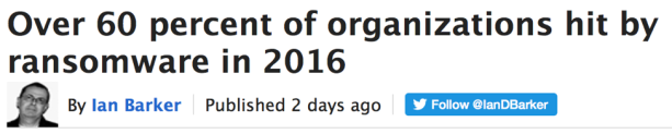
Here’s another one. The Cyberthreat Defense Group conducted an online survey that asked many enterprise security questions. One of the results was that 60% of the respondent’s organizations were hit by ransomware in 2016. I fast-forwarded to the section that described the methodology. They vaguely disclosed the fact that survey takers were PAID and the survey results represented the opinions of the respondents. It’s back-page news, but at least it’s there. This is the problem:
Now it’s not the opinion of a small, self-selected, compensated group of people that may or may not be in security. Now it’s fact.
Then it gets tweeted, re-tweeted, liked, whatever. Now it’s InfoSec Folklore.

See the problem?