
The CISO’s White Whale: Measuring the Effectiveness of Security Awareness Training
Most CISOs secretly wonder: does security awareness training actually reduce risk, or just check a compliance box? This post breaks down the metrics that don’t work—and offers a practical framework for ones that do.

Boats attacking whales | Source: New York Public Library Digital Collections
I have a hypothesis about end-user security awareness training. Despite heavy investment, most - if not all - CISO’s wonder if it does anything at all to reduce risk.
There, I said it. Do you disagree and would love to prove me wrong? Good!
How can you prove me wrong? Security awareness effectiveness metrics, of course.
Many security awareness metrics don’t tell us it’s working. They report something related, like how many people attend training, pass/fail rate on post-training quizzes, or sentiment surveys. I presume most CISO’s want their security awareness training to reduce risk. How would you know if it does?
Therein lies the CISO’s white whale. CISO’s don’t need (or want) metrics that prove the program exists or count the number of employees that completed training. CISO’s need metrics that show employee behavior is noticeably influenced and measurably changed, proportional to the level of investment.
How do we do it? A little bit of measurement fundamentals, some Clairvoyant Test, and some creative thinking.
Metrics that don’t work
Here’s what doesn’t work: metrics that simply report the existence of a security awareness training program. This helps click the compliance checkbox, but it doesn’t tell us if security awareness training measurably reduces risk. Below is the single most common metric I’ve seen in various security programs, shown in the table below.
| Metric | Status | Comments |
|---|---|---|
| Security Awareness Training Effectiveness | Green | 98% of employees completed mandatory training in Q1 |
First, the entire metric is a semi-attached figure. The semi-attached figure is a rhetorical device in which the author asserts a claim that cannot be proven, so “proof” is given for something completely different. The proof (percentage of employees that completed training) does not match the claim (Security Awareness Training is effective). Training completion rate doesn’t tell us if or how user behavior is influenced.
Next, let’s ask ourselves: Does this metric pass the Clairvoyant Test (or the Biff Test, if you’re a Back to the Future fan)? Quick refresher: a metric is well-written if Biff Tannen, with his limited judgment and problem-solving skills, can fetch the answer with Doc’s DeLorean. In other words, a good metric is clear, unambiguous, directly observable, quantifiable, and not open to interpretation.
The answer is no. It does not pass the Biff Test. There are several problems with the metric.
Ambiguous: It’s not exactly clear what we mean by “Security Awareness Training” – many companies have different levels of training, at varying cadences, for different job functions.
Observable: The metric itself is not directly observable; the measured item is implied, but not explicit.
Quantitative: The measured object, Security Awareness Training Effectiveness, is fuzzy; it’s not measurable as it is. The measurement, “Green,” is used as an adjective, not a measurement. It looks pretty but doesn’t tell you anything.
Objective: “Effective” is not an objective measurement. Different people will come to different conclusions about whether or not something is “effective.”
Well, how could we measure security awareness training effectiveness?
It can be difficult to measure intangibles, like “effective,” “love,” and “high risk.” However, it is possible and done every day in the actuarial, medical, and engineering fields, to name a few. When I get stuck, I remind myself of Doug Hubbard’s clarification chain from How to Measure Anything: Finding the Value of Intangibles in Business. The clarification chain is summed up as three axioms:
If it matters at all, it is detectable/observable.
If it is detectable, it can be detected as an amount (or range of possible amounts.)
If it can be detected as a range of possible amounts, it can be measured.
What observable thing are we trying to measure? What would you see that would tell you security awareness training is working? Keep working on the problem, decomposing, whiteboarding, talking to subject matter experts until you have a list.
Applying that logic to our problem, we realize that security awareness training isn’t measured by one item but rather a collection of items that show how employee behavior changes when security awareness training is visibly working.
With this in mind, we can now see that “effective awareness training” isn’t one thing, but rather many different and distinct behaviors and activities that we can observe - and therefore measure.
For example, if security awareness training is effective, you may observe the following:
An increased number of suspicious emails forwarded to security teams
A decrease in endpoint malware incidents
Fewer clicks on employee phishing simulations
Employees challenge tailgaters in locked areas, as observed through security cameras
Fewer incidents of business email compromise and other attacks that target end-users
This list can be directly turned into metrics.
| Metric | Measurement | Data |
|---|---|---|
| Suspicious emails reported | Quarter-over-quarter change in suspicious emails forwarded to Security by end-users | 5% increase from the previous quarter |
| Endpoint malware | Quarter-over-quarter change in detected malware infections on endpoints | 13% decrease from the previous quarter |
| Phishing tests | Percentage of employees that click on simulated malicious links during a phishing test | 3% of employees clicked (2% decrease from the last test) |
| Tailgating incidents | Quarter-over quarter change in reported tailgating incidents | 1% increase from the previous quarter |
| Business email compromise | Quarter-over quarter change in detected business email compromise incidents | 5% decrease from the previous quarter |
| Awareness Training Coverage | 98% of employees completed mandatory training in Q1 | 98% in the previous quarter |
| Awareness Training pass/fail rate | 75% of employees passed the final test on the first attempt | 60% in the previous quarter |
As you’re reading through the metrics above, take note of two things:
Just like there’s no single characteristic that tells you I’m a safe driver, no single metric tells you awareness training is working. It’s a collection of attributes that starts to paint a broad picture of how behavior is influenced over time.
Notice the last two; they look very similar to the metrics I said didn’t work at the beginning of the post. They don’t work to measure effectiveness, but they do work to measure coverage of controls. Coverage is a very important metric and one I’ll probably cover in a future post.
Start to monitor each of the above items and track trends and changes. After you have a baseline, decide your thresholds, and - boom - you have your first set of security awareness training KRI’s and KPI’s. These can be reported on their own, aggregated together, or used in a risk analysis.
Wrapping Up
Hopefully, this gives a good starting point to answer the burning question all CISO’s have: is my security awareness investment working?
Be forewarned: you must keep an open mind. Your metrics may reveal that training doesn’t work at all, and we need to build better systems rather than cajole our user base into doing our job for us.
Or is that too revolutionary?

My 2020 Predictions, Graded
I made 15 bold, measurable predictions for 2020—then graded myself against the results, calibration curve and all. Spoiler: I wasn’t as right as I thought, and the Electronic Frontier Foundation got a chunk of my money.

This post is a little bit overdue, but I’ve been looking forward to writing it. In December 2019, I made 15 predictions for 2020. I was inspired by two sources. First, Scott Alexander does yearly predictions with end-of-year grading - all plotted on a calibration curve. Scott inspired me to do the same. The second source of inspiration is all the end-of-year predictions that say a lot, but mean nothing. For example, “Ransomware will continue to be a problem.” Yeah. It’s obvious, but it’s also so vague that one can never be wrong. I want to do better.
I put a twist on my predictions. I wrote them to be measurable and completely gradable, after the fact - just like Scott Alexander. They pass The Clairvoyant Test (or, The Biff Test, if you please.) More importantly, I put my money where my mouth is.
It’s well-known in the field of expert judgment and forecasting that people make better predictions if they have something on the line. It’s why the Equivalent Bet Test works. I committed to donating $10 for every 10th of a decimal point I’m off from being perfectly calibrated. See the 2020 Prediction post for more info on the methodology.
How did I do?
I think I did just ok.
8 out of my 15 predictions came true - slightly more than half.
Based on my confidence levels, I believed I would get 11 right
In this set of forecasts, I am overconfident. People that are overconfident believe they are right more often than they actually are.
EFF will get $400 of my money as a donation
I have learned that yearly predictions, especially of macro trends, are very difficult. While a global pandemic should have been on everyone’s radar, predicting it a year before it happens is hard. COVID-19 tanked some of my forecasts.
Without further delay…
My 2020 Predictions, Graded
Facebook will ban political ads in 2020, similar to Twitter’s 2019 ban.
Confidence: 50%
Assessment: Wrong
Notes: Facebook did ban political ads, but not like Twitter, which was the benchmark. Facebook waited until after the November election to ban ads.By December 31, 2020 none of the 12 Russian military intelligence officers indicted by a US federal grand jury for interference in the 2016 elections will be arrested.
Confidence: 90%
Assessment: Right
Notes: All 12 intelligence officers are still on the FBI’s Most Wanted list.The Jabberzeus Subjects – the group behind the Zeus malware massive cyber fraud scheme – will remain at-large and on the FBI’s Cyber Most Wanted list by the close of 2020.
Confidence: 90%
Assessment: Right
Notes: They are still on the FBI’s Most Wanted list.The total number of reported US data breaches in 2020 will not be greater than the number of reported US data breaches in 2019. This will be measured by doing a Privacy Rights Clearinghouse data breach occurrence count.
Confidence: 70%
Assessment: Right
Notes: It feels like data breaches get exponentially worse year after year, but it’s not. I think we see numbers ebb and flow but with a general upward trend as the number of connected systems and the sheer number of records increase. 2019 was exceptionally bad, so it was reasonable to think that 2020 would be better.
The Privacy Rights Clearinghouse, unfortunately, doesn’t seem to be updating data breach numbers anymore so I took the numbers from the Identity Theft Resource Center.
2019 had 1,362 reported data breaches and 2020 had 1,108.The total number of records exposed in reported data breaches in the US in 2020 will not exceed those in 2019. This will be measured by adding up records exposed in the Privacy Rights Clearinghouse data breach database. Only confirmed record counts will apply; breaches tagged as “unknown” record counts will be skipped.
Confidence: 80%
Assessment: Right
Notes: Same reasoning as #6. 2019 had 887,286,658 records exposed and 2020 had 300,562,519 according to the Identity Theft Resource Center.One or more companies in the Fortune Top 10 list will not experience a reported data breach by December 31, 2020.
Confidence: 80%
Assessment: Right
Notes: Several companies on the list did not have a data breach.The 2020 Verizon Data Breach Investigations Report will report more breaches caused by state-sponsored or nation state-affiliated actors than in 2019. The percentage must exceed 23% - the 2019 number.
Confidence: 80%
Assessment: Wrong
Notes: Nope, way less than 23%.By December 31, 2020 two or more news articles, blog posts or security vendors will declare 2020 the “Year of the Data Breach.”
Confidence: 90%
Assessment: Right
Notes: This was kind of an inside joke to myself. Regular readers know that I like poking fun at marketing hyperbole and orgs using FUD to sell products. Every year since 2005 has been declared the “Year of the Data Breach” by a blogger, journalist, security vendor, etc. It seems to me that one year should be the “Year of the Data Breach,” not every year. The phrase means nothing now. I wrote about this here: Will the Real “Year of the Data Breach” Please Stand Up?”
Sure enough, none other than the Harvard Business Review declared 2020 the Year of the Data Breach. LOL.Congress will not pass a federal data breach law by the end of 2020.
Confidence: 90%
Assessment: Right
Notes: Did not happenBy midnight on Wednesday, November 4th 2020 (the day after Election Day), the loser in the Presidential race will not have conceded to the victor specifically because of suspicions or allegations related to election hacking, electoral fraud, tampering, and/or vote-rigging.
Confidence: 60%
Assessment: Right
Notes: I’m not some forecasting genius because I got this right. Trump has been saying this since 2016.Donald Trump will express skepticism about the Earth being round and/or come out in outright support of the Flat Earth movement. It must be directly from him (e.g. tweet, rally speech, hot mic) - cannot be hearsay.
Confidence: 60%
Assessment: Wrong
Notes: Really though, why not? Trump would say or do anything to pander for votes.Donald Trump will win the 2020 election.
Confidence: 80%
Assessment: Wrong
Notes: Without the pandemic and botched response, I think he would have won.I will submit a talk to RSA 2021 and it will be accepted. (I will know by November 2020).
Confidence: 50%
Assessment: Wrong
Notes: The pandemic sapped my will to do many things extracurricular, not to mention that RSA as a conference has lost a lot of its appeal to me. I didn’t even submit.On or before March 31, 2020, Carrie Lam will not be Chief Executive of Hong Kong.
Confidence: 60%
Assessment: Wrong
Notes: Back in 2019, I thought Hong Kong independence would be THE BIG story for 2020. I was wildly wrong.By December 31, 2020 the National Bureau of Economic Research (NBER) will not have declared that the US is in recession.
Confidence: 70%
Assessment: Wrong
Notes: I was wrong.
Final Thoughts
This was really fun and I think I’ll do it again. I didn’t do any 2021 - I had too much going on in December to even think about this. If you have been through calibration training or perform forecasts on any level as part of your job, I think you should try this - even if you keep the results to yourself. It will help you improve your estimations and forecasts in the long run.

Better Security Metrics with Biff Tannen
Can your metrics pass the Biff Test? If a time-traveling dimwit like Back to the Future's Biff Tannen can fetch and understand your metric, it’s probably clear enough to guide better decisions.

In a previous post, I wrote about testing metrics with The Clairvoyant Test. In short, a metric is properly written if a clairvoyant, who only has the power of observation, can identify it.
Some people struggle with The Clairvoyant Test. They have a hard time grasping the rules: the clairvoyant can observe anything but cannot make judgments, read minds or extrapolate. It’s no wonder they have a hard time; our cultural view of clairvoyants is shaped by the fake ones we see on TV. For example, Miss Cleo, John Edward, and Tyler “The Hollywood Medium” Henry often do make personal judgments and express opinions about future events. Almost every clairvoyant we see in movies and TV can read minds. I think people get stuck on this, and often will declare metrics or measurements as incorrectly passing The Clairvoyant Test due to the cultural perception that clairvoyants know everything.
Since this is a cultural problem and not a technical one, is there a better metaphor we can use? Please allow me to introduce you to Biff Tannen.
Meet Biff
Biff Tannen is the main villain in all three Back to the Future movies. In Back to the Future II, Biff steals Doc’s time-traveling DeLorean in 2015 for nefarious reasons. Among other shenanigans, 2015 Biff gives a sports almanac to 1955 Biff, providing the means for him to become a multi-millionaire and ruining Hill Valley in the process.
If you recall, Biff has the following negative characteristics:
He’s a dullard and has no conjecture abilities
He lacks common sense
He has little judgment or decision-making capabilities
He’s a villain, so you can’t trust him
But...
He has access to Doc’s time-traveling DeLorean so he can go to any point in the future and fetch, count, look up or directly observe something for you.
Here’s how Biff Tannen can help you write better metrics: if Biff can understand and fetch the value using his time-traveling DeLorean, it’s a well-written metric. Metrics have to be clear, unambiguous, directly observable, quantifiable, and not open to interpretation.
You should only design metrics that are Biff-proof. Biff gets stuck on ambiguity, abstractions and can only understand concepts that are right in front of him, such as the sports almanac. He can only count through observation due to low intelligence and lacks judgment and common sense. If you design a metric that Biff Tannen can fetch for you, it will be understood and interpreted by your audience. That’s the magic in this.
How to Use the Biff Test: A Few Examples
Metric: % of vendors with adequate information security policies
Biff cannot fetch this metric for you; he has no judgment or common sense. He will get stuck on the word “adequate” and not know what to do. Your audience, reading the same metric, will also get confused and this opens the measurement up to different interpretations. Let’s rewrite:
New Metric: % of vendors with information security policies in compliance with the Company’s Vendor Security Policy
The re-written metric assumes there is a Vendor Security Policy that describes requirements. The new metric is unambiguous and clear. Biff – with his limited abilities – can fetch it.
Metric: % of customer disruption due to downtime
This one is slightly more complex but perhaps seen on many lists of company metrics. Biff would not be able to fetch this metric for us. “Disruption” is ambiguous, and furthermore, think about the word“downtime.” Downtime of what? How does that affect customers? Let’s re-write this into a series of metrics that show the total picture when shown as a set.
New Metrics:
Total uptime % on customer-facing systems
% customer-facing systems meeting uptime SLAs
Mean-time to repair (RTTR) on customer-facing systems
# of abandoned customer shopping carts within 24 hours following an outage
Biff can fetch the new metric and non-IT people (your internal customers!) will be able to interpret and understand them.
Metric: % of critical assets that have risk assessments performed at regular intervals
Biff doesn’t have judgment and gets confused at “regular intervals.” He wonders, what do they mean by that? Could “regular” mean once a week or every 10 years?
New Metric: % of critical assets that have risk assessments performed at least quarterly
The rewritten metric assumes that “critical asset” and “risk assessment” have formal definitions in policies. If so, one small tweak and now it passes the Biff Test.
Conclusion and Further Work
Try this technique with the next security metric you write and anything else you are trying to measure, such as OKR’s, performance targets, KRIs and KPIs.

I often ask a lay reader to review my writing to make sure it's not overly technical and will resonate with broad audiences. For this same reason, we would ask Biff - an impartial observer with a time machine - to fetch metrics for us.
Of course, I’m not saying your metric consumers are as dull or immoral as Biff Tannen, but the metaphor does make a good proxy for the wide range of skills, experience, and backgrounds that you will find in your company. A good metric that passes the test means that it’s clear, easy to understand and will be interpreted the same way by the vast majority of people. Whether you use the Biff or the Clairvoyant Test, these simple thought exercises will help you write crisp and clear metrics.

Better Security Metrics with the Clairvoyant Test
Think your security metrics are clear? Put them to the test—The Clairvoyant Test—a thought experiment that strips away ambiguity, subjectivity, and fuzziness to make sure your metrics are measurable, observable, and decision-ready.

"Clairvoyant at Whitby" by Snapshooter46 is licensed under CC BY-NC-SA 2.0
There’s an apocryphal business quote from Drucker, Demmings, or maybe even Lord Kelvin that goes something like this: “You can’t manage what you don’t measure.” I’ll add that you can’t measure what you don’t clearly define.
Clearly defining the object of measurement is where many security metrics fail. I’ve found one small trick borrowed from the field of Decision Science that helps in the creation and validation of clear, unambiguous, and succinct metrics. It’s called The Clairvoyant Test, and it’s a 30-second thought exercise that makes the whole process quick and easy.
What is the Clairvoyant Test?
The Clairvoyant Test was first introduced in 1975 as a decision analysis tool in a paper titled “Probability Encoding in Decision Analysis” by Spetzler and Von Holstein. It’s intended to be a quick critical thinking tool to help form questions that ensure what we want to measure is, in reality, measurable. It’s easily extended to security metrics by taking the metric description or definition and passing it through the test.
The Clairvoyant Test supposes that one can ask a clairvoyant to gather the metric, and if they are able to fetch it, it is properly formed and defined. In real life, the clairvoyant represents the uninformed observer in your company.
There’s a catch, and this is important to remember: the clairvoyant only has the power of observation.
The Catch: Qualities of the Clairvoyant
The clairvoyant can only view events objectively through a crystal ball (or whatever it is clairvoyants use).
They cannot read minds. The clairvoyant’s powers are limited to what can be observed through the crystal ball. You can’t ask the clairvoyant if someone is happy, if training made them smarter, or if they are less likely to reuse passwords over multiple websites.
The clairvoyant cannot make judgments. For example, you can’t ask if something is good, bad, effective, or inefficient.
They can only observe. Questions posed to the clairvoyant must be framed as observables. If your object of measurement can’t be directly observed, decompose the problem until it can be.
They cannot extrapolate. The clairvoyant cannot interpret what you may or not mean, offer conjecture or fill in the gaps of missing information. In other words, they can only give you data.
What’s a well-designed metric that passes the Clairvoyant Test?
A well-designed metric has the following attributes:
Unambiguous: The metric is clearly and concisely written; in fact, it is so clear and so concise that there is very little room for interpretation. For example, the number of red cars on Embarcadero St. between 4:45 and 5:45 pm will be interpreted the same way by the vast majority of people.
Objective: Metrics avoid subjective judgments, such as “effective” or “significant.” Those words mean different things to different people and can vary greatly across age, experience, cultural, and language backgrounds.
Quantitative: Metrics need to be quantitative measurements. “Rapid deployment of critical security patches” is not quantitative; “Percentage of vulnerabilities with an EPSS probability of 80% of higher remediated within ten days” is.
Observable: The metrics need to be designed so that anyone, with the right domain knowledge and access, can directly observe the event you are measuring.
A few examples…
Let’s try a few common metrics and pass through The Clairvoyant Test to see if they’re measurable and written concisely.
Metric: % of users with privileged access
The clairvoyant would not be able to reveal the value of the metric. “Privileged access” is a judgment call and means different things to different people. The clairvoyant would also need to know what system to look into. Let’s rewrite:
New Metric: % of users with Domain Admin on the production Active Directory domain
The new metric is objective, clear, and measurable. Additional systems and metrics (root on Linux systems, AWS permissions, etc.) can be aggregated.
Let’s try a metric that is a little harder:
Metric: Percentage of vendors with effective cybersecurity policies.
The clairvoyant would not be able to reveal this either – “effective” is subjective, and believe it or not – a cybersecurity policy is not the same across all organizations. Some have a 50-page documented program, others have a 2-page policy, and even others would provide a collection of documents: org chart, related policies, and a 3-year roadmap. Rewritten, “effective” needs to be defined, and “policy” needs to be decomposed. For example, a US-based bank could start with this:
New Metric: % of vendors that have a written and approved cybersecurity policy that adheres to FFIEC guidelines.
This metric is a good starting point but needs further work – the FFIEC guidelines by themselves don’t pass The Clairvoyant Test, but we’re getting closer to something that does. We can now create an internal evaluation system or scorecard for reviewing vendor security policies. In this example, keep decomposing the problem and defining attributes until it passes The Clairvoyant Test.
Conclusion and Further Work
Do your security metrics pass The Clairvoyant Test? If they don’t, you may have a level of ambiguity that leads to audience misinterpretation. Start with a few metrics and try rewriting them. You will find that clearly stated and defined metrics leads to a security program that is easier to manage.

San Francisco's poop statistics: Are we measuring the wrong thing?
Reports of feces in San Francisco have skyrocketed—but are we measuring actual incidents or just better reporting? This post breaks down the data, visualizations, and media narratives to ask whether we’re tracking the problem… or just the poop map.

In this post, I’m going to cover two kinds of shit. The first kind is feces on the streets of San Francisco that I’m sure everyone knows about due to abundant news coverage. The second kind is bullshit; specifically, the kind found in faulty data gathering, analysis, hypothesis testing, and reporting.
Since 2011, the SF Department of Public Works started tracking the number of reports and complaints about feces on public streets and sidewalks. The data is open and used to create graphs like the one shown below.

Source: Openthebooks.com
The graph displays the year-over-year number of citizen reports of human feces in the city. It certainly seems like it’s getting worse. In fact, the number of people defecating on the streets between 2001 and 2018 has increased by over 400%! This is confirmed by many news headlines reporting on the graph when it was first released. A few examples are:
Sure seems like a dismal outlook, almost a disaster fit for the Old Testament.
Or is it?
The data (number of reports of human feces) and the conclusion drawn from it (San Francisco is worse than ever) makes my measurement spidey sense tingle. I have a few questions about both the data and the report.
Does the data control for the City’s rollout of the 411 mobile app, which allows people to make reports from their phone?
Has the number of people with mobile phones from 2011 to the present increased?
Do we think the City’s media efforts to familiarize people with 411, the vehicle for reporting poop, could contribute to the increase?
The media loves to report on the poop map and poop graph as proof of San Francisco’s decline. Would extensive media coverage contribute to citizen awareness that it can be reported, therefore resulting in an increase in reports?
Is it human poop? (I know the answer to this: not always. Animal poop and human poop reports are logged and tagged together in City databases.)
Does the data control for multiple reports of the same pile? 911 stats have this problem; 300 calls about a car accident doesn’t mean there were 300 car accidents.
Knowing that a measurement and subsequent analysis starts with a well-formed question, we have to ask: are we measuring the wrong thing here?
I think we are!
Perhaps a better question we can answer with this data is: what are the contributing factors that may show a rise in feces reports?
A more honest news headline might read something like this: Mobile app, outreach efforts leads to an increase in citizens reporting quality of life issues
Here’s another take on the same data:

Locations of all poop reports from 2011 to 2018. Source: Openthebooks.com
At first glance, the reader would come to the conclusion that San Francisco is covered in poop - literally. The entire map is covered! The publishing of this map led to this cataclysmic headline from Fox News: San Francisco human feces map shows waste blanketing the California city.
Fox’s Tucker Carlson declared San Francisco is proof that “Civilization Itself Is Coming Apart” and often references the poop map as proof.
Let’s pull this map apart a little more. The map shows 8 years of reports on one map - all the years are displayed on top of each other. That’s a problem. It’s like creating a map of every person, living or dead, that’s ever lived in the city of London from 1500AD to present and saying, “Look at his map! London is overpopulated!” A time-lapse map would be much more appropriate in this case.
Here’s another problem with the map: a single pin represents one poop report. Look at the size of the pin and what it’s meant to represent in relation to the size of the map. Is it proportional? It is not! Edward Tufte, author of “The Visual Display of Quantitative Information” calls this the Lie Factor.
Upon defining the Lie Factor, the following principle is stated in his book:
The representation of numbers, as physically measured on the surface of the graphic itself, should be directly proportional to the quantities represented.
In other words, the pin is outsized. It’s way bigger than the turd it’s meant to represent, relative to the map. No wonder the map leads us to think that San Francisco is blanketed in poop.
I’m not denying that homelessness is a huge problem in San Francisco. It is. However, these statistics and headlines are hardly ever used to improve the human condition or open a dialog about why our society pushes people to the margins. It’s almost always used to mock and poke fun at San Francisco.
There’s an Information Security analogy to this. Every time I see an unexpected, sharp increase in anything, whether it’s phishing attempts or lost laptops, I always ask this: What has changed in our detection, education, visibility, logging and reporting capabilities? It’s almost never a drastic change in the threat landscape and almost always a change in our ability to detect, recognize and report incidents.
Get Practical Takes on Cyber Risk That Actually Help You Decide
Subscribe below to get new issues monthly—no spam, just signal.

My 2020 Cyber Predictions -- with Skin in the Game!
Most cybersecurity predictions are vague and unaccountable — but not these. I made 15 specific, measurable forecasts for 2020, added confidence levels, and pledged a donation to the EFF for every miss. Let’s see how it played out.

It’s the end of the year and that means two things: the year will be declared the “Year of the Data Breach” again (or equivalent hyperbolic headline) and <drumroll> Cyber Predictions! I react to yearly predictions with equal parts of groan and entertainment.
Some examples of 2020 predictions I’ve seen so far are:
Security awareness will continue to be a top priority.
Cloud will be seen as more of a threat.
Attackers will exploit AI.
5G deployments will expand the attack surface.
The US 2020 elections will see an uptick in AI-generated fake news.
They’re written so generically that they could hardly be considered predictions at all.
I should point out that these are interesting stories that I enjoy reading. I like seeing general trends and emerging threats from cybersecurity experts. However, when compared against forecasts and predictions that we’re accustomed to seeing such as, a 40% chance of rain or the Eagles’ odds are 10:1 to win, end of year predictions are vague, unclear and unverifiable.
They’re worded in such a way that the person offering up the prediction could never be considered wrong.
Another problem is that no one ever goes back to grade their prior predictions to see if they were accurate or not. What happened with all those 2019 predictions? How accurate were they? What about individual forecasters – which ones have a high level of accuracy, and therefore, deserve our undivided attention in the coming years? We don’t know!
I’ve decided to put my money where my big mouth is. I’m going to offer up 10 cyber predictions, with a few extra ones thrown in for fun. All predictions will be phrased in a clear and unambiguous manner. Additionally, they will be quantitatively and objectively measurable. Next year, anyone with access to Google will be able to independently grade my predictions.
Methodology
There are two parts to the prediction:
The Prediction: “The Giants will win Game 2 of the 2020 World Series.” The answer is happened/didn’t happen and is objectively knowable. At the end of 2020, I’ll tally up the ones I got right.
My confidence in my prediction. This ranges from 50% (I’m shaky; I might as well trust a coin flip) to 100% (a sure thing). The sum of all percentages is the number I expect to get right. People familiar with calibrated probability assessments will recognize this methodology.
The difference between the actual number correct and expected number correct is an indicator of my overconfidence or underconfidence in my predictions. For every 10th of a decimal point my expected correct is away from my actual correct, I’ll donate $10 to the Electronic Frontier Foundation. For example, if I get 13/15 right, and I expected to get 14.5 right, that’s a $150 donation.
My Predictions
Facebook will ban political ads in 2020, similar to Twitter’s 2019 ban.
Confidence: 50%
By December 31, 2020 none of the 12 Russian military intelligence officers indicted by a US federal grand jury for interference in the 2016 elections will be arrested.
Confidence: 90%
The Jabberzeus Subjects – the group behind the Zeus malware massive cyber fraud scheme – will remain at-large and on the FBI’s Cyber Most Wanted list by the close of 2020.
Confidence: 90%The total number of reported US data breaches in 2020 will not be greater than the number of reported US data breaches in 2019. This will be measured by doing a Privacy Rights Clearinghouse data breach occurrence count.
Confidence: 70%The total number of records exposed in reported data breaches in the US in 2020 will not exceed those in 2019. This will be measured by adding up records exposed in the Privacy Rights Clearinghouse data breach database. Only confirmed record counts will apply; breaches tagged as “unknown” record counts will be skipped.
Confidence: 80%One or more companies in the Fortune Top 10 list will not experience a reported data breach by December 31, 2020.
Confidence: 80%The 2020 Verizon Data Breach Investigations Report will report more breaches caused by state-sponsored or nation state-affiliated actors than in 2019. The percentage must exceed 23% - the 2019 number.
Confidence: 80%By December 31, 2020 two or more news articles, blog posts or security vendors will declare 2020 the “Year of the Data Breach.”
Confidence: 90%Congress will not pass a Federal data breach law by the end of 2020.
Confidence: 90%By midnight on Wednesday, November 4th 2020 (the day after Election Day), the loser in the Presidential race will not have conceded to the victor specifically because of suspicions or allegations related to election hacking, electoral fraud, tampering, and/or vote-rigging.
Confidence: 60%
I’m throwing in some non-cyber predictions, just for fun. Same deal - I’ll donate $10 to the EFF for every 10th of a decimal point my expected correct is away from my actual correct.
Donald Trump will express skepticism about the Earth being round and/or come out in outright support of the Flat Earth movement. It must be directly from him (e.g. tweet, rally speech, hot mic) - cannot be hearsay.
Confidence: 60%Donald Trump will win the 2020 election.
Confidence: 80%I will submit a talk to RSA 2021 and it will be accepted. (I will know by November 2020).
Confidence: 50%On or before March 31, 2020, Carrie Lam will not be Chief Executive of Hong Kong.
Confidence: 60%By December 31, 2020 the National Bureau of Economic Research (NBER) will not have declared that the US is in recession.
Confidence: 70%
OK, I have to admit, I’m a little nervous that I’m going to end up donating a ton of money to the EFF, but I have to accept it. Who wants to join me? Throw up some predictions, with skin in the game!

The Most Basic Thanksgiving Turkey Recipe -- with Metrics!
Cooking turkey is hard — and that’s why I love it. In this post, I break down the most basic Thanksgiving turkey recipe and share how I use metrics (yes, real KPIs) to measure success and improve year over year.

I love Thanksgiving. Most cultures have a day of gratitude or a harvest festival, and this is ours. I also love cooking. I’m moderately good at it, so when we host Thanksgiving, I tackle the turkey. It brings me great joy, not only because it tastes great, but because it’s hard. Anyone who knows me knows I love hard problems. Just cooking a turkey is easy, but cooking it right is hard.
I’ve gathered decades of empirical evidence on how to cook a turkey from my own attempts and from observing my mother and grandmother. I treat cooking turkey like a critical project, with risk factors, mitigants and - of course - metrics. Metrics are essential to me because I can measure the success of my current cooking effort and improve year over year.
Turkey Cooking Objectives
Let’s define what we want to achieve. A successful Thanksgiving turkey has the following attributes:
The bird is thoroughly cooked and does not have any undercooked areas.
The reversal of a raw bird is an overcooked, dry one. It’s a careful balancing act between a raw and dry bird, with little margin for error.
Tastes good and is flavorful.
The bird is done cooking within a predictable timeframe (think side dishes. If your ETA is way off in either direction, you can end up with cold sides or a cold bird.)
Tony’s Turkey Golden Rules
Brining is a personal choice. It’s controversial. Some people swear by a wet brine, a dry brine, or no brine. There’s no one right way - each has pros, cons, and different outcomes. Practice different methods on whole chickens throughout the year to find what works for you. I prefer a wet brine with salt, herbs, and spices.
Nothing (or very little) in the cavity. It’s tempting to fill the cavity up with stuffing, apples, onions, lemons and garlic. It inhibits airflow and heat while cooking, significantly adding to total cooking time. Achieving a perfectly cooked turkey with a moist breast means you are cooking this thing as fast as possible.
No basting. Yes, basting helps keep the breast moist, but you’re also opening the oven many times, letting heat out - increasing the cooking time. I posit basting gives the cook diminished returns and can have the unintended consequence of throwing the side dish timing out of whack.
The Most Basic Recipe
Required Tools
Turkey lacer kit (pins and string)
Roasting pan
Food thermometer (a real one, not the pop-up kind)
Ingredients
Turkey
Salt
Herb butter (this is just herbs, like thyme, mixed into butter. Make this in the morning)
Prep Work
If frozen, make sure the turkey is sufficiently thawed. The ratio is 24 hours in the refrigerator for every 5 pounds.
Preheat the oven to 325 degrees Fahrenheit.
Remove the turkey from the packaging or brine bag. Check the cavity and ensure it’s empty.
Rub salt on the whole turkey, including the cavity. Take it easy on this step if you brined.
Loosen the skin on the breast and shove herb butter between the skin and meat.
Melt some of your butter and brush it on.
Pin the wings under the bird and tie the legs together.
Determine your cooking time. It’s about 13-15 minutes per pound (at 325F) per the USDA.
Optional: You can put rosemary, thyme, sage, lemons or apples into the cavity, but take it easy. Just a little bit - you don’t want to inhibit airflow.
Optional: Calibrate your oven and your kitchen thermometer for a more accurate cooking time range.
Cooking
Put the turkey in the oven
About halfway through the cooking time, cover the turkey breast with aluminum foil. This is the only time you will open the oven, other than taking temperature readings. This can be mitigated somewhat with the use of a digital remote thermometer.
About 10-15 minutes before the cooking time is up, take a temperature reading. I take two; the innermost part of the thigh and the thickest part of the breast. Watch this video for help.
Take the turkey out when the temperature reads 165 degrees F. Let it rest for 15-20 minutes.
Carving is a special skill. Here’s great guidance.
Metrics
Metrics are my favorite part. How do we know we met our objectives? Put another way - what would we directly observe that would tell us Thanksgiving was successful?
Here are some starting metrics:
Cooking time within the projected range: We want everything to be served warm or hot, so the turkey should be ready +/- 15 minutes within the projected total cooking time. Anything more, in either direction, is a risk factor. Think of the projected cooking time as your forecast. Was your forecast accurate? Were you under or overconfident?
Raw: This is a binary metric; it either is, or it isn’t. If you cut into the turkey and there are pink areas, something went wrong. Your thermometer is broken, needs calibration, or you took the temperature wrong.
Is the turkey moist, flavorful, and enjoyable to eat? This is a bit harder because it’s an intangible. We know that intangibles can be measured, so let’s give it a shot. Imagine two families sitting down for Thanksgiving dinner: Family #1 has a dry, gross, overcooked turkey. Family #2 has a moist, perfectly cooked turkey. What differences are we observing between families?
% of people that take a second helping. This has to be a range because some people will always get seconds, and others will never, regardless of how dry or moist it is. In my family, everyone is polite and won’t tell me it’s dry during the meal, but if the percentage of second helpings is less than prior observations (generally, equal to or less than 20%), there’s a problem. There’s my first KPI (key performance indicator).
% of people that use too much gravy. This also has to be a range because some people drink gravy like its water, and others hate it. Gravy makes dry, tasteless turkey taste better. I know my extended family very well, and if the percentage of people overusing gravy exceeds 40%, it’s too dry. Keep in mind that “too much gravy” is subjective and should be rooted in prior observations.
% of kids that won’t eat the food. Children under the age of 10 lack the manners and courteousness of their adult counterparts. It’s a general fact that most kids like poultry (McNuggets, chicken strips, chicken cheesy rice) and a good turkey should, at the very least, get picked at, if not devoured by a child 10 or under. If 50% or more of kids in my house won’t take a second bite, something is wrong.
% of leftover turkey that gets turned into soup, or thrown out. Good turkey doesn’t last long. Bad turkey gets turned into soup or thrown out after a few days in the refrigerator. In my house, if 60% or more of leftovers don’t get directly eaten within four days, it wasn’t that good.
Bonus: Predictive Key Risk Indicator. In late October, if 50% or more of your household is lobbying for you to “take it easy this year” and “just get Chinese takeout,” your Thanksgiving plan is at risk. In metrics and forecasting, past is prologue. Last year’s turkey didn’t turn out well!
Adjust all of the above thresholds to control for your own familial peculiarities: picky eaters, never/always eat leftovers (regardless of factors), a bias for Chinese takeout, etc.
With these tips, you are more likely to enjoy a delicious and low-risk holiday. Happy Thanksgiving!

An Evening with Doug Hubbard: The Failure of Risk Management: Why it's *Still* Broken and How to Fix It
What do dog love, company reputation, and the Challenger explosion have in common? In this recap of Doug Hubbard’s live Measurement Challenge, we explore how even the most “immeasurable” things in risk and life can, in fact, be measured—if we frame them right.

There seems to be two different types of risk managers in the world: those who are perfectly satisfied with the status quo, and those who think current techniques are vague and do more harm than good. Doug Hubbard is firmly in the latter camp. His highly influential and groundbreaking 2009 book titled The Failure of Risk Management: Why it’s Broken and How to Fix It takes readers on a journey through the history of risk, why some methods fail to enable better decision making and – most importantly – how to improve. Since 2009, however, much has happened in the world of forecasting and risk management: the Fukushima Daiichi Nuclear Disaster in 2011, the Deepwater Horizon Offshore Oil Spill in 2019, multiple large data breaches (Equifax, Anthem, Target), and many more. It makes one wonder; in the last 10 years, have we “fixed” risk?
Luckily, we get an answer. A second edition of the book will be released in July 2019, titled The Failure of Risk Management: Why it's *Still* Broken and How to Fix It. On September 10th, 2018, Hubbard treated San Francisco to a preview of the new edition, which includes updated content and his unique analysis on the events of the last decade. Fans of quantitative risk techniques and measurement (yes, we’re out there) also got to play a game that Hubbard calls “The Measurement Challenge,” in which participants attempt to stump him with questions they think are immeasurable.

It was a packed event, with over 200 people from diverse fields and technical backgrounds in attendance in downtown San Francisco. Richard Seiersen, Hubbard’s How to Measure Anything in Cybersecurity Risk co-author, kicked off the evening with a few tales of risk measurement challenges he’s overcome during his many years in the cybersecurity field.
Is it Still Broken?
The first edition of the book used historical examples of failed risk management, including the 2008 credit crisis, the Challenger disaster and natural disasters to demonstrate that the most popular form of risk analysis today (scoring using ordinal scales) is flawed and does not effectively help manage risk. In the 10 years since Hubbard’s first edition was released, quantitative methods, while still not widely adopted, have made inroads in consulting firms and companies around the world. Factor Analysis of Information Risk (FAIR) is an operational risk analysis methodology that shares many of the same approaches and philosophies that Hubbard advocates for and has made signification traction in risk departments in the last decade. One has to ask – is it still broken?
It is. Hubbard pointed to several events since the first edition:
Fukushima Daiichi Nuclear Disaster (2011)
Deepwater Horizon Offshore Oil Spill (2010)
Flint Michigan Water System (2012 to present)
Samsung Galaxy Note 7 (2016)
Amtrak Derailments/collisions (2018)
Multiple large data breaches (Equifax, Anthem, Target)
Risk managers are fighting the good fight in trying to drive better management decisions with risk analysis, but by and large, we are not managing our single greatest risk: how we measure risk.
Hubbard further drove the point home and explained that the most popular method of risk analysis, the risk matrix, is fatally flawed. Research by Cox, Bickel and many others discovered that the risk matrix adds errors, rather than reduces errors, in decision making.
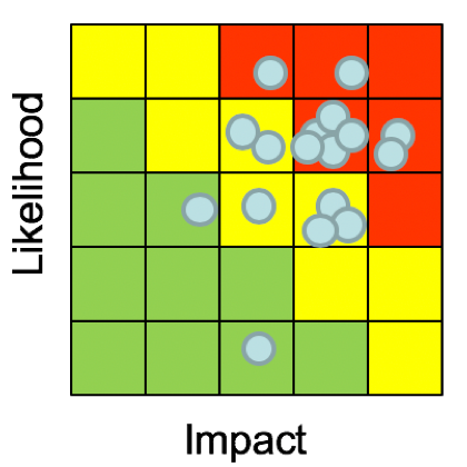
Fig 1: Typical risk matrix
See Fig. 1: “Should we spend $X to reduce risk Y or $A to reduce risk B?” It is not clear how to answer this question, using the risk matrix methodology.
How do we fix it? Hubbard elaborated on the solution at length, but the short answer is: math with probabilities. There are tangible examples in the first edition of the book, and will be expanded upon in the second edition.
The Measurement Challenge!
A pervasive problem in business is the belief that some things, especially those that are intangible, cannot be measured. Doug Hubbard has proven, however, that anything can be measured. The technique lies in understanding exactly what measurement is and framing the object under measurement in a way that facilitates measurement. Based on this idea, Hubbard created a game that he likes to do on his website, books and occasionally when he speaks at an event, called The Measurement Challenge. The Measurement Challenge is a simple concept: Hubbard will take questions, concepts, items, or ideas that people perceive to be immeasurable, and he will demonstrate how to measure them. The Measurement Challenge is based on another one of Hubbard’s books, How to Measure Anything: Finding the Value of Intangibles in Business in which simple statistical techniques are described to demonstrate how to measure (literally!) anything.
When all the participants checked into the event that evening, The Measurement Challenge was briefly explained to them, and they were given paper to write down one item they thought was hard or impossible to measure. Some entries actually have been measured before, such as measuring the number of jelly beans in a jar, the number of alien civilizations in the universe and decomposition problems, similar to the number of piano tuners in Chicago. The most interesting ones were things that are intangible, and which is of course, is Hubbard’s specialty.
Measuring intangibles requires a clear definition of what it is you're trying to measure.
It’s useful to keep in mind the clarification chain, described in Hubbard’s book How to Measure Anything: Finding the Value of Intangibles in Business. The clarification chain is summed up as three axioms:
If it matters at all, it is detectable/observable.
If it is detectable, it can be detected as an amount (or range of possible amounts.)
If it can be detected as a range of possible amounts, it can be measured.
All entries were collected, duplicates were combined and tallied up for final voting. The finalist questions were put up on an online voting system for all participants to vote on from their smartphones. There were a diverse number of excellent questions, but two were picked to give plenty of time to delve into the concepts of measurement and how to decompose the problems.
Some interesting questions that weren’t picked:
Measure the capacity for hate
The effectiveness of various company training programs
The value of being a better calibrated estimator
How much does my daughter love me?
The winning questions were:
How much does my dog love me?, and
What is the probable reputation damage to my company resulting from a cyber incident?
Challenge #1: How much does my dog love me?
How much does my dog love me? This is a challenging question, and it combined many other questions that people had asked of a similar theme. There were many questions on love, hate and other emotions, such as: How do I know my daughter loves me? How much does my spouse love me? How can I measure the love between a married couple? How much does my boss hate me? If you can figure out how to measure love, you would also know how to measure hate. Taking that general theme, “How much does my dog love me?” is a good first measurement challenge.
Hubbard read the question, looked up somewhat quizzically and told the person who had asked the question to raise their hand. He asked a counter question: “What do you mean by love?” Most people in the audience, including the person who’d asked the question, were unsure how to answer. Pausing to let the point be made, Hubbard then started to explain how to solve this problem.
He explained that the concept of “love” has many different definitions based on who you are, your cultural differences, age, gender, and many other factors. The definition of love also varies by the object of which you are forming the question around. For example, the definition of love from an animal is very different from the definition of love from a child, which is also very different from the love from a spouse. After explaining, Hubbard asked again: “What do you mean by love from your dog? What does this mean?”
People started throwing out ideas of what it means for a dog to love an individual, naturally using the clarification chain as a mental framework. Observable, detectable behaviors were shouted out, such as:
When I come home from work and my dog is happy to see me. She jumps up on me. This is how I know she loves me.
I observe love from my dog when he cuddles in bed after a long day at work.
Some dogs are service animals and are trained to save lives or assist throughout your day. That could also be a form of love.
Hubbard asked a follow-up question, “Why do you care if your dog loves you?” This is where the idea of measuring “love” started to come into focus for many of the people in the audience. If one is able to clearly define what love is, able to articulate why one personally cares, and frame the measurement as what can be observed, meaningful measurements can be made.
The last question Hubbard asked was, “What do you already know about this measurement problem?” If one’s idea of love from a dog is welcome greetings, one can measure how many times the dog jumps up, or some other activity that is directly observable. In the service animal example, what would we observe that would tell us that the dog is doing its job? Is it a number of activities per day that that the dog is able to complete successfully? Would it be passing certain training milestones so that you would know that the dog can save your life when it's needed? If your definition of love falls within those parameters, it should be fairly easy to build measurements around what you can observe.
Challenge #2: What is the probable reputation damage to my company resulting from a cyber incident?
The next question was by far one of the most popular questions that was asked. This is a very interesting problem, because some people would consider this to be an open and shut case. Reputation damage has been measured many times by many people and the techniques are fairly common knowledge. However, many risk managers proudly exclaim that reputation damage simply cannot be measured for various reasons: the tools don't exist, it’s too intangible, or that it's not possible to inventory all the various areas a business has reputation, as an asset to lose.
Just like the first question, he asked the person that posed this problem to raise their hand and he asked a series of counter questions, designed to probe exactly what they mean by “reputation,” what could you observe that would tell you that have good reputation, and as a counter question, what could you observe that would tell you that you have a bad reputation?
Framing it in the form of observables started an avalanche of responses from audience. One person chimed in saying that if a company had a good reputation, it would lead to customers’ trust and sales might increase. Another person added that an indicator of a bad reputation could be a sharp decrease in sales. The audience got the point quickly. Many other ideas were brought up:
A drop in stock price, which would be a measurement of shareholder trust/satisfaction.
A bad reputation may lead to high interest rates when borrowing money.
Inability to retain and recruit talent.
Increase in public relations costs.
Many more examples, and even more sector specific examples, were given by the audience. By the end of this exercise, the audience was convinced that reputation could indeed be measured, as well as many other intangibles.
Further Reading
Hubbard previewed his new book at the event and everyone in the audience had a great time trying to stump him with measurement challenges, even if it proved to be futile. These are all skills that can be learned. Check out the links below for further reading.
Douglas Hubbard
The Failure of Risk Management, by Douglas Hubbard
The Failure of Risk Management: Why it’s Broken and How to Fix It | Current, First edition published in 2009
The Failure of Risk Management: Why it's *Still* Broken and How to Fix It | 2nd edition, Due to be released in July, 2019
How to Measure Anything, by Douglas Hubbard
How to Measure Anything: Finding the Value of Intangibles in Business | 3rd edition
How to Measure Anything in Cyber Security Risk | with co-author Richard Seiersen
More Information of Risk Matrices
Bickel et al. “The Risk of Using Risk Matrices”, Society of Petroleum Engineers, 2014
Tony Cox “What’s wrong with Risk Matrices”