
Risk modeling the vulnerability du jour, part 2: Forward-looking risk registers
Risk registers shouldn’t be a graveyard of past incidents—they should be living forecasts of future loss. Here’s how to model emerging threats like ShadowBrokers or Spectre and make your risk register proactive, not reactive.

"extreme horizon" by uair01 is licensed under CC BY 2.0
Strange, unusual, media-worthy vulnerabilities and cyberattacks… they seem to pop up every few months or so and send us risk managers into a fire drill. The inevitable questions follow: Can what happened to Yahoo happen to us? Are we at risk of a Heartbleed-type vuln? And, my personal favorite, Is this on our risk register?
This post is the second of a two-part series on how to frame, scope, and model unusual or emerging risks in your company's risk register. Part 1 covered how to identify, frame, and conceptualize these kinds of risks. Part 2, this post, introduces several tips and steps I use to brainstorm emerging risks and include the results in your risk register.
What’s a “forward-looking risk register”?
Before we get started, here’s the single most important takeaway of this blog post:
Risk registers should be forecasts, not a big ‘o list of problems that need to be fixed.
It shouldn't be a list of JIRA tickets of all the systems that are vulnerable to SQL injection, don't have working backups, or are policy violations. That's a different list.
A risk register:
Identifies the bad things that happen. For example, a threat uses SQL injection against your database and obtains your customer list
Forecasts the probability of the bad things happening, and
How much it could cost you if it does happen
In other words, risk registers look forward, not back. They are proactive, not reactive.
Including new threats and vector in your risk register
When I revamp a risk program, the first thing I do is make sure the company's risk register - the authoritative list of all risks that we know and care about - is as comprehensive and complete as possible. Next, I look for blind spots and new, emerging risks.
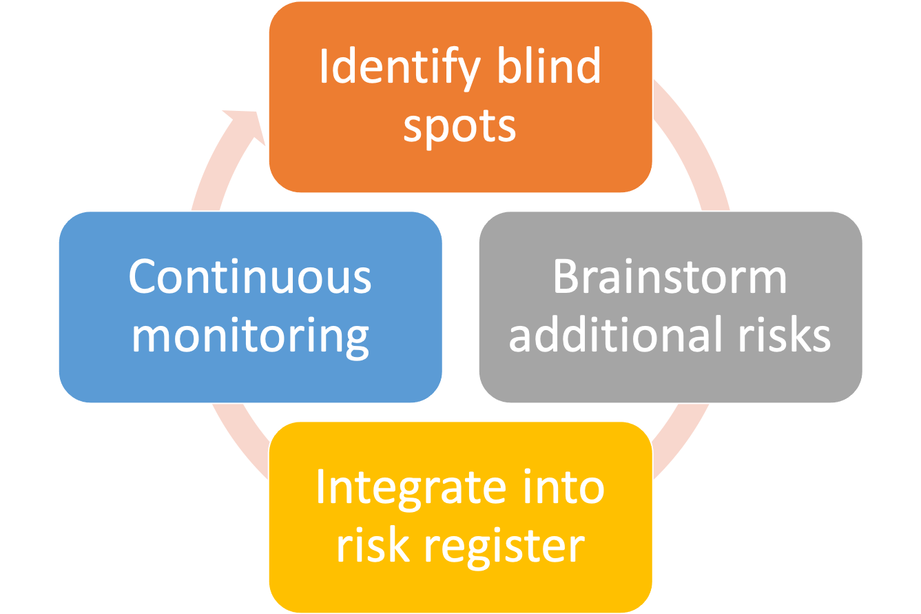
Here's my 4 step process to identify risk register blind spots, brainstorm new risks, how to integrate them into your register, and implement continuous monitoring.
Step 1: Inventory historical vulns and identify blind spots in your register
Run-of-the-mill risks like data breaches, outages, phishing, and fraud are easily turned into risk scenarios. It's a bit harder to identify risk blind spots. When a security incident story hits the major media and is big enough that I think I'm going to be asked about it, I start to analyze it. I look at who the threat actors are, their motivations, vector of attack, and probable impact. I then compare my analysis with the list of existing risks and ask myself, Am I missing anything? What lessons can I learn from the past to help me forecast the future?
Here are some examples:
| Vulnerability / Incident | What happened | Lessons for your risk register |
|---|---|---|
| Solarwinds hack (2020) | SolarWinds' software build process was infiltrated, giving attackers a foothold in Solarwinds customers' networks. | Software you trust gets delivered or updated with malware or provides access to system resources. |
| Target hack (2013) | Phishing email targeted at a vendor was successful, giving the attackers access to internal Target systems, leading to a breach of cardholder data. | Vendors you trust are compromised, giving attackers a foothold into your systems. |
| Sony Pictures Entertainment (SPE) (2014) | SPE released a movie that was unflattering to a particular regime, leading to a large-scale cyberattack that included ransom/extortion, massive data leaks, and a prolonged system outage. | State-sponsored groups or hacktivists are unhappy with a company's positions, products, leadership, or employee opinions and launch a cyber-attack in retaliation. |
| Rowhammer vuln | Privilege escalation and network-based attacks by causing a data leakage in DRAM. | There are hardware vulnerabilities that are OS-independent. OS/supplier diversification is not a panacea. |
| Spectre / Meltdown | An attacker exploits a vuln present in most modern CPUs, allowing access to data. | Same as above |
| Cold boot attack | An attacker with physical access to the target computer gains access to the data in memory. | You must assume that if an attacker is motivated, adequately resourced, and has the right knowledge, they can do anything with physical access to hardware. See the Evil Maid Attack. |
| Heartbleed | Bug in the OpenSSL library gives attackers access to data or the ability to impersonate sessions. | Linus’ Law (“given enough eyeballs, all bugs are shallow”) is not a risk mitigation technique. Open-source software has vulnerabilities just like commercial software, and sometimes they’re really bad. |
| Shadowbrokers leak (2016) | A massive leak of NSA hacking tools and zero-day exploits. | Criminal organizations and state-sponsored groups have some of the scariest tools and exploits and are unknown to software vendors and the general public. When these get leaked, adjust associated incident probabilities up. |
Step 2: Brainstorm any additional risks

"Brainstorms at INDEX: Views" by @boetter is licensed under CC BY 2.0
Keep it high-level and focus on resiliency instead of modeling out specific threat actions, methods, state-sponsored versus cybercriminals activity, etc. For example, you don't need to predict the next cold-boot type hardware attack. Focus on what you could do to improve overall security and resilience against scenarios in which the attackers have physical access to your hardware, whoever they may be.
Step 3: Integrate into the risk register
This step is a bit more complex, and the approach will significantly depend on your company's risk culture and what your audience expects out of a risk register.
One approach is to integrate your new scenarios into existing risk scenarios. For example, suppose you already have an existing data breach risk analysis. In that case, you can revisit the assumptions, probability of occurrence, and the factors that make up the loss side of the equation and ensure that events, such as Shadowbrokers or Target, are reflected.
Another approach is to create new risk scenarios, but this could make the register very busy with hypotheticals. Risk managers at Microsoft, the US State Department, and defense contractors probably would have a robust list of hypotheticals. The rest of us would just build the risks into existing scenarios.
Step 4: Continuous monitoring
As new attacks, methods, vectors, and vulnerabilities are made public, ask the following questions:
Conceptually and from a high level, do you have an existing scenario that covers this risk? Part 1 gives more advice on how to determine this.
Framing the event as a risk scenario, does it apply to your organization?
Is the risk plausible and probable, given your organization's risk profile? I never try to answer this myself; I convene a group of experts and elicit opinions.
In addition to the above, hold yearly emerging risk brainstorming sessions. What's missing, what's on the horizon, and where should we perform risk analyses?
I hope this gives you some good pointers to future-proof your risk register. What do you think? How do you approach identifying emerging risk? Let me know in the comments below.
Further reading

Risk modeling the vulnerability du jour, part 1: Framing
When the next headline-making exploit drops, your execs will ask, “Was this on our risk register?” This guide walks through how to proactively frame exotic or emerging threats—without falling into the FUD trap.

Every few months or so, we hear about a widespread vulnerability or cyber attack that makes its way to mainstream news. Some get snappy nicknames and their very own logos, like Meltdown, Specter, and Heartbleed. Others, like the Sony Pictures Entertainment, OPM, and Solarwinds attacks cause a flurry of activity across corporate America with executives asking their CISO’s and risk managers, “Are we vulnerable?”
I like to call these the vulnerability du jour, and I’m only half sarcastic when I say that. On the one hand, it’s a little annoying how sensationalized these are. Media-worthy vulnerabilities and attacks feel interchangeable: when one runs its course and attention spans drift, here’s another one to take its place, just like a restaurant’s soup of the day. On the other hand, if this is what it takes to get the boardroom talking about risk - I’ll take it.
When the vulnerability du jour comes on an executive’s radar, the third or fourth question is usually, “Was this on our risk register?” Of course, we don’t have crystal balls and can’t precisely predict the next big thing, but we can use brainstorming and thought exercises to ensure our risk registers are well-rounded. A well-rounded and proactive risk register includes as many of these events and vulnerabilities as possible - on a high level.
This is a two-part series, with this post (part 1) setting some basic guidelines on framing these types of risks. Part 2 gives brainstorming ideas on how to turn your risk register into one that’s forward-looking and proactive instead of reactive.
Building a forward-looking risk register means you’re holding at least annual emerging risk workshops in which you gather a cross-section of subject matter experts in your company and brainstorm any new or emerging risks to fill in gaps and blind spots in your risk register. I have three golden rules to keep in mind when you’re holding these workshops.
Golden Rules of Identifying Emerging Risk
#1: No specifics

Meteorologists, not Miss Cleo
We’re forecasters, not fortune tellers (think a meteorologist versus Miss Cleo). I don’t think anyone had “State-sponsored attackers compromise SolarWind’s source code build system, leading to a company data breach” in their list of risks before December 2020. (If you did - message me. I’d love to know if Elvis is alive and how he’s doing.)
Keep it high-level and focused on how the company can prepare for resiliency rather than a specific vector or method of attack. For example, one can incorporate the SolarWinds incident with a generalized risk statement like the example below. This covers the SolarWinds vector and other supply chain attacks and also provides a starting point to future-proof your risk register to similar attacks we will see in the future.
Attacker infiltrates and compromises a software vendor's source code and/or build and update process, leading to company security incidents (e.g. malware distribution, unauthorized data access, unauthorized system access.)The fallout from the incident can be further decomposed and quantified using FAIR’s 6 forms of loss or a similar model.
#2: Risk Quantification
The risk matrix encourages FUD (fear, uncertainty, doubt)
Communicating hypothetical, speculative, or rare risks is hard to do without scaring people. If a good portion of your company’s risk register is stuff like hypervisor escapes, privilege escalation via rowhammer, and state-sponsored attacks you really need to have the data to back up why it needs executive attention. Otherwise, it will just look like another case of FUD.
The key to success is risk quantification: risk articulated in numbers, not colors. A bunch of red high risks (or green low risks) obfuscates the true story you are trying to tell.
All risk, because it’s forward-looking, is filled with uncertainty.
Unique and exotic risks have even more uncertainty. For example, there have been so many data breaches that we have a really good idea of how often they occur and how much it costs. Supply chain attacks like SolarWinds? Not so much. Choose a risk model that can communicate both the analyst’s uncertainty and the wide range of possibilities.
I use FAIR because it’s purpose-built for information and operational risks but you really can use any quantitative model.
#3: Be aware of risk blindness

Every good risk analyst knows the difference between risks that are possible and those that are probable. Without going too deep into philosophy, just about anything is possible and it’s the risk analyst’s job to reign in people when the risk brainstorming veers to outlandish scenarios. But, don’t reign them in too much!
Any risk, no matter how routine, was unique and a surprise to someone once upon a time. Ransomware would sound strange to someone in the 1970’s; computer crime would be received as black magic to someone in the 15th century.
Try to put yourself in this mindset as you hold emerging risk workshops. I personally love holding workshops with incident responders and red teamers - they have the ability to think outside of the box and are not shy about coming up with hypotheticals and highly speculative scenarios. Don’t discourage them. Yes, we still need to separate out possible from probable, but it is an emerging risk workshop. See what they come up with.
Next Up
I hope this post got you thinking about how to add these types of risks to your register. In part 2, I’m going to give real-life examples of how to further brainstorm and workshop out these risks.
Further reading

Black Swans and risk blindness
Black Swans aren't about rare events—they're about the risks we refuse to see. Here's how to spot your inner Thanksgiving turkey and avoid being blindsided by the next big shock.

I’ve noticed something unusual lately. There seems to be an increase in the number of events people are declaring Black Swans and the ensuing philosophic tug-of-war of detractors saying they’re wrong. At first, I thought people were just going for clickbait headlines, but I now feel something else is going on. We are experiencing a sort of collective risk blindness: we’re unable or unwilling to see emerging risk in front of us.
Keep in mind that the Black Swan is not a metaphor for sudden, surprise, high impact/low probability or catastrophic events. It’s a metaphor for risk blindness. Recall the parable of the Thanksgiving turkey:
Consider a turkey that is fed every day. Every single feeding will firm up the bird's belief that it is the general rule of life to be fed every day by friendly members of the human race 'looking out for its best interests,' as a politician would say. On the afternoon of the Wednesday before Thanksgiving, something unexpected will happen to the turkey. It will incur a revision of belief.”
- Nassim Taleb, “The Black Swan”
The Thanksgiving turkey is blind to risk. Cognitive bias, over-reliance on historical data, and not considering new, emerging risk led to it being surprised when it was served for dinner.
Both risk in general and Black Swans are observer-dependent. It’s in the eye of the beholder. 9/11 was a Black Swan to most of us, but not to John O’Neill. An accidental half-billion dollar wire transfer, Texas power outages, Gamestop stock volatility, and COVID-19 have all recently been declared Black Swans by some, but to others, the above examples were no surprise at all.
It’s no wonder that we’re starting to resemble Thanksgiving turkeys, unable to spot emerging risk. Risk blindness is why we are starting to see Black Swans everywhere. It seems tied to COVID-19 and all the recent political and social turmoil that’s happening. Every new big event seems surprising, and it shouldn’t be. Fighting cognitive bias, separating possible from probable, and looking beyond historical trends to see emerging threats takes work.
I’m tired. We’re all tired.
How do we ensure we’re not blind risk turkeys?
Recognize your built-in biases. Confirmation bias, anchoring, the availability effect, and overconfidence are present in every person. They cloud the decision-making process - especially when risk is involved. The corresponding Wikipedia article has a great list. Bias is an impediment to rational decision-making under uncertainty.
Diversification: Diversify your risk-seeking behavior. In other words, don’t put all your eggs in one basket.
Resiliency: Identify areas where you tend to be risk-averse and ensure you have resiliency. This could be extra liquidity, a plan B, some proactive measures, or just a recognition that you are overexposed in a particular area.
Think about how any of the above applies in your personal and professional life, weigh it against current events, what’s to come, and how you can take steps to reduce risk. For me, this is avoiding speculative investments, diversification, thinking about where I live and the risk that comes with it, thinking about insurance (do I have the right kind, in the right amounts), and ensuring that I have a plan B for critical decisions.
Footnote
I did a quick on-a-napkin brainstorming session of signficant 30-year risks that are top of mind. I’m thinking about each one and considering the following: a) how might my cognitive bias prevent me from seeing other risks? b) am I resilient to these risks, and c) if not, would diversification help me?
30 year Black Swan List (2021-2031)
(Risks that the collective “we” are blind to)
Cryptographic protocols go poof: A significant number of computer-based cryptographic protocols are unexpectedly and suddenly cracked or broken, leading to substantial financial, societal, and governmental repercussions. This could be from some kind of universal vulnerability, a monumental leap forward in computing power, artificial intelligence capabilities, or something else.
West Coast US Tsunami: Devastating tsunami on the US West Coast, most likely from an earthquake on the Cascadia subduction zone.
Extraterrestrial life is discovered: I don’t think microbe fossils on Mars would cause an adverse event, but if proof of extraterrestrial life is found to a degree that it causes large groups of people to question their religious views, there could be financial market shockwaves, panic selling, civic unrest, etc.
Another pandemic: COVID-19 scale pandemics are generally considered 100-year events, so another one in the next 30 years would shock many people. (Although those versed in probability theory know that another pandemic can happen today and still could be a 100-year event).
Twin pandemics: Speaking of pandemics, another one right now or two at the same time in the next 30 years is plausible.
Cryptocurrency is vaporized: Overnight (or very suddenly), the value of cryptocurrency (e.g. Bitcoin) plummets to near nothing. It could be from sudden government regulation, some kind of intentional devaluing, panic selling, the first event I listed (cryptographic protocols are broken), coordinated cyberattack/theft, or something else.
“Derecho” enters the popular lexicon: Devastating straight-line wind storms (as opposed to rotating - e.g. tornado, hurricane) become more frequent, extreme, damaging, and appear in places we’re not accustomed to seeing them. This is part of a trend of an increase in extreme weather globally.
Insurrection in the US: January 6, 2021 was just the beginning. Right-wing extremists perpetuate violent uprisings or terrorist attacks. Both the violence and subsequent law enforcement/military response cause financial, commerce, and civic repercussions.

The 2021 Security Outcomes report and better research methods
Most security surveys are junk science — biased, unrepresentative, and built to sell, not inform. Cisco’s 2021 report, in partnership with Cyentia, finally gets it right, showing the industry what statistically sound research actually looks like.

Something extraordinary happened recently in the Information Security research report area. Why I think it’s so extraordinary might have passed you by, unless you geek out on statistical methods in opinion polling as I do. The report is Cisco’s 2021 Security Outcomes report, produced in collaboration with the Cyentia Institute which is the only report in recent memory that uses sound, statistical methods in conducting survey-based opinion research. What is that and why is it so important? Glad you asked! <soapbox on>
The Current Problem
Numerous information security reports and research are survey-based, meaning they ask a group of people their opinion on something, aggregate the results, draw conclusions, then present the results. This is a very common -- and often illuminating -- way to perform research. It reveals the preferences and opinions of a group of people, which can further be used as a valuable input in an analysis. This method is called opinion polling, and we are all very familiar with this kind of research, mostly from political opinion polls that ask a group of people how they’re voting.
The single most important thing to keep in mind when evaluating the veracity of an opinion poll is knowing how respondents are selected.
If the people that comprise the group are selected at random, one can extrapolate the results to the general population.
If the people that comprise the group are not selected at random, the survey results only apply to the group itself.
Here’s the problem: most, if not all, survey-based information security reports make no effort to randomize the sample. As a consequence, the results are skewed. If a headline reads “40% of Ransomware Victims Pay Attackers” and the underlying research is non-random opinion polling, like a Twitter poll or emailing a customer list, the headline is misleading. The results only apply to the people that filled out the survey, not the general population. If you’re not following, let me use a more tangible example.
Let’s suppose you are a campaign worker for one of the candidates in the 2020 US Presidential campaign. You want to know who is ahead in California - Trump or Biden. The way you figure this out is to ask a group of people how they plan on voting on Election Day. I want to extrapolate the results to the whole of California - not just one area or demographic. It’s not feasible to ask every single Californian voter how they’re voting; just ask a representative sample. Which one of these polling methods do you think will yield the most accurate results?
Stand in front of a grocery store in Anaheim (the most conservative city in California) and ask 2000 people how they are voting
Stand in front of a grocery store in San Francisco (the most liberal city in California) and ask 2000 people how they are voting
Ask 2000 people on my Twitter account and offer them a $5 Amazon gift card to answer a poll on how they’re voting. It’s the honor system that they’re actually from California.
All three options will result in significant error and bias in the report, especially if the results are applied to how all Californians will vote. It’s called selection bias and it occurs when the group sampled is systematically different than the wider population being studied. Regardless if you work for the Biden or Trump campaign, you can’t use these survey results. Option 1 will skew toward Trump and option 2 will skew toward Biden - giving both teams an inaccurate view of how all Californians will vote. Option 3 would yield odd results, with people from all over the world completing the survey just to get the gift card.
Every survey-based security research report I’ve seen is conducted using non-randomized samples, like the examples above, and are subject to selection bias. If you’re a risk analyst like me, you can’t use reports like this - the results are just too questionable. I won’t use it. Junk research is the death of the defensibility of a risk assessment.
What Cyentia did
Let’s add a 4th option to the list above:
4. Obtain a list of all likely California voters, randomly sample enough people so that the likely response rate will be ~2000, and ask them how they plan on voting.
This method is much better; this gets us closer to a more accurate (or less wrong, following George Box’s aphorism) representation of how a larger group of people will vote.

Here’s the extraordinary thing: Cisco and Cyentia actually did it! They produced a research report based on opinion polling that adheres to sampling and statistical methods. They didn’t just ask 500 randos on Twitter with the lure of gift cards to answer a survey, like everyone else does. They went through the hard work to get a list, randomly sample it, debias the questions, and present the results in a transparent, usable way. This is the first time I’ve ever seen this in our industry and I truly hope it’s not the last.
A sea change?
Nearly all survey-based Information Security research reports cut corners, use poor methods, and typically use the results to scare and sell, rather than inform. The result is, at best, junk and at worst, actively harmful to your company if used to make decisions. I know that doing the right thing is hard and expensive, but it’s worth doing. Wade Baker of Cyentia wrote a blog post detailing the painstaking complexity of the sampling methodology. As a consumer of this research, I want Cyentia and Cisco to know that their hard work isn’t for nothing. The hard work means I and many others can use the results in a risk analysis.
I truly hope this represents a sea change in how security research is conducted. Thanks to everyone involved for going the extra mile - the results are remarkable.
Further Reading
Finally - a properly sampled security survey | blog post by Wade Baker on how the Cisco’s 2021 Security Outcomes report was designed
The good, the bad, and the ugly of public opinion polls | paper by Russell D. Renka
Sampling Methods Review by Khan Academy
Internet Surveys: Bad Data, Bad Science and Big Bias | blog post by Ian Chadwick
20 Questions A Journalist Should Ask About Poll Results | great post on opinion polling and ethics

Risk Mythbusters: We need actuarial tables to quantify cyber risk
Think you need actuarial tables to quantify cyber risk? You don’t — actuaries have been pricing rare, high-uncertainty risks for centuries using imperfect data, expert judgment, and common sense, and so can you.

Risk management pioneers: The New Lloyd's Coffee House, Pope's Head Alley, London
The auditor stared blankly at me, waiting for me to finish speaking. Sensing a pause, he declared, “Well, actually, it’s not possible to quantify cyber risk. You don’t have cyber actuarial tables.” If I had a dollar for every time I heard that… you know how the rest goes.
There are many myths about cyber risk quantification that have become so common, they border on urban legend. The idea that we need vast and near-perfect historical data is a compelling and persistent argument, enough to discourage all the but the most determined of risk analysts. Here’s the flaw in that argument: actuarial science is a varied and vast discipline, selling insurance on everything from automobile accidents to alien abduction - many of which do not have actuarial tables or even historical data. Waiting for “perfect” historical data is a fruitless exercise and will prevent the analyst from using the data at hand, no matter how sparse or flawed, to drive better decisions.
Insurance without actuarial tables
Many contemporary insurance products, such as car, house, fire, and life have rich historical data today. However, many insurance products have for decades - in some cases, centuries - been issued without historical data, actuarial tables, or even good information. For those still incredulous, consider the following examples:
Auto insurance: Issuing auto insurance was unheard of when the first policy was issued in 1898. Companies only insured horse-drawn carriages up to that point, and actuaries used data from other types of insurance to set a price.
Celebrities’ body parts: Policies on Keith Richards’ hands and David Beckham’s legs are excellent tabloid fodder, but also a great example of how actuaries are able to price rare events.
First few years of cyber insurance: Claims data was sparse in the 1970’s, when this product was first conceived, but there was money to be made. Insurance companies set initial prices based on estimates and adjacent data. Prices were adjusted as claims data became available.
There are many more examples: bioterrorism, capital models, and reputation insurance to name a few.
How do actuaries do it?
Many professions, from cyber risk to oil and gas exploration, use the same estimation methods developed by actuaries hundreds of years ago. Find as much relevant historical data as possible - this can be adjacent data, such as the number of horse-drawn carriage crashes when setting a price for the first automobile policy - and bring it to the experts. Experts then apply reasoning, judgment, and their own experience to set insurance prices or estimate the probability of a data breach.
Subjective data encoded quantitatively isn’t bad! On the contrary, it’s very useful when there is deep uncertainty, sparse data, data is expensive to acquire or a new, emerging risk.
I’m always a little surprised when people reject better methods altogether, citing the lack of “perfect data,” then swing in the opposite direction to gut checks and wet finger estimation. The tools and techniques are out there to make cyber risk quantification not only possible but could give any company a competitive edge. Entire industries have been built around less than perfect data and we as cyber risk professionals should not use a lack of perfect data as an excuse not to quantify cyber risk. If there is a value placed on Tom Jones' chest hair then certainly we can predict the loss risk of a data incident... go ask the actuaries!

Better Security Metrics with Biff Tannen
Can your metrics pass the Biff Test? If a time-traveling dimwit like Back to the Future's Biff Tannen can fetch and understand your metric, it’s probably clear enough to guide better decisions.

In a previous post, I wrote about testing metrics with The Clairvoyant Test. In short, a metric is properly written if a clairvoyant, who only has the power of observation, can identify it.
Some people struggle with The Clairvoyant Test. They have a hard time grasping the rules: the clairvoyant can observe anything but cannot make judgments, read minds or extrapolate. It’s no wonder they have a hard time; our cultural view of clairvoyants is shaped by the fake ones we see on TV. For example, Miss Cleo, John Edward, and Tyler “The Hollywood Medium” Henry often do make personal judgments and express opinions about future events. Almost every clairvoyant we see in movies and TV can read minds. I think people get stuck on this, and often will declare metrics or measurements as incorrectly passing The Clairvoyant Test due to the cultural perception that clairvoyants know everything.
Since this is a cultural problem and not a technical one, is there a better metaphor we can use? Please allow me to introduce you to Biff Tannen.
Meet Biff
Biff Tannen is the main villain in all three Back to the Future movies. In Back to the Future II, Biff steals Doc’s time-traveling DeLorean in 2015 for nefarious reasons. Among other shenanigans, 2015 Biff gives a sports almanac to 1955 Biff, providing the means for him to become a multi-millionaire and ruining Hill Valley in the process.
If you recall, Biff has the following negative characteristics:
He’s a dullard and has no conjecture abilities
He lacks common sense
He has little judgment or decision-making capabilities
He’s a villain, so you can’t trust him
But...
He has access to Doc’s time-traveling DeLorean so he can go to any point in the future and fetch, count, look up or directly observe something for you.
Here’s how Biff Tannen can help you write better metrics: if Biff can understand and fetch the value using his time-traveling DeLorean, it’s a well-written metric. Metrics have to be clear, unambiguous, directly observable, quantifiable, and not open to interpretation.
You should only design metrics that are Biff-proof. Biff gets stuck on ambiguity, abstractions and can only understand concepts that are right in front of him, such as the sports almanac. He can only count through observation due to low intelligence and lacks judgment and common sense. If you design a metric that Biff Tannen can fetch for you, it will be understood and interpreted by your audience. That’s the magic in this.
How to Use the Biff Test: A Few Examples
Metric: % of vendors with adequate information security policies
Biff cannot fetch this metric for you; he has no judgment or common sense. He will get stuck on the word “adequate” and not know what to do. Your audience, reading the same metric, will also get confused and this opens the measurement up to different interpretations. Let’s rewrite:
New Metric: % of vendors with information security policies in compliance with the Company’s Vendor Security Policy
The re-written metric assumes there is a Vendor Security Policy that describes requirements. The new metric is unambiguous and clear. Biff – with his limited abilities – can fetch it.
Metric: % of customer disruption due to downtime
This one is slightly more complex but perhaps seen on many lists of company metrics. Biff would not be able to fetch this metric for us. “Disruption” is ambiguous, and furthermore, think about the word“downtime.” Downtime of what? How does that affect customers? Let’s re-write this into a series of metrics that show the total picture when shown as a set.
New Metrics:
Total uptime % on customer-facing systems
% customer-facing systems meeting uptime SLAs
Mean-time to repair (RTTR) on customer-facing systems
# of abandoned customer shopping carts within 24 hours following an outage
Biff can fetch the new metric and non-IT people (your internal customers!) will be able to interpret and understand them.
Metric: % of critical assets that have risk assessments performed at regular intervals
Biff doesn’t have judgment and gets confused at “regular intervals.” He wonders, what do they mean by that? Could “regular” mean once a week or every 10 years?
New Metric: % of critical assets that have risk assessments performed at least quarterly
The rewritten metric assumes that “critical asset” and “risk assessment” have formal definitions in policies. If so, one small tweak and now it passes the Biff Test.
Conclusion and Further Work
Try this technique with the next security metric you write and anything else you are trying to measure, such as OKR’s, performance targets, KRIs and KPIs.

I often ask a lay reader to review my writing to make sure it's not overly technical and will resonate with broad audiences. For this same reason, we would ask Biff - an impartial observer with a time machine - to fetch metrics for us.
Of course, I’m not saying your metric consumers are as dull or immoral as Biff Tannen, but the metaphor does make a good proxy for the wide range of skills, experience, and backgrounds that you will find in your company. A good metric that passes the test means that it’s clear, easy to understand and will be interpreted the same way by the vast majority of people. Whether you use the Biff or the Clairvoyant Test, these simple thought exercises will help you write crisp and clear metrics.

Better Security Metrics with the Clairvoyant Test
Think your security metrics are clear? Put them to the test—The Clairvoyant Test—a thought experiment that strips away ambiguity, subjectivity, and fuzziness to make sure your metrics are measurable, observable, and decision-ready.

"Clairvoyant at Whitby" by Snapshooter46 is licensed under CC BY-NC-SA 2.0
There’s an apocryphal business quote from Drucker, Demmings, or maybe even Lord Kelvin that goes something like this: “You can’t manage what you don’t measure.” I’ll add that you can’t measure what you don’t clearly define.
Clearly defining the object of measurement is where many security metrics fail. I’ve found one small trick borrowed from the field of Decision Science that helps in the creation and validation of clear, unambiguous, and succinct metrics. It’s called The Clairvoyant Test, and it’s a 30-second thought exercise that makes the whole process quick and easy.
What is the Clairvoyant Test?
The Clairvoyant Test was first introduced in 1975 as a decision analysis tool in a paper titled “Probability Encoding in Decision Analysis” by Spetzler and Von Holstein. It’s intended to be a quick critical thinking tool to help form questions that ensure what we want to measure is, in reality, measurable. It’s easily extended to security metrics by taking the metric description or definition and passing it through the test.
The Clairvoyant Test supposes that one can ask a clairvoyant to gather the metric, and if they are able to fetch it, it is properly formed and defined. In real life, the clairvoyant represents the uninformed observer in your company.
There’s a catch, and this is important to remember: the clairvoyant only has the power of observation.
The Catch: Qualities of the Clairvoyant
The clairvoyant can only view events objectively through a crystal ball (or whatever it is clairvoyants use).
They cannot read minds. The clairvoyant’s powers are limited to what can be observed through the crystal ball. You can’t ask the clairvoyant if someone is happy, if training made them smarter, or if they are less likely to reuse passwords over multiple websites.
The clairvoyant cannot make judgments. For example, you can’t ask if something is good, bad, effective, or inefficient.
They can only observe. Questions posed to the clairvoyant must be framed as observables. If your object of measurement can’t be directly observed, decompose the problem until it can be.
They cannot extrapolate. The clairvoyant cannot interpret what you may or not mean, offer conjecture or fill in the gaps of missing information. In other words, they can only give you data.
What’s a well-designed metric that passes the Clairvoyant Test?
A well-designed metric has the following attributes:
Unambiguous: The metric is clearly and concisely written; in fact, it is so clear and so concise that there is very little room for interpretation. For example, the number of red cars on Embarcadero St. between 4:45 and 5:45 pm will be interpreted the same way by the vast majority of people.
Objective: Metrics avoid subjective judgments, such as “effective” or “significant.” Those words mean different things to different people and can vary greatly across age, experience, cultural, and language backgrounds.
Quantitative: Metrics need to be quantitative measurements. “Rapid deployment of critical security patches” is not quantitative; “Percentage of vulnerabilities with an EPSS probability of 80% of higher remediated within ten days” is.
Observable: The metrics need to be designed so that anyone, with the right domain knowledge and access, can directly observe the event you are measuring.
A few examples…
Let’s try a few common metrics and pass through The Clairvoyant Test to see if they’re measurable and written concisely.
Metric: % of users with privileged access
The clairvoyant would not be able to reveal the value of the metric. “Privileged access” is a judgment call and means different things to different people. The clairvoyant would also need to know what system to look into. Let’s rewrite:
New Metric: % of users with Domain Admin on the production Active Directory domain
The new metric is objective, clear, and measurable. Additional systems and metrics (root on Linux systems, AWS permissions, etc.) can be aggregated.
Let’s try a metric that is a little harder:
Metric: Percentage of vendors with effective cybersecurity policies.
The clairvoyant would not be able to reveal this either – “effective” is subjective, and believe it or not – a cybersecurity policy is not the same across all organizations. Some have a 50-page documented program, others have a 2-page policy, and even others would provide a collection of documents: org chart, related policies, and a 3-year roadmap. Rewritten, “effective” needs to be defined, and “policy” needs to be decomposed. For example, a US-based bank could start with this:
New Metric: % of vendors that have a written and approved cybersecurity policy that adheres to FFIEC guidelines.
This metric is a good starting point but needs further work – the FFIEC guidelines by themselves don’t pass The Clairvoyant Test, but we’re getting closer to something that does. We can now create an internal evaluation system or scorecard for reviewing vendor security policies. In this example, keep decomposing the problem and defining attributes until it passes The Clairvoyant Test.
Conclusion and Further Work
Do your security metrics pass The Clairvoyant Test? If they don’t, you may have a level of ambiguity that leads to audience misinterpretation. Start with a few metrics and try rewriting them. You will find that clearly stated and defined metrics leads to a security program that is easier to manage.

Probability & the words we use: why it matters
When someone says there's a "high risk of breach," what do they really mean? This piece explores how fuzzy language sabotages decision-making—and how risk analysts can replace hand-wavy terms with probabilities that actually mean something.

The medieval game of Hazard
So difficult it is to show the various meanings and imperfections of words when we have nothing else but words to do it with. -John Locke
A well-studied phenomenon is that perceptions of probability vary greatly between people. You and I perceive the statement “high risk of an earthquake” quite differently. There are so many factors that influence this disconnect: one’s risk tolerance, events that happened earlier that day, cultural and language considerations, background, education, and much more. Words sometimes mean a lot, and other times, convey nothing at all. This is the struggle of any risk analyst when they communicate probabilities, forecasts, or analysis results.
Differences in perception can significantly impact decision making. Some groups of people have overcome this and think and communicate probabilistically - meteorologists and bookies come to mind, but other areas such as business, lag far behind. My position has always been that if business leaders can start to think probabilistically, like bookies, significantly better risk decisions can be made, yielding an advantage over their competitors. I know from experience, however, that I need to first convince you there’s a problem.
The Roulette Wheel

A pre-COVID trip to Vegas reminded me of the simplicity in betting games and their usefulness in explaining probabilities. Early probability theory was developed to win at dice games, like hazard - a precursor to craps - not to advance the field of math.
Imagine this scenario: we walk into a Las Vegas casino together and I place $2,000 on black on the roulette wheel. I ask you, “What are my chances of winning?” How would you respond? It may be one of the following:
You have a good chance of winning
You are not likely to win
That’s a very risky bet, but it could go either way
Your probability of winning is 47.4%
Which answer above is most useful when placing a bet? The last one, right? But, which answer is the one you are most likely to hear? Maybe one of the first three?
All of the above could be typical answers to such a question, but the first three reflect attitudes and personal risk tolerance, while the last answer is a numerical representation of probability. The last one is the only one that should be used for decision making; however, the first three examples are how humans talk.
I don’t want us all walking around like C3PO, quoting precise odds of successfully navigating an asteroid field at every turn, but consider this: not only is “a good chance of winning” not helpful, you and I probably have a different idea of what “good chance” means!
The Board Meeting
Let’s move from Vegas to our quarterly Board meeting. I've been in many situations where metaphors are used to describe probabilities and then used to make critical business decisions. A few recent examples that come to mind:
We'll probably miss our sales target this quarter.
There's a snowball's chance in hell COVID infection rates will drop.
There's a high likelihood of a data breach on the customer database.
Descriptors like the ones above are the de facto language of forecasting in business: they're easy to communicate, simple to understand, and do not require a grasp of probability - which most people struggle with. There's a problem, however. Research shows that our perceptions of probability vary widely from person to person. Perceptions of "very likely" events are influenced by many factors, such as gender, age, cultural background, and experience. Perceptions are further influenced by the time of day the person is asked to make the judgment, a number you might have heard recently that the mind anchors to, or confirmation bias (a tendency to pick evidence that confirms our own beliefs).
In short, when you report “There's a high likelihood of a data breach on the customer database” each Board member interprets “high likelihood” in their own way and makes decisions based on the conclusion. Any consensus about how and when to respond is an illusion. People think they’re on the same page, but they are not. The CIA and the DoD noticed this problem in the 1960’s and 1970’s and set out to study it.
The CIA’s problem
One of the first papers to tackle this work is a 1964 CIA paper, Words of Estimative Probability by Sherman Kent. It's now declassified and a fascinating read. Kent takes the reader through how problems arise in military intelligence when ambiguous phrases are used to communicate future events. For example, Kent describes a briefing from an aerial reconnaissance mission.

Aerial reconnaissance of an airfield
Analysts stated:
"It is almost certainly a military airfield."
"The terrain is such that the [redacted] could easily lengthen the runways, otherwise improve the facilities, and incorporate this field into their system of strategic staging bases. It is possible that they will."
"It would be logical for them to do this and sooner or later they probably will."
Kent describes how difficult it is to interpret these statements meaningfully; not to mention, make strategic military decisions.
The next significant body of work on this subject is "Handbook for Decision Analysis" by Scott Barclay et al for the Department of Defense. A now-famous 1977 study was conducted on 23 NATO officers, asking them to match probabilities, articulated in percentages, to probability statements. The officers were given a series of 16 statements, including:
It is highly likely that the Soviets will invade Czechoslovakia.
It is almost certain that the Soviets will invade Czechoslovakia.
We believe that the Soviets will invade Czechoslovakia.
We doubt that the Soviets will invade Czechoslovakia.
Only the probabilistic words in bold (emphasis added) were changed across the 16 statements. The results may be surprising:

"Handbook for Decisions Analysis" by Scott Barclay et al for the Department of Defense, 1977
It is obvious that the officers' perceptions of probabilities are all over the place. For example, there's an overlap with "we doubt" and "probably," and the inconsistencies don't stop there. The most remarkable thing is that this phenomenon isn't limited to 23 NATO officers - take any group of people, ask them the same questions, and you will see very similar results.
Can you imagine trying to plan for the Soviet invasion of Czechoslovakia, literal life and death decisions, and having this issue? Let’s suppose intelligence states there's a “very good chance” of an invasion occurring. One officer thinks “very good chance” feels about 50/50 - a coin flip. Another thinks that’s a 90% chance. They both nod in agreement and continue war planning!
Can I duplicate the experiment?
I recently discovered a massive, crowdsourced version of the NATO officer survey called www.probabilitysurvey.com. The website collects perceptions of probabilistic statements, then shows an aggregated view of all responses. I took the survey to see if I agreed with the majority of participants, or if I was way off base.

My perceptions of probabilities (from www.probabilitysurvey.com). The thick black bars are my answers
I was surprised that some of my responses were so different than others, yet others were in line with everyone else. I work with probabilities every day and work with people to translate what they think is possible, and probable, to probabilistic statements. Thinking back, I consider many terms in the survey as synonymous with each other, while others perceive slight variations.
This is even more proof that if you and I are in a meeting, talking about high likelihood events, we will have different notions of what that means, leading to mismatched expectations and inconsistent outcomes. This can destroy the integrity of a risk analysis.
What can we do?
We can't really "fix" this, per se. It's a condition, not a problem. It's like saying, "We need to fix the problem that everyone has a different idea of what 'driving fast' means." We need to recognize that perceptions vary among people and adjust our own expectations accordingly. As risk analysts, we need to be intellectually honest when we present risk forecasts to business leaders. When we walk into a room and say “ransomware is a high likelihood event,” we know that every single person in the room hears “high” differently. One may think it’s right around the corner and someone else may that’s a once-every-ten-years event and have plenty of time to mitigate.
That’s the first step. Honesty.
Next, start thinking like a bookie. Experiment with using mathematical probabilities to communicate future events in any decision, risk, or forecast. Get to know people and their backgrounds; try out different techniques with different people. For example, someone who took meteorology classes in college might prefer probabilities and someone well-versed in gambling might prefer odds. Factor Analysis of Information Risk (FAIR), an information risk framework, uses frequencies because it’s nearly universally understood.
For example,
"There's a low likelihood of our project running over budget."
Becomes…
There's a 10% chance of our project running over budget.
Projects like this one, in the long run, will run over budget about once every 10 years.
Take the quiz yourself on www.probabilitysurvey.com. Pass it around the office and compare results. Keep in mind there is no right answer; everyone perceives probabilistic language differently. If people are sufficiently surprised, test out using numbers instead of words.
Numbers are unambiguous and lead to clear objectives, with measurable results. Numbers need to become the new de facto language of probabilities in business. Companies that are able to forecast and assess risk using numbers instead of soft, qualitative adjectives, will have a true competitive advantage.
Resources
Words of Estimative Probability by Sherman Kent
Handbook for Decisions Analysis by Scott Barclay et al for the Department of Defense
Take your own probability survey
Thinking Fast and Slow by Daniel Kahneman | a deep exploration into this area and much, much more

Recipe for passing the OpenFAIR exam
Thinking about the OpenFAIR certification? Here's a practical, no-fluff study guide to help you prep smarter—not harder—and walk into the exam with confidence.

Passing and obtaining the OpenGroup’s OpenFAIR certification is a big career booster for information risk analysts. Not only does it look good on your CV, it demonstrates your mastery of FAIR to current and potential employers. It also makes a better analyst because it deepens one’s understanding of risk concepts that may not be often used. I passed the exam myself a while back, and I’ve also helped people prepare and study for it. This is my recipe for studying for and passing the OpenFAIR exam.
What to study
The first thing you need to understand in order to pass the exam is that the certification is based on the published OpenFAIR standard, last updated in 2013. Many people and organizations - bloggers, risk folks on Twitter, the FAIR Institute, me, Jack Jones himself - have put their own spin and interpretation on FAIR in the years since the standard was published. Reading this material is important to becoming a good risk analyst but it won’t help you pass the exam. You need to study and commit to memory the OpenFAIR standard. If you find contradictions in later texts, favor the OpenFAIR documentation.
Now, get your materials
The two most important texts are:
Open Risk Taxonomy Technical Standard (O-RT) - free, registration required
Open Risk Analysis Technical Standard (O-RA) - free, registration required
Two more optional texts, but highly recommended:
OpenFAIR Foundation Study Guide - $29.95
Measuring and Managing Information Risk: A FAIR Approach by Jack Freund and Jack Jones - book, $49.95 on Amazon
How to Study
This is how I recommend you study for the exam:
Thoroughly read the Taxonomy (O-RT) and Analysis (O-RA) standards, cover to cover. Use the FAIR book, blogs, and other papers you find to help answer questions or supplement your understanding, but use the PDF’s as your main study aid.
Start memorizing - there are only three primary items that require rote memorization; everything else is common sense if you have a mastery of the materials. Those items are:
The Risk Management Stack
You need to know what they are, but more importantly, you need to know them in order.

Accurate models lead to meaningful measurements, which lead to effective comparisons - you get the idea. The test will have several questions like, “What enables well-informed decisions?” Answer: effective comparisons. I never did find a useful mnemonic that stuck like Please Don’t Throw Sausage Pizzas Away, but try to come up with something that works for you.
The FAIR Model
You are probably already familiar with the FAIR model and how it works by now, but you need to memorize it exactly as it appears on the ontology.

The FAIR model (source: FAIR Institute)
It’s not enough to know that Loss Event Frequency is derived from Threat Event Frequency and Vulnerability - you need to know that Threat Event Frequency is in the left box and Vulnerability is on the right. Once a day, draw out 13 blank boxes and fill them in. The test will ask you to match various FAIR elements of risk on an empty ontology. You also need to know if each element is a percentage or a number. This should be easier to memorize if you have a true understanding of the definitions.
Forms of Loss
Last, you need to know the six forms of loss. You don’t need to memorize the order, but you definitely need to recognize these as the six forms of loss and have a firm understanding of the definitions.
Productivity Loss
Response Loss
Replacement Loss
Fines and Judgements
Competitive Advantage
Reputation Damage
Quiz Yourself
I really recommend paying the $29.95 for the OpenFAIR Foundation Study Guide PDF. It has material review, questions/answers at the end of each chapter, and several full practice tests. The practice tests are so similar (even the same, for many questions) to the real test, that if you ace the practice tests, you’re ready. Also, check out FAIR certification flashcards for help in understanding the core concepts.
When you think you’re ready, register for your exam for a couple of weeks out. This gives you time to keep taking practice tests and memorizing terms.
In Closing…
It’s not a terribly difficult test, but you truly need a mastery of the FAIR risk concepts to pass. I think if you have a solid foundation in risk analysis in general, it takes a few weeks to study, as opposed to months for the CRISC or CISSP.
Good luck with your FAIR journey! As always, feel free to reach out to me or ask questions in the comments below.

No, COVID-19 is not a Black Swan event*
COVID-19 isn’t a Black Swan—it was predicted, modeled, and even planned for. So why are so many leaders acting like turkeys on Thanksgiving?
*Unless you’re a turkey

It’s really a White Ostrich event
There’s a special kind of history re-writing going on right now among some financial analysts, risk managers, C-level leadership, politicians and anyone else responsible for forecasting and preparing for major business, societal and economic disruptions. We’re about 3 months into the COVID-19 outbreak and people are starting to declare this a “Black Swan” event. Not only is “Black Swan” a generally bad and misused metaphor, the current pandemic also doesn’t fit the definition. I think it’s a case of CYA.
Just a few of many examples:
Marketwatch quoted an advisory firm founder stating the stock market fall is a “black swan market drop.”
The Nation predicted on February 25, 2020 that “The Coronavirus Could Be the Black Swan of 2020.”
Forbes declared on March 19, 2020: COVID-19 is a Black Swan.
My LinkedIn and Twitter feed is filled with Black Swan declarations or predictions that the coming economic ramifications will be Black Swan events.
None of this is a Black Swan event. COVID-19, medical supply shortages, economic disaster – none of it.
Breaking Black Swans down
The term “Black Swan” became part of the business lexicon in 2007 with Nassim Taleb’s book titled The Black Swan: The Impact of the Highly Improbable. In it, Taleb describes a special kind of extreme, outlier event that comes as a complete surprise to the observer. The observer is so caught off-guard that rationalization starts to occur: they should have seen it all along.
According to Taleb, a Black Swan event has these three attributes:
“First, it is an outlier, as it lies outside the realm of regular expectations, because nothing in the past can convincingly point to its possibility. Second, it carries an extreme ‘impact’. Third, in spite of its outlier status, human nature makes us concoct explanations for its occurrence after the fact, making it explainable and predictable.”
Let’s take the Black Swan definition and fit it to everything that’s going on now.
“First, it is an outlier, as it lies outside the realm of regular expectations, because nothing in the past can convincingly point to its possibility.”
COVID-19 and all of the fallout, deaths, the looming humanitarian crisis, economic disaster and everything in-between is the opposite of what Taleb described. In risk analysis, we use past incidents to help inform forecasting of future events. We know a lot about past pandemics, how they happen and what occurs when they do. We’ve had warnings and analysis that the world is unprepared for a global pandemic. What is looming should also be of no surprise: past pandemics often significantly alter economies. A 2019 pandemic loss assessment by the World Health Organization (WHO) feels very familiar as well as many recent threat assessments that show this was expected in the near-term future. Most medium and large companies have pandemic planning and response as part of their business continuity programs. In other words, past is prologue. Everything in the past convincingly points to the possibility of a global pandemic.
Perhaps the details of COVID-19’s origins may be a surprise to some, but the relevant information needed for risk managers, business leaders and politicians to become resilient and prepare for these events should be of absolutely no surprise. It’s true that when is not knowable, but that’s is the purpose of risk analysis. We don’t ignore high impact, low probability events.
“Second, it carries an extreme ‘impact’.”
This might be the only aspect of what we’re currently experiencing that fits the Black Swan definition, but extreme impact alone does not make the COVID-19 pandemic a Black Swan. The COVID-19 impact today is self-evident, and what’s to come is foreseeable.
“Third, in spite of its outlier status, human nature makes us concoct explanations for its occurrence after the fact, making it explainable and predictable.”
When a true Black Swan occurs, according to Taleb, observers start rationalizing: oh, we should have predicted it, signs were there all along, etc. Think about what this means – before the Black Swan event it’s unfathomable; after, it seems completely reasonable.
We are seeing the exact opposite now. The select folks who are outright calling this a Black Swan aren’t rationalizing that it should have or could have been predicted; they are now saying it was completely unpredictable. From POTUS saying the pandemic “snuck up on us,” to slow response from business, there’s some revisionist thinking going on.
I’m not sure why people are calling this a Black Swan. I suspect it’s a combination of misunderstanding what a Black Swan is, politicians playing CYA and fund managers trying to explain to their customers why their portfolios have lost so much value.
It’s a Black Swan to turkeys
“Uncertainty is a feature of the universe. Risk is in the eye of the beholder.”
-Sam Savage
Taleb explains in his book that Black Swans are observer-dependent. To explain this point, he tells the story of the Thanksgiving turkey in his book.
“Consider a turkey that is fed every day. Every single feeding will firm up the bird's belief that it is the general rule of life to be fed every day by friendly members of the human race 'looking out for its best interests,' as a politician would say. On the afternoon of the Wednesday before Thanksgiving, something unexpected will happen to the turkey. It will incur a revision of belief.”
For the turkey, Thanksgiving is a Black Swan event. For the cook, it certainly is not. It’s possible that some are truly turkey politicians, risk managers and business executives in this global pandemic. However, I don’t think there are many. I think most happen to be a different kind of bird.
If the COVID-19 pandemic isn’t a Black Swan…
If the COVID-19 pandemic isn’t a Black Swan event, what is it? My friend and fellow risk analyst Jack Whitsitt coined phrase White Ostrich and had this to say:

I like Taleb’s book. It’s a fascinating read on risk and risk philosophy, but the whole Black Swan metaphor is misused, overused and doesn’t make much sense outside the parameters that he sets. I’ve written about the bad metaphor problem the context of cyber risk. I also recommend reading Russell Thomas’s blog post on different colored swans. It will illuminate the issues and problems we face today.

Book Review | The Failure of Risk Management: Why It's Broken and How to Fix It, 2nd Edition
Doug Hubbard’s The Failure of Risk Management ruffled feathers in 2012—and the second edition lands just as hard, now with more tools, stories, and real-world tactics. If you’ve ever been frustrated by heat maps, this book is your upgrade path to real, defensible risk analysis.
When the first edition of The Failure of Risk Management: Why It's Broken and How to Fix It by Douglas Hubbard came out in 2012, it made a lot of people uncomfortable. Hubbard laid out well-researched arguments that some of businesses’ most popular methods of measuring risk have failed, and in many cases, are worse than doing nothing. Some of these methods include the risk matrix, heat map, ordinal scales, and other methods that fit into the qualitative risk category. Readers of the 1st edition will know that the fix is, of course, methods based on mathematical models, simulations, data, and evidence collection. The 2nd edition, released in March 2020, builds on the work of the previous edition but brings it into 2020 with more contemporary examples of the failure of qualitative methods and tangible advice on how to incorporate quantitative methods into readers’ risk programs. If you considered the 1st edition required reading, as many people do (including myself), the 2nd edition is a worthy addition to your bookshelf because of the extra content.

The closest I’ll get to an unboxing video
The book that (almost) started it all
I don’t think it would be fair to Jacob Bernoulli’s 1713 book Ars Conjectandi to say that the first edition of The Failure of Risk Management started it all, but Hubbard’s book certainly brought concepts such as probability theory into the modern business setting. Quantitative methodologies have been around for hundreds of years, but in the 1980’s and ‘90’s people started to look for shortcuts around the math, evidence gathering, and critical thinking. Those companies starting using qualitative models (e.g., red/yellow/green, high/medium/low, heat maps) and these, unfortunately, became the de facto language of risk in most business analysis. Hubbard noticed this and carefully laid out an argument on why these methods are flawed and gave readers tangible examples of how to re-integrate quantitative methodologies into decision and risk analysis.
Hubbard eloquently reminds readers in Part Two of his new book all the reasons why qualitative methodologies have failed us. Most readers should be familiar with the arguments at this point and will find the “How to Fix It” portion of the book, Part Three, a much more interesting and compelling read. We can tell people all day how they’re using broken models, but if we don’t offer an alternative they can use, I fear arguments will fall on deaf ears. I can't tell you how many times I've seen a LinkedIn risk argument (yes, we have those) end with, “Well, you should have learned that in Statistics 101.” We’ll never change the world this way.
Hubbard avoids the dogmatic elements of these arguments and gives all readers actionable ways to integrate data-based decision making into risk programs. Some of the topics he covers include calibration, sampling methods for gathering data, an introduction to Monte Carlo simulations, and integrating better risk analysis methods into a broader risk management program. What's most remarkable isn't what he covers, but how he covers it. It’s accessible, (mostly) mathless, uses common terminology, and is loaded with stories and anecdotes. Most importantly, the reader can run quantitative risk analysis with Monte Carlo simulations from the comfort on their own computer with nothing more than Excel. I know that Hubbard has received criticism for using Excel instead of more typical data analysis software, such as Python or R, but I see this as a positive. With over 1.2 billion installs of Excel worldwide, readers can get started today instead of learning how to code and struggling with installing new software and packages. Anyone with motivation and a computer can perform quantitative risk analysis.
What’s New?
There are about 100 new pages in the second edition, with most being new content, but some readers will recognize concepts from Hubbard’s newer books, like the 2nd edition of How to Measure Anything and How to Measure Anything in Cybersecurity Risk. Some of the updated content includes:
An enhanced introduction, that includes commentary on the many of the failures of risk management that has occurred since the 1st edition was published, such as increased cyber-attacks and the Deepwater Horizon oil spill.
I was delighted to see much more content around how to get started in quantitative modeling in Part 1. Readers only need a desire to learn, and not a ton of risk or math experience to get started immediately.
Much more information is provided on calibration and how to reduce cognitive biases, such as the overconfidence effect.
Hubbard beefed up many sections with stories and examples, helping the reader connect even the most esoteric risk and math concepts to the real world.
Are things getting better?
It’s easy to think that things haven’t changed much. After all, most companies, frameworks, standards, and auditors still use qualitative methodologies and models. However, going back and leafing through the 1st edition and comparing it with the 2nd edition made me realize there has been significant movement in the last eight years. I work primarily in the cyber risk field, so I'm only going to speak to that subject, but the growing popularity of Factor Analysis of Information Risk (FAIR) – a quantitative cyber risk model – is proof that we are moving away from qualitative methods, albeit slowly. There are also two national conferences, FAIRcon and SIRAcon, that are dedicated to advancing quantitative cyber risk practices – both of which didn’t exist in 2012.
I'm happy that I picked up the second edition. The new content and commentary are certainly worth the money. If you haven’t read either edition and want to break into the risk field, I would add this to your required reading list and make sure you get the newer edition. The book truly changed the field for the better in 2012, and the latest edition paves the way for the next generation of data-driven risk analysts.
You can buy the book here.


Exploit Prediction Scoring System (EPSS): Good news for risk analysts
Security teams have long relied on CVSS to rank vulnerabilities—but it was never meant to measure risk. EPSS changes the game by forecasting the likelihood of exploitation, giving risk analysts the probability input we’ve been missing.

I'm excited about Exploit Prediction Scoring System (EPSS)! Most Information Security and IT professionals will tell you that one of their top pain points is vulnerability management. Keeping systems updated feels like a hamster wheel of work: update after update, yet always behind. It’s simply not possible to update all the systems all the time, so prioritization is needed. Common Vulnerability Scoring System (CVSS) provides a way to rank vulnerabilities, but at least from the risk analyst perspective, something more is needed. EPSS is what we’ve been looking for.
Hi CVSS. It’s not you, it’s me

Introduced in 2007, CVSS was the first mainstream model to tackle the vulnerability ranking problem and provide an open and easy-to-use model that offers a ranking of vulnerabilities. Security, risk, and IT people could then use the scores as a starting point to understand how vulnerabilities compare with each other, and by extension, prioritize system management.
CVSS takes a weighted scorecard approach. It combines base metrics (access vector, attack complexity, and authentication) with impact metrics (confidentiality, integrity, availability). Each factor is weighted and added together, resulting in a combined score of 0 through 10, with 10 being the most critical and needing urgent attention.

CVSS scores and rating
So, what’s the problem? Why do we want to break up with CVSS? Put simply, it’s a little bit of you, CVSS – but it’s mostly me (us). CVSS has a few problems: there are better models than a weighted scorecard ranked on an ordinal scale, and exploit complexity has seriously outgrown the base/impact metrics approach. Despite the problems, it’s a model that has served us well over the years. The problem lies with us; the way we use it, the way we've shoehorned CVSS into our security programs way beyond what it was ever intended to be. We’ve abused CVSS.
We use it as a de facto vulnerability risk ranking system. Keep in mind that risk, which is generally defined as an adverse event that negatively affects objectives, is made up of two components: the probability of a bad thing happening, and the impact to your objectives if it does. Now go back up and read what the base and impact metrics are: it’s not risk. Yes, they can be factors that comprise portions of risk, but a CVSS score is not risk on its own.
CVSS was never meant to communicate risk.
The newly released v3.1 adds more metrics on the exploitability of vulnerabilities, which is a step in the right direction. But, what if we were able to forecast future exploitability?
Why I like EPSS
If we want to change the way things are done, we can browbeat people with complaints about CVSS and tell them it’s broken, or we can make it easy for people to use a better model. EPSS does just that. I first heard about EPSS after Blackhat 2019 when Michael Roytman and Jay Jacobs gave a talk and released an accompanying paper describing the problem space and how their model solves many issues facing the field. In the time since, an online EPSS calculator as been released. After reading the paper and using the calculator on several real-world risk analysis, I’ve come to the conclusion that EPSS is easier and much more effective than using CVSS to prioritize remediation efforts based on risk. Some of my main takeaways on EPSS are:
True forecasting methodology: The EPSS calculation returns a probability of exploit in the next 12 months. This is meaningful, unambiguous – and most importantly – information we can take action on.
A move away from the weighted scorecard model. Five inputs into a weighted scorecard is not adequate to understand the full scope of harm a vulnerability can (or can’t) cause, considering system and exploit complexities.
Improved measurement: The creators behind EPSS created a model that inspects the attributes of a current vulnerability and compares it with the attributes of vulnerabilities in the past and whether or not they've been successfully exploited. This is the best indicator we have that will tell us whether not something is likely to be exploitable in the future. This will result in (hopefully) better vulnerability prioritization. This is an evolution from CVSS which measures attributes that may not be correlated to a vulnerability’s chance of exploit.
Comparisons: When using an ordinal scale, you can only make comparisons between items on that scale. By using probabilities, EPSS allows the analyst to compare anything: a system update, another risk that has been identified outside of CVSS, etc.

EPSS output (source: https://www.kennaresearch.com/tools/epss-calculator/)
In a risk analysis, EPSS significantly improves assessing the probability side of the equation. In some scenarios, a risk analyst can use this input directly, leaving only magnitude to work on. This speeds up the time to perform risk assessments over CVSS. Using CVSS as an input to help determine the probability of successful exploit requires a bit of extra work. For example, I would check to see if a Metasploit package was available, combine with past internal incident data and ask a few SME’s for adjustment. Admittedly crude and time-consuming, but it worked. I don't have to do this anymore.
There’s a caution to this, however. EPSS informs the probability portion only of a risk calculation. You still need to calculate magnitude by cataloging the data types on the system and determine the various ways your company could be impacted if the system was unavailable or the data disclosed.
Determining the probability of a future event is always a struggle, and EPSS significantly reduces the amount of work we have to do. I’m interested in hearing from other people in Information Security – is this significant for you as well? Does this supplement, or even replace, CVSS? If not, why?
Further Reading and Links:
Exploit Prediction Scoring System (EPSS) | BlackHat 2019 slides
Webinar: Predictive Vulnerability Scoring System | SIRA webinar series, behind member wall
EPSS Calculator from Kenna Research

San Francisco's poop statistics: Are we measuring the wrong thing?
Reports of feces in San Francisco have skyrocketed—but are we measuring actual incidents or just better reporting? This post breaks down the data, visualizations, and media narratives to ask whether we’re tracking the problem… or just the poop map.

In this post, I’m going to cover two kinds of shit. The first kind is feces on the streets of San Francisco that I’m sure everyone knows about due to abundant news coverage. The second kind is bullshit; specifically, the kind found in faulty data gathering, analysis, hypothesis testing, and reporting.
Since 2011, the SF Department of Public Works started tracking the number of reports and complaints about feces on public streets and sidewalks. The data is open and used to create graphs like the one shown below.

Source: Openthebooks.com
The graph displays the year-over-year number of citizen reports of human feces in the city. It certainly seems like it’s getting worse. In fact, the number of people defecating on the streets between 2001 and 2018 has increased by over 400%! This is confirmed by many news headlines reporting on the graph when it was first released. A few examples are:
Sure seems like a dismal outlook, almost a disaster fit for the Old Testament.
Or is it?
The data (number of reports of human feces) and the conclusion drawn from it (San Francisco is worse than ever) makes my measurement spidey sense tingle. I have a few questions about both the data and the report.
Does the data control for the City’s rollout of the 411 mobile app, which allows people to make reports from their phone?
Has the number of people with mobile phones from 2011 to the present increased?
Do we think the City’s media efforts to familiarize people with 411, the vehicle for reporting poop, could contribute to the increase?
The media loves to report on the poop map and poop graph as proof of San Francisco’s decline. Would extensive media coverage contribute to citizen awareness that it can be reported, therefore resulting in an increase in reports?
Is it human poop? (I know the answer to this: not always. Animal poop and human poop reports are logged and tagged together in City databases.)
Does the data control for multiple reports of the same pile? 911 stats have this problem; 300 calls about a car accident doesn’t mean there were 300 car accidents.
Knowing that a measurement and subsequent analysis starts with a well-formed question, we have to ask: are we measuring the wrong thing here?
I think we are!
Perhaps a better question we can answer with this data is: what are the contributing factors that may show a rise in feces reports?
A more honest news headline might read something like this: Mobile app, outreach efforts leads to an increase in citizens reporting quality of life issues
Here’s another take on the same data:

Locations of all poop reports from 2011 to 2018. Source: Openthebooks.com
At first glance, the reader would come to the conclusion that San Francisco is covered in poop - literally. The entire map is covered! The publishing of this map led to this cataclysmic headline from Fox News: San Francisco human feces map shows waste blanketing the California city.
Fox’s Tucker Carlson declared San Francisco is proof that “Civilization Itself Is Coming Apart” and often references the poop map as proof.
Let’s pull this map apart a little more. The map shows 8 years of reports on one map - all the years are displayed on top of each other. That’s a problem. It’s like creating a map of every person, living or dead, that’s ever lived in the city of London from 1500AD to present and saying, “Look at his map! London is overpopulated!” A time-lapse map would be much more appropriate in this case.
Here’s another problem with the map: a single pin represents one poop report. Look at the size of the pin and what it’s meant to represent in relation to the size of the map. Is it proportional? It is not! Edward Tufte, author of “The Visual Display of Quantitative Information” calls this the Lie Factor.
Upon defining the Lie Factor, the following principle is stated in his book:
The representation of numbers, as physically measured on the surface of the graphic itself, should be directly proportional to the quantities represented.
In other words, the pin is outsized. It’s way bigger than the turd it’s meant to represent, relative to the map. No wonder the map leads us to think that San Francisco is blanketed in poop.
I’m not denying that homelessness is a huge problem in San Francisco. It is. However, these statistics and headlines are hardly ever used to improve the human condition or open a dialog about why our society pushes people to the margins. It’s almost always used to mock and poke fun at San Francisco.
There’s an Information Security analogy to this. Every time I see an unexpected, sharp increase in anything, whether it’s phishing attempts or lost laptops, I always ask this: What has changed in our detection, education, visibility, logging and reporting capabilities? It’s almost never a drastic change in the threat landscape and almost always a change in our ability to detect, recognize and report incidents.
Get Practical Takes on Cyber Risk That Actually Help You Decide
Subscribe below to get new issues monthly—no spam, just signal.

My 2020 Cyber Predictions -- with Skin in the Game!
Most cybersecurity predictions are vague and unaccountable — but not these. I made 15 specific, measurable forecasts for 2020, added confidence levels, and pledged a donation to the EFF for every miss. Let’s see how it played out.

It’s the end of the year and that means two things: the year will be declared the “Year of the Data Breach” again (or equivalent hyperbolic headline) and <drumroll> Cyber Predictions! I react to yearly predictions with equal parts of groan and entertainment.
Some examples of 2020 predictions I’ve seen so far are:
Security awareness will continue to be a top priority.
Cloud will be seen as more of a threat.
Attackers will exploit AI.
5G deployments will expand the attack surface.
The US 2020 elections will see an uptick in AI-generated fake news.
They’re written so generically that they could hardly be considered predictions at all.
I should point out that these are interesting stories that I enjoy reading. I like seeing general trends and emerging threats from cybersecurity experts. However, when compared against forecasts and predictions that we’re accustomed to seeing such as, a 40% chance of rain or the Eagles’ odds are 10:1 to win, end of year predictions are vague, unclear and unverifiable.
They’re worded in such a way that the person offering up the prediction could never be considered wrong.
Another problem is that no one ever goes back to grade their prior predictions to see if they were accurate or not. What happened with all those 2019 predictions? How accurate were they? What about individual forecasters – which ones have a high level of accuracy, and therefore, deserve our undivided attention in the coming years? We don’t know!
I’ve decided to put my money where my big mouth is. I’m going to offer up 10 cyber predictions, with a few extra ones thrown in for fun. All predictions will be phrased in a clear and unambiguous manner. Additionally, they will be quantitatively and objectively measurable. Next year, anyone with access to Google will be able to independently grade my predictions.
Methodology
There are two parts to the prediction:
The Prediction: “The Giants will win Game 2 of the 2020 World Series.” The answer is happened/didn’t happen and is objectively knowable. At the end of 2020, I’ll tally up the ones I got right.
My confidence in my prediction. This ranges from 50% (I’m shaky; I might as well trust a coin flip) to 100% (a sure thing). The sum of all percentages is the number I expect to get right. People familiar with calibrated probability assessments will recognize this methodology.
The difference between the actual number correct and expected number correct is an indicator of my overconfidence or underconfidence in my predictions. For every 10th of a decimal point my expected correct is away from my actual correct, I’ll donate $10 to the Electronic Frontier Foundation. For example, if I get 13/15 right, and I expected to get 14.5 right, that’s a $150 donation.
My Predictions
Facebook will ban political ads in 2020, similar to Twitter’s 2019 ban.
Confidence: 50%
By December 31, 2020 none of the 12 Russian military intelligence officers indicted by a US federal grand jury for interference in the 2016 elections will be arrested.
Confidence: 90%
The Jabberzeus Subjects – the group behind the Zeus malware massive cyber fraud scheme – will remain at-large and on the FBI’s Cyber Most Wanted list by the close of 2020.
Confidence: 90%The total number of reported US data breaches in 2020 will not be greater than the number of reported US data breaches in 2019. This will be measured by doing a Privacy Rights Clearinghouse data breach occurrence count.
Confidence: 70%The total number of records exposed in reported data breaches in the US in 2020 will not exceed those in 2019. This will be measured by adding up records exposed in the Privacy Rights Clearinghouse data breach database. Only confirmed record counts will apply; breaches tagged as “unknown” record counts will be skipped.
Confidence: 80%One or more companies in the Fortune Top 10 list will not experience a reported data breach by December 31, 2020.
Confidence: 80%The 2020 Verizon Data Breach Investigations Report will report more breaches caused by state-sponsored or nation state-affiliated actors than in 2019. The percentage must exceed 23% - the 2019 number.
Confidence: 80%By December 31, 2020 two or more news articles, blog posts or security vendors will declare 2020 the “Year of the Data Breach.”
Confidence: 90%Congress will not pass a Federal data breach law by the end of 2020.
Confidence: 90%By midnight on Wednesday, November 4th 2020 (the day after Election Day), the loser in the Presidential race will not have conceded to the victor specifically because of suspicions or allegations related to election hacking, electoral fraud, tampering, and/or vote-rigging.
Confidence: 60%
I’m throwing in some non-cyber predictions, just for fun. Same deal - I’ll donate $10 to the EFF for every 10th of a decimal point my expected correct is away from my actual correct.
Donald Trump will express skepticism about the Earth being round and/or come out in outright support of the Flat Earth movement. It must be directly from him (e.g. tweet, rally speech, hot mic) - cannot be hearsay.
Confidence: 60%Donald Trump will win the 2020 election.
Confidence: 80%I will submit a talk to RSA 2021 and it will be accepted. (I will know by November 2020).
Confidence: 50%On or before March 31, 2020, Carrie Lam will not be Chief Executive of Hong Kong.
Confidence: 60%By December 31, 2020 the National Bureau of Economic Research (NBER) will not have declared that the US is in recession.
Confidence: 70%
OK, I have to admit, I’m a little nervous that I’m going to end up donating a ton of money to the EFF, but I have to accept it. Who wants to join me? Throw up some predictions, with skin in the game!

The Most Basic Thanksgiving Turkey Recipe -- with Metrics!
Cooking turkey is hard — and that’s why I love it. In this post, I break down the most basic Thanksgiving turkey recipe and share how I use metrics (yes, real KPIs) to measure success and improve year over year.

I love Thanksgiving. Most cultures have a day of gratitude or a harvest festival, and this is ours. I also love cooking. I’m moderately good at it, so when we host Thanksgiving, I tackle the turkey. It brings me great joy, not only because it tastes great, but because it’s hard. Anyone who knows me knows I love hard problems. Just cooking a turkey is easy, but cooking it right is hard.
I’ve gathered decades of empirical evidence on how to cook a turkey from my own attempts and from observing my mother and grandmother. I treat cooking turkey like a critical project, with risk factors, mitigants and - of course - metrics. Metrics are essential to me because I can measure the success of my current cooking effort and improve year over year.
Turkey Cooking Objectives
Let’s define what we want to achieve. A successful Thanksgiving turkey has the following attributes:
The bird is thoroughly cooked and does not have any undercooked areas.
The reversal of a raw bird is an overcooked, dry one. It’s a careful balancing act between a raw and dry bird, with little margin for error.
Tastes good and is flavorful.
The bird is done cooking within a predictable timeframe (think side dishes. If your ETA is way off in either direction, you can end up with cold sides or a cold bird.)
Tony’s Turkey Golden Rules
Brining is a personal choice. It’s controversial. Some people swear by a wet brine, a dry brine, or no brine. There’s no one right way - each has pros, cons, and different outcomes. Practice different methods on whole chickens throughout the year to find what works for you. I prefer a wet brine with salt, herbs, and spices.
Nothing (or very little) in the cavity. It’s tempting to fill the cavity up with stuffing, apples, onions, lemons and garlic. It inhibits airflow and heat while cooking, significantly adding to total cooking time. Achieving a perfectly cooked turkey with a moist breast means you are cooking this thing as fast as possible.
No basting. Yes, basting helps keep the breast moist, but you’re also opening the oven many times, letting heat out - increasing the cooking time. I posit basting gives the cook diminished returns and can have the unintended consequence of throwing the side dish timing out of whack.
The Most Basic Recipe
Required Tools
Turkey lacer kit (pins and string)
Roasting pan
Food thermometer (a real one, not the pop-up kind)
Ingredients
Turkey
Salt
Herb butter (this is just herbs, like thyme, mixed into butter. Make this in the morning)
Prep Work
If frozen, make sure the turkey is sufficiently thawed. The ratio is 24 hours in the refrigerator for every 5 pounds.
Preheat the oven to 325 degrees Fahrenheit.
Remove the turkey from the packaging or brine bag. Check the cavity and ensure it’s empty.
Rub salt on the whole turkey, including the cavity. Take it easy on this step if you brined.
Loosen the skin on the breast and shove herb butter between the skin and meat.
Melt some of your butter and brush it on.
Pin the wings under the bird and tie the legs together.
Determine your cooking time. It’s about 13-15 minutes per pound (at 325F) per the USDA.
Optional: You can put rosemary, thyme, sage, lemons or apples into the cavity, but take it easy. Just a little bit - you don’t want to inhibit airflow.
Optional: Calibrate your oven and your kitchen thermometer for a more accurate cooking time range.
Cooking
Put the turkey in the oven
About halfway through the cooking time, cover the turkey breast with aluminum foil. This is the only time you will open the oven, other than taking temperature readings. This can be mitigated somewhat with the use of a digital remote thermometer.
About 10-15 minutes before the cooking time is up, take a temperature reading. I take two; the innermost part of the thigh and the thickest part of the breast. Watch this video for help.
Take the turkey out when the temperature reads 165 degrees F. Let it rest for 15-20 minutes.
Carving is a special skill. Here’s great guidance.
Metrics
Metrics are my favorite part. How do we know we met our objectives? Put another way - what would we directly observe that would tell us Thanksgiving was successful?
Here are some starting metrics:
Cooking time within the projected range: We want everything to be served warm or hot, so the turkey should be ready +/- 15 minutes within the projected total cooking time. Anything more, in either direction, is a risk factor. Think of the projected cooking time as your forecast. Was your forecast accurate? Were you under or overconfident?
Raw: This is a binary metric; it either is, or it isn’t. If you cut into the turkey and there are pink areas, something went wrong. Your thermometer is broken, needs calibration, or you took the temperature wrong.
Is the turkey moist, flavorful, and enjoyable to eat? This is a bit harder because it’s an intangible. We know that intangibles can be measured, so let’s give it a shot. Imagine two families sitting down for Thanksgiving dinner: Family #1 has a dry, gross, overcooked turkey. Family #2 has a moist, perfectly cooked turkey. What differences are we observing between families?
% of people that take a second helping. This has to be a range because some people will always get seconds, and others will never, regardless of how dry or moist it is. In my family, everyone is polite and won’t tell me it’s dry during the meal, but if the percentage of second helpings is less than prior observations (generally, equal to or less than 20%), there’s a problem. There’s my first KPI (key performance indicator).
% of people that use too much gravy. This also has to be a range because some people drink gravy like its water, and others hate it. Gravy makes dry, tasteless turkey taste better. I know my extended family very well, and if the percentage of people overusing gravy exceeds 40%, it’s too dry. Keep in mind that “too much gravy” is subjective and should be rooted in prior observations.
% of kids that won’t eat the food. Children under the age of 10 lack the manners and courteousness of their adult counterparts. It’s a general fact that most kids like poultry (McNuggets, chicken strips, chicken cheesy rice) and a good turkey should, at the very least, get picked at, if not devoured by a child 10 or under. If 50% or more of kids in my house won’t take a second bite, something is wrong.
% of leftover turkey that gets turned into soup, or thrown out. Good turkey doesn’t last long. Bad turkey gets turned into soup or thrown out after a few days in the refrigerator. In my house, if 60% or more of leftovers don’t get directly eaten within four days, it wasn’t that good.
Bonus: Predictive Key Risk Indicator. In late October, if 50% or more of your household is lobbying for you to “take it easy this year” and “just get Chinese takeout,” your Thanksgiving plan is at risk. In metrics and forecasting, past is prologue. Last year’s turkey didn’t turn out well!
Adjust all of the above thresholds to control for your own familial peculiarities: picky eaters, never/always eat leftovers (regardless of factors), a bias for Chinese takeout, etc.
With these tips, you are more likely to enjoy a delicious and low-risk holiday. Happy Thanksgiving!

Improve Your Estimations with the Equivalent Bet Test
Overconfident estimates can wreck a risk analysis. The Equivalent Bet Test is a simple thought experiment—borrowed from decision science and honed by bookies—that helps experts give better, more calibrated ranges by putting their assumptions to the test.

“The illusion that we understand the past fosters overconfidence in our ability to predict the future.”
― Daniel Kahneman, Thinking Fast and Slow
A friend recently asked me to teach him the basics of estimating values for use in a risk analysis. I described the fundamentals in a previous blog post, covering Doug Hubbard’s Measurement Challenge, but to quickly recap: estimates are best provided in the form of ranges to articulate uncertainty about the measurement. Think of the range as wrapping an estimate in error bars. An essential second step is asking the estimator their confidence that the true value falls into their range, also known as a confidence interval.
Back to my friend: after a quick primer, I asked him to estimate the length of a Chevy Suburban, with a 90% confidence interval. If the true length, which is easily Googleable, is within his range, I’d buy him lunch. He grinned at me and said, “Ok, Tony – the length of a Chevy Suburban is between 1 foot and 50 feet. Now buy me a burrito.” Besides the obvious error I made in choosing the wrong incentives, I didn't believe the estimate he gave me reflected his best estimate. A 90% confidence interval, in this context, means the estimator is wrong 10% of the time, in the long run. His confidence interval is more like 99.99999%. With a range as impossibly absurd as that, he is virtually never wrong.
I challenged him to give a better estimate – one that truly reflected a 90% confidence interval, but with a free burrito in the balance, he wasn’t budging.
If only there were a way for me to test his estimate. Is there a way to ensure the estimator isn’t providing impossibly large ranges to ensure they are always right? Conversely, can I also test for ranges that are too narrow? Enter the Equivalent Bet Test.
The Equivalent Bet Test
Readers of Hubbard’s How to Measure Anything series or Jones and Freund’s Measuring and Managing Risk: A FAIR Approach are familiar with the Equivalent Bet Test. The Equivalent Bet Test is a mental aid that helps experts give better estimates in a variety of applications, including risk analysis. It’s just one of several tools in a risk analyst’s toolbox to ensure subject matter experts are controlling for the overconfidence effect. Being overconfident when giving estimates means one’s estimates are wrong more often than they think they are. The inverse is also observed, but not as common: underconfidence means one’s estimates are right more often than the individual thinks they are. Controlling for these effects, or cognitive biases is called calibration. An estimator is calibrated when they routinely give estimates with a 90% confidence interval, and in the long run, they are correct 90% of the time.
Under and overconfident experts can significantly impact the accuracy of a risk analysis. Therefore, risk analysts must use elicitation aids such as calibration quizzes, constant feedback on the accuracy of prior estimates and offering equivalent bets, all of which get the estimator closer to calibration.
The technique was developed by decision science pioneers Carl Spetzler and Carl-Axel Von Holstein and introduced in their seminal 1975 paper Probability Encoding in Decision Analysis. Spetzler and Von Holstein called this technique the Probability Wheel. The Probability Wheel, along with the Interval Technique and the Equivalent Urn Test, are some of several methods of validating probability estimates from experts described in their paper.
Doug Hubbard re-introduced the technique in his 2007 book How to Measure Anything as the Equivalent Bet Test and is one of the easiest to use tools a risk analyst has to test for the under and overconfidence biases in their experts. It’s best used as a teaching aid and requires a little bit of setup but serves as an invaluable exercise to get estimators closer to their stated confidence interval. After estimators learn this game and why it is so effective, they can play it in their head when giving an estimate.

Figure 1: The Equivalent Bet Test Game Wheel
How to Play
First, set up the game by placing down house money. The exact denomination doesn’t matter, as long as it's enough money that someone would want to win or lose. For this example, we are going to play with $20. The facilitator also needs a specially constructed game wheel, seen in Figure 1. The game wheel is the exact opposite of what one would see on The Price is Right: there’s a 90% chance of winning, and only a 10% chance of losing. I made an Equivalent Bet Test game wheel – and it spins! It's freely available for download here.
Here are the game mechanics:
The estimator places $20 down to play the game; the house also places down $20
The facilitator asks the estimator to provide an estimate in the form of a range of numbers, with a 90% confidence interval (the estimator is 90% confident that the true number falls somewhere in the range.)
Now, the facilitator presents a twist! Which game would you like to play?
Game 1: Stick with the estimate. If the true answer falls within the range provided, you win the house’s $20.
Game 2: Spin the wheel. 90% of the wheel is colored blue. Land in blue, win $20.
Present a third option: Ambivalence; the estimator recognizes that both games have an equal chance of winning $20; therefore, there is no preference.
Which game the estimator chooses reveals much about how confident they are about the given estimate. The idea behind the equivalent bet test is to test whether or not one is truly 90% confident about the estimation.
If Game One is chosen, the estimator believes the estimation has a higher chance of winning. This means the estimator is more than 90% confident; the ranges are too wide.
If Game Two is chosen, the estimator believes the wheel has a greater chance of winning – the estimator is less than 90% confident. This means the ranges are too tight.
The perfect balance would be that the estimator doesn’t care which game they play. Each has an equal chance of winning, in the estimators' mind; therefore, both games have a 90% chance of winning.
Why it Works

Insight into why this game helps the estimator achieve calibration can be had by looking at the world of bookmakers. Bookmakers are people who set odds and place bets on sporting and other events as a profession. Recall that calibration, in this context, is a measurement of the validity of one's probability assessment. For example: if an expert gives estimates on the probability of different types of cyber-attacks occurring with a 90% confidence interval, that individual would be considered calibrated if – in the long run -- 90% of the forecasts are accurate. (For a great overview of calibration, see the paper Calibration of Probabilities: The State of the Art to 1980 written by Lichtenstein, Fischhoff and Phillips). Study after study shows that humans are not good estimators of probabilities, and most are overconfident in their estimates. (See footnotes at the end for a partial list).
When bookmakers make a bad forecast, they lose something – money. Sometimes, they lose a lot of money. If they make enough bad forecasts, in the long run, they are out of business, or even worse. This is the secret sauce – bookmakers receive constant, consistent feedback on the quality of their prior forecasts and have a built-in incentive, money, to improve continually. Bookmakers wait a few days to learn the outcome of a horserace and adjust accordingly. Cyber risk managers are missing this feedback loop – data breach and other incident forecasts are years or decades in the future. Compounding the problem, horserace forecasts are binary: win or lose, within a fixed timeframe. Cyber risk forecasts are not. The timeline is not fixed; “winning” and “losing” are shades of grey and dependent on other influencing factors, like detection capabilities.
It turns out we can simulate the losses a bookmaker experiences with games, like the Equivalent Bet test, urn problems and general trivia questions designed to gauge calibration. These games trigger loss aversion in our minds and, with feedback and consistent practice, our probability estimates will improve. When we go back to real life and make cyber forecasts, those skills carry forward.
Integrating the Equivalent Bet Test into your Risk Program
I’ve found that it’s most effective to present the Equivalent Bet Test as a training aid when teaching people the basics of estimation. I explain the game, rules and the outcomes: placing money down to play, asking for an estimate, offering a choice between games, spinning a real wheel and the big finale – what the estimator’s choice of game reveals about their cognitive biases.
Estimators need to ask themselves this simple question each time they make an estimate: “If my own money was at stake, which bet would I take: my estimate that has a 90% chance of being right, or take a spin on a wheel in which there's a 90% chance of winning." Critically think about each of the choices, then adjust the range on the estimate until the estimator is truly ambivalent about the two choices. At this point, in the estimator’s mind, both games have an equal chance of winning or losing.
Hopefully, this gives risk analysts one more tool in their toolbox for improving estimations with eliciting subject matter experts. Combined with other aids, such as calibration quizzes, the Equivalent Bet Test can measurably improve the quality of risk forecasts.
Resources
Downloads
Equivalent Bet Test Game Wheel PowerPoint file
Further Reading
Calibration, Estimation and Cognitive Biases
Calibration of Probabilities: The State of the Art to 1980 by Lichtenstein, Fischhoff and Phillips
How to Measure Anything by Douglas Hubbard (section 2)
Thinking Fast and Slow by Daniel Kahneman (part 3)
Probability Encoding in Decision Analysis by Carl S. Spetzler and Carl-Axel S. Staël Von Holstein
Why bookmakers are well-calibrated
On the Efficiency and Equity of Betting Markets by Jack Dowie
The Oxford Handbook of the Economics of Gambling, edited by Leighton Vaughan-Williams and Donald S. Siegel (the whole book is interesting, but the “Motivation, Behavior and Decision-Making in Betting Markets” section covers research in this area)
Conditional distribution analyses of probabilistic forecasts by J. Frank Yates and Shawn P. Curley
An empirical study of the impact of complexity on participation in horserace betting by Johnnie E.V. Johnson and Alistair C. Bruce

Aggregating Expert Opinion: Simple Averaging Method in Excel
Simple averaging methods in Excel, such as mean and median, can help aggregate expert opinions for risk analysis, though each approach has trade-offs. Analysts should remain cautious of the "flaw of averages," where extreme values may hide important insights or errors.

"Expert judgment has always played a large role in science and engineering. Increasingly, expert judgment is recognized as just another type of scientific data …" -Goossens et al., “Application and Evaluation of an Expert Judgment Elicitation Procedure for Correlations”
Have you ever thought to yourself, if only there were an easy way of aggregating the numerical estimates of experts to use in a risk analysis... then this post is for you. My previous post on this topic, Aggregating Expert Opinion in Risk Analysis: An Overview of Methods covered the basics of expert opinion and the two main methods of aggregation, behavioral and mathematical. While each method has pros and cons, the resulting single distribution is a representation of all the estimates provided by the group and can be used in a risk analysis. This post focuses on one, of several, mathematical methods - simple averaging in Excel. I’ll cover the linear opinion pool with expert weighting method using R in the next blog post.
But first, a note about averaging…

Have you heard the joke about the statistician that drowned in 3 feet of water, on average? An average is one number that represents the central tendency of a set of numbers. Averaging is a way to communicate data efficiently, and because it's broadly understood, many are comfortable with using it. However – the major flaw with averaging a group of numbers is that insight into extreme values is lost. This concept is expertly covered in Dr. Sam Savage’s book, The Flaw of Averages.
Consider this example. The table below represents two (fictional) companies’ year-over-year ransomware incident data.
Fig 1: Company A and Company B ransomware incident data. On average, it’s about the same. Examining the values separately reveals a different story
After analyzing the data, one could make the following assertion:
Over a 5-year period, the ransomware incident rates for Company A and Company B, on average, are about the same.
This is a true statement.
One could also make a different – and also true – assertion.
Company A’s ransomware infection rates are slowly reducing, year over year. Something very, very bad happened to Company B in 2019.
In the first assertion, the 2019 infection rate for Company B is an extreme value that gets lost in averaging. The story changes when the data is analyzed as a set instead of a single value. The cautionary tale of averaging expert opinion into a single distribution is this: the analyst loses insight into those extreme values.
Those extreme values may represent:
An expert misinterpreted data or has different assumptions that skew the distribution and introduces error into the analysis.
The person that gave the extreme value knows something that no one else knows and is right. Averaging loses this insight.
The “expert” is not an expert after all, and the estimations are little more than made up. This may not even be intentional – the individual may truly believe they have expertise in the area (see the Dunning-Kruger effect). Averaging rolls this into one skewed number.
Whenever one takes a group of distributions and combines them into one single distribution – regardless of whether you are using simple arithmetic mean or linear opinion pooling with weighting, you are going to lose something. Some methods minimize errors in one area, at the expense of others. Be aware of this problem. Overall, the advantages of using group estimates outweigh the drawbacks. My best advice is to be aware of the flaws of averages and always review and investigate extreme values in data sets.
Let’s get to it
To help us conceptualize the method, imagine this scenario:
You are a risk manager at a Fortune 100 company, and you want to update the company's risk analysis on a significant data breach of 100,000 or more records containing PII. You have last years’ estimate and have performed analysis on breach probabilities using public datasets. The company's controls have improved in the previous year, and, according to maturity model benchmarking, controls are above the industry average.
The first step is to analyze the data and fit it to the analysis – as it applies to the company and, more importantly, the question under consideration. It’s clear that while all the data points are helpful, no single data point fits the analysis exactly. Some level of adjustment is needed to forecast future data breaches given the changing control environment. This is where experts come in. They take all the available data, analyze it, and use it to create a forecast.
The next step is to gather some people in the Information Security department together and ask for a review and update of the company's analysis of a significant data breach using the following data:
Last year's analysis, which put the probability of a significant data breach at between 5% and 15%
Your analysis of data breaches using public data sets, which puts the probability at between 5% and 10%.
Status of projects that influence - in either direction - the probability or the impact of such an event.
Other relevant information, such as a year-over-year comparison of penetration test results, vulnerability scans, mean-time-to-remediation metrics, staffing levels and audit results.
Armed with this data, the experts provide three estimates. In FAIR terminology, this is articulated as - with a 90% confidence interval- “Minimum value” (5%), Most Likely (50%), and Maximum (95%). In other words, you are asking your experts to provide a range that, they believe, will include the true value 90% of the time.
The experts return the following:

Fig 2: Data breach probability estimates from company experts
There are differences, but generally, the experts are in the same ballpark. Nothing jumps out at us as an extreme value that might need follow-up with an expert to check assumptions, review the data or see if they know something the rest of the group doesn't know (e.g. a critical control failure).
How do we combine them?
Aggregating estimates employs a few major performance improvements to the inputs to our risk analysis. First, it pools the collective wisdom of our experts. We have a better chance of arriving at an accurate answer than just using the opinion of one expert. Second, as described in The Wisdom of Crowds, by James Surowiecki opinion aggregation tents to cancel out bias. For example, the overconfident folks will cancel out the under-confident ones, etc. Last - we are able to use a true forecast in the risk analysis that represents a changing control environment. Using solely historical data doesn’t reflect the changing control environment and the changing threat landscape.
For this example., we are going to use Microsoft Excel, but any semi-modern spreadsheet program will work. There are three ways to measure the central tendency of a group of numbers: mean, mode, and median. Mode counts the number of occurrences of numbers in a data set, so it is not the best choice. Mean and median are most appropriate for this application. There is not a clear consensus around which one of the two, mean or median, performs better. However, recent research jointly performed by USC and the Department of Homeland Security examining median versus mean when averaging expert judgement estimates indicates the following:
Mean averaging corrects for over-confidence better than median, therefore it performs well when experts are not calibrated. However, mean averaging is influenced by extreme values
Median performs better when experts are calibrated and independent. Median is not influenced by extreme values.
I’m going to demonstrate both. Here are the results of performing both function on the data in Fig. 1:

Fig 3. Mean and Median values of the data found in Fig. 2
The mean function in Excel is =AVERAGE(number1, number2…)
The median function in Excel is=MEDIAN(number1, number2…)
Download the Excel workbook here to see the results.
Next Steps
The results are easily used in a risk analysis. The probability of a data breach is based on external research, internal data, takes in-flight security projects into account and brings in the opinion of our own experts. In other words, it’s defensible. FAIR users can simply replace the probability percentages with frequency numbers and perform the same math functions.
There’s still one more method to cover – linear opinion pool. This is perhaps the most common and introduces the concept of weighting experts into the mix. Stay tuned – that post is coming soon.
Further Reading
The Flaw of Averages by Sam Savage
Naked Statistics by Charles Weelan | Easy-to-read primer of some of these concepts
Median Aggregation of Distribution Functions | paper by Stephen C. Hora, Benjamin R. Fransen, Natasha Hawkins and Irving Susel
Is It Better to Average Probabilities or Quantiles? | paper by Kenneth C. Lichtendahl, Jr., Yael Grushka-Cockayne and Robert L. Winkler
Application and Evaluation of an Expert Judgment Elicitation Procedure for Correlations | paper by Mariëlle Zondervan-Zwijnenburg, Wenneke van de Schoot-Hubeek, Kimberley Lek, Herbert Hoijtink, and Rens van de Schoot

The Downstream Effects of Cyberextortion
Dumping sewage and toxic waste into public waterways and paying cyberextortionists to get data back are examples of negative externalities. In the case of the Chicago River, business was booming, but people downstream suffered unintended consequences. “Negative externality” is a term used in the field of economics that describes an “uncompensated harm to others in society that is generated as a by-product of production and exchange.”

Polluted Bubbly Creek - South Fork of the South Branch of the Chicago River (1911)
The following article was posted ISACA Journal Volume 4, 2018. It was originally published behind the member paywall and I’m permitted to re-post it after a waiting period. The waiting period is expired, so here it is… The text is verbatim, but I’ve added a few more graphics that did not make it to printed journal.
In the mid-1800s, manufacturing was alive and well in the Chicago (Illinois, USA) area. Demand for industrial goods was growing, the population swelled faster than infrastructure and factories had to work overtime to keep up. At the same time, the Chicago River was a toxic, contaminated, lethal mess, caused by factories dumping waste and by-products and the city itself funneling sewage into it. The river, at the time, emptied into Lake Michigan, which was also the city’s freshwater drinking source. The fact that sewage and pollution were dumped directly into residents’ drinking water caused regular outbreaks of typhoid, cholera and other waterborne diseases. The situation seemed so hopeless that the city planners embarked on a bold engineering feat to reverse the flow of the river so that it no longer flowed into Lake Michigan. Their ingenuity paid off and the public drinking water was protected. (1)
What does this have to do with paying cyberextortionists? Dumping sewage and toxic waste into public waterways and paying cyberextortionists to get data back are examples of negative externalities. In the case of the Chicago River, business was booming, but people downstream suffered unintended consequences. “Negative externality” is a term used in the field of economics that describes an “uncompensated harm to others in society that is generated as a by-product of production and exchange.”(2)
Negative externalities exist everywhere in society. This condition occurs when there is a misalignment between interests of the individual and interests of society. In the case of pollution, it may be convenient or even cost-effective for an organization to dump waste into a public waterway and, while the action is harmful, the organization does not bear the full brunt of the cost. Paying extortionists to release data is also an example of how an exchange creates societal harm leading to negative externalities. The criminal/victim relationship is a business interaction and, for those victims who pay, it is an exchange. The exact number of ransomware (the most common form of cyberextortion) victims is hard to ascertain because many crimes go unreported to law enforcement;(3) however, payment amounts and rate statistics have been collected and analyzed by cybersecurity vendors, therefore, it is possible to start to understand the scope of the problem. In 2017, the average ransomware payment demand was US $522,(4) with the average payment rate at 40 percent.(5) The US Federal Bureau of Investigation (FBI) states that “[p]aying a ransom emboldens the adversary to target other victims for profit and could provide incentive for other criminals to engage in similar illicit activities for financial gain.”(6) It costs a few bitcoin to get data back, but that action directly enriches and encourages the cybercriminals, thereby creating an environment for more extortion attempts and more victims.
Ransomware is specially crafted malicious software designed to render a system and/or data files unreadable until the victim pays a ransom. The ransom is almost always paid in bitcoin or another form of cryptocurrency; the amount is typically US $400 to $1,000 for home users and tens of thousands to hundreds of thousands of US dollars for organizations. Typically, ransomware infections start with the user clicking on a malicious link from email or from a website. The link downloads the payload, which starts the nightmare for the user. If the user is connected to a corporate network, network shares may be infected, affecting many users.
The economic exchange in the ransomware ecosystem occurs when cybercriminals infect computers with malware, encrypt files and demand a ransom to unlock the files, and the victim pays the ransom and presumably receives a decryption key. Both parties are benefiting from the transaction: The cybercriminal receives money and the victim receives access to his/her files. The negative externality emerges when the cost that this transaction imposes on society is considered. Cybercriminals are enriched and bolstered. Funds can be funneled into purchasing more exploit kits or to fund other criminal activities. Just like other forms of negative externalities, if victims simply stopped supporting the producers, the problem would go away. But, it is never that easy.
Cyberextortion and Ransomware

The Interview, 2014
Cyberextortion takes many different shapes. In November 2014, hackers demanded that Sony Pictures Entertainment pull the release of the film The Interview or they would release terabytes of confidential information and intellectual property to the public. (7) In 2015, a group of hackers calling themselves The Impact Team did essentially the same to the parent company of the Ashley Madison website, Avid Life Media. The hackers demanded the company fold up shop and cease operations or be subject to a massive data breach.(8) Neither company gave in to the demands of the extortionists and the threats were carried out: Both companies suffered major data breaches after the deadlines had passed. However, there are many examples of known payments to extortionists; ProtonMail and Nitrogen Sports both paid to stop distributed denial-of-service (DDoS) attacks and it was widely publicized in 2016 and 2017 that many hospitals paid ransomware demands to regain access to critical files. (9)
There is a reason why cyberextortion, especially ransomware, is a growing problem and affects many people and companies: Enough victims pay the ransom to make it profitable for the cybercriminals and, while the victims do suffer in the form of downtime and ransom payment, they do not bear the brunt of the wider societal issues payment causes. Paying ransomware is like dumping waste into public waterways; other people pay the cost of the negative externality it creates (figure 1).

Fig. 1: The ransomware ecosystem
The Ransomware Decision Tree
There are several decisions a victim can make when faced with cyberextortion due to ransomware. The decision tree starts with a relatively easy action, restoring from backup, but if that option is not available, difficult decisions need to be made—including possibly paying the ransom. The decision to pay the ransom can not only be costly, but can also introduce negative externalities as an unfortunate by-product. The decision is usually not as simple as pay or do not pay; many factors influence the decision-making process (figure 2).

Fig. 2: Ransomware response decision tree
Understanding the most common options can help security leaders introduce solutions into the decision-making process:
Restore from backup—This is the best option for the victim. If good quality, current backups exist, the entire problem can be mitigated with minimal disruption and data loss. This typically entails reloading the operating system and restoring the data to a point in time prior to the infection.
Decrypters—Decrypter kits are the product of the good guys hacking bad-guy software. Just like any software, ransomware has flaws. Antivirus vendors and projects such as No More Ransom! (10) have developed free decrypter kits for some of the most popular ransomware strains. This enables the victim to decrypt files themselves without paying the ransom.
Engage with extortionists—This is a common choice because it is convenient and may result in access to locked files, but it should be the path of last resort. This involves engaging the extortionists, possibly negotiating the price and paying the ransom. Victims will usually get a working decryption key, but there are cases in which a key was not provided or the key did not work.
Ignore—If the files on the computer are not important, if the victim simply has no means to pay, and a decrypter kit is not available, the victim can simply ignore the extortion request and never again gain access to the locked files.
It is clear that there are few good options. They are all inconvenient and, at best, include some period of time without access to data and, at worst, could result in total data loss without a chance of recovery. What is notable about ransomware and other forms of cyberextortion is that choices have ripple effects. What a victim chooses to do (or not do) affects the larger computing and cybercrime ecosystems. This is where the concept of externalities come in—providing a construct for understanding how choices affect society and revealing clues about how to minimize negative effects.
What Can Be Done?
“Do not pay” is great advice if one is playing the long game and has a goal of improving overall computer security, but it is horrible advice to the individual or the hospital that cannot gain access to important, possibly life-saving, information and there are no other options. Advising a victim to not pay is like trying to stop one person from throwing waste into the Chicago River. Turning the tide of ransomware requires computer security professionals to start thinking of the long game—reversing the flow of the river.
English economist Arthur Pigou argued that public policies, such as “taxes and subsidies that internalize externalities” can counteract the effects of negative externalities.(11) Many of the same concepts can be applied to computer security to help people from falling victim in the first place or to avoid having to pay if they already are. Possible solutions include discouraging negative externalities and encouraging (or nudging parties toward) positive externalities.
On the broader subject of negative externalities, economists have proposed and implemented many ideas to deal with societal issues, with varying results. For example, carbon credits have long been a proposal for curbing greenhouse gas emissions. Taxes, fines and additional regulations have been used in an attempt to curb other kinds of pollution. (12) Ransomware is different. There is no single entity to tax or fine toward which to direct public policy or even with which to enter into negotiations.
Positive externalities are the flip side of negative—a third party, such as a group of people or society as a whole, benefits from a transaction. Public schools are an excellent example of positive externalities. A small group of people—children who attend school—directly benefit from the transaction, but society gains significantly. An educated population eventually leads to lower unemployment rates and higher wages, makes the nation more competitive, and results in lower crime rates.
Positive externalities are also observed in the ransomware life cycle. As mentioned previously, antivirus companies and other organizations have, both separately and in partnership, developed and released to the public, free of charge, decrypter kits for the most common strains of ransomware. These decrypter kits allow victims to retrieve data from affected systems without paying the ransom. This has several benefits. The victim receives access to his/her files free of charge, and the larger security ecosystem benefits as well.
Once a decrypter kit is released for a common strain, that strain of ransomware loses much of its effectiveness. There may be some people who still pay the ransom, due to their lack of awareness of the decrypter kit. However, if the majority of victims stop paying, the cost to attackers increases because they must develop or purchase new ransomware strains and absorb the sunk cost of previous investments.
Decrypter kits are part of a larger strategy called “nudges” in which interested parties attempt to influence outcomes in nonintrusive, unforced ways. Behavioral economists have been researching nudge theory and have discovered that nudges are very effective at reducing negative externalities and can be more effective than direct intervention. This is an area in which both corporations and governments can invest to help with the ransomware problem and other areas of cybercrime. Some future areas of research include:
Public and private funding of more decrypter kits for more strains of ransomware
Long-term efforts to encourage software vendors to release products to the market with fewer vulnerabilities and to make it easier for consumers to keep software updated
Education and assistance to victims; basic system hygiene (e.g., backups, patching), assistance with finding decrypter kits, help negotiating ransoms
It is important for information security professionals to consider figure 2 and determine where they can disrupt or influence the decision tree. The current state of ransomware and other forms of cyberextortion are causing negative societal problems and fixing them will take a multi-pronged, long-term effort. The solution will be a combination of reducing negative externalities and encouraging positive ones through public policy or nudging. The keys are changing consumer behavior and attitudes and encouraging a greater, concerted effort to disrupt the ransomware life cycle.
Endnotes
1 Hill, L.; The Chicago River: A Natural and Unnatural History, Southern Illinois University Press, USA, 2016
2 Hackett, S. C.; Environmental and Natural Resources Economics: Theory, Policy, and the Sustainable Society, M. E. Sharpe, USA, 2001
3 Federal Bureau of Investigation, “Ransomware Victims Urged to Report Infections to Federal Law Enforcement,” USA, 15 September 2016, https://www.ic3.gov/media/2016/160915.aspx
4 Symantec, Internet Security Threat Report, volume 23, USA, 2018
5 Baker, W.; “Measuring Ransomware, Part 1: Payment Rate,” Cyentia Institute, https://www.cyentia.com/2017/07/05/ransomware-p1-payment-rate/
6 Op cit Federal Bureau of Investigation
7 Pagliery, J.; “What Caused Sony Hack: What We Know Now,” CNNtech, 29 December 2014, http://money.cnn.com/2014/12/24/technology/security/sony-hack-facts/index.html
8 Hackett, R.; “What to Know About the Ashley Madison Hack,” Fortune, 26 August 2015, http://fortune.com/2015/08/26/ashley-madison-hack/
9 Glaser, A.; “U.S. Hospitals Have Been Hit by the Global Ransomware Attack,” Recode, 27 June 2017, https://www.recode.net/2017/6/27/15881666/global-eu-cyber-attack-us-hackers-nsa-hospitals
10 No More Ransom!, https://www.nomoreransom.org
11 Frontier Issues in Economic Thought, Human Well-Being and Economic Goals, Island Press, USA, 1997
12 McMahon, J.; “What Would Milton Friedman Do About Climate Change? Tax Carbon,” Forbes, 12 October 2014, https://www.forbes.com/sites/jeffmcmahon/2014/10/12/what-would-milton-friedman-do-about-climate-change-tax-carbon/#53a4ef046928

Aggregating Expert Opinion in Risk Analysis: An Overview of Methods
Want a quick way to combine expert estimates into a usable forecast? This post walks through simple mean and median averaging in Excel—great for risk analysts who need a defensible input without the overhead of complex statistical tooling.

Expert elicitation is simple to define, but difficult to effectively use given its complexities. Most of us already use some form of expert elicitation while performing a risk analysis whenever we ask someone their opinion on a particular data point. The importance of using a structured methodology for collecting and aggregating expert opinion is understated in risk analysis, especially in cyber risk where this topic in common frameworks is barely touched upon, if at all.
There may be instances in a quantitative risk analysis in which expert opinion is needed. For example, historical data on generalized ransomware payout rates is available, but an adjustment is needed for a particular sector. Another common application is eliciting experts when data is sparse, hard to come by, expensive, not available, or the analysis does not need precision. Supplementing data with the opinion of experts is an effective, and common, method. This technique is seen across many fields: engineering, medicine, oil and gas exploration, war planning - essentially, anywhere you have any degree of uncertainty in decision making, experts are utilized to generate, adjust or supplement data .
If asking one expert to make a forecast is good, asking many is better. This is achieved by gathering as many opinions as possible to include a diversity of opinion in the analysis. Once all the data is gathered, however, how does the analyst combine all the opinions to create one single input for use in the analysis? It turns out that there is not one single way to do this, and one method is not necessarily better than others. The problem of opinion aggregation has vexed scientists and others that rely on expert judgment, but after decades of research, the field is narrowed to several techniques with clear benefits and drawbacks to each.
The Two Methods: Behavioral and Mathematical
The two primary methods of combining the opinion of experts fall into two categories: behavioral and mathematical. Behavioral methods involve the facilitator working through the question with a group of experts until a consensus is reached. Methods vary from anonymous surveys, informal polling, group discussion and facilitated negotiation. The second major category, mathematical aggregation, involves asking experts an estimation of a value and using an equation to aggregate all opinions together.
Each category has its pros and cons, and the one the risk analyst chooses may depend on the analysis complexity, available resources, precision required in the analysis and whether or not the drawbacks of the method ultimately chosen are palatable to both the analyst and the decision maker.
Behavioral Methods
Combining expert estimates using behavioral methods span a wide range of techniques, but all have one thing in common: a facilitator interviews experts in a group setting and asks for estimations, justification, and reasoning. At the end of the session, the group (hopefully) reaches a consensus. The facilitator now has a single distribution that represents the opinion of a majority of the participants that can be used in a risk analysis.
An example of this would be asking experts for a forecast of future lost or stolen laptops for use in a risk analysis examining stronger endpoint controls. The facilitator gathers people from IT and Information Security departments, presents historical data (internal and external) about past incidents and asks for a forecast of future incidents.
Most companies already employ some kind of aggregation of expert opinion in a group setting: think of the last time you were in a meeting and were asked to reach a consensus about a decision. If you have ever performed that task, you are familiar with this type of elicitation.
The most common method is unstructured: gather people in a room, present research, and have a discussion. More structured frameworks exist that aim to reduce some of the cons listed below. The two most commonly used methods are the IDEA Protocol (Investigate, Discuss, Estimate, Aggregate) and some forms of the Delphi Method.
There are several pros and cons associated with the behavioral method.
Pros:
Agreement on assumptions. The facilitator can quickly get the group using the same assumptions, definitions, and interpret the data in generally the same way. If one member of the group misunderstands a concept or misinterprets data, others in the group can help.
Corrects for some bias. If the discussion is structured (e.g., using the IDEA protocol), it allows the interviewer to identify some cognitive biases, such as the over/underconfidence effect, the availability heuristic and anchoring. A good facilitator uses the group discussion to minimize the effects of each in the final estimate.
Mathless. Group discussion and consensus building do not require an understanding of statistics or complex equations, which can be a factor for some companies. Some risk analysts may wish to avoid complex math equations if they, or their management, do not understand them.
Diversity of opinion: The group, and the facilitator, hears the argument of the minority opinion. Science is not majority rule. Those with the minority opinion can still be right.
Consensus: After the exercise, the group has an estimate that the majority agrees with.
Cons:
Prone to Bias: While this method controls for some bias, it introduces others. Unstructured elicitation sees bias creep in, such as groupthink, the bandwagon effect, and the halo effect. Participants will subconsciously, or even purposely, adopt the same opinions as their leader or manager. If not recognized by the facilitator, majority rule can quickly take over, drowning out minority opinion. Structured elicitation, such as the IDEA protocol which has individual polling away from the group as a component, can reduce these biases.
Requires participant time: This method may take up more participant time than math-based methods, which do not involve group discussion and consensus building.
Small groups: It may not be possible for a facilitator to handle large groups, such as 20 or more, and still expect to have a productive discussion and reach a consensus in a reasonable amount of time.
Mathematical Methods
The other method of combining expert judgment is math based. The methods all include some form of averaging, whether it's averaging all values in each quantile or creating a distribution from distributions. The most popular method of aggregating many distributions is the classical model developed by Roger Cooke. The classical model has extensive usage in many risk and uncertainty analysis disciplines, including health, public policy, bioscience, and climate change.
Simple averaging (e.g. mean, mode, median) in which all participants are weighted equally can be done in a few minutes in Excel. Other methods, such as the classical model, combines probabilistic opinions using a weighted linear average of individual distributions. The benefit to using the linear opinion pool method is that the facilitator can assign weights to different opinions. For example, one can weigh calibrated experts higher than non-calibrated ones. There are many tools that support this function, including two R packages: SHELF and expert.
As with the behavioral category, there are numerous pros and cons to using mathematical methods. The risk analyst must weigh each one to find the best that aids in the decision and risk analysis under consideration.
Pros:
May be faster than consensus: The facilitator may find that math-based methods are quicker than group deliberation and discussion, which lasts until a consensus is reached or participants give up.
Large group: One can handle very large groups of experts. If the facilitator uses an online application to gather and aggregate opinion automatically, the number of participants is virtually limitless.
Math-based: Some find this a con, others find this a pro. While the data is generated from personal opinion, the results are math-based. For some audiences, this can be easier to defend.
Reduces some cognitive biases: Experts research the data and give their opinion separately from other experts and can be as anonymous as the facilitator wishes. Groupthink, majority rule, and other associated biases are significantly reduced. Research by Philip Tetlock in his 2016 book Superforecasters shows that if one has a large enough group, biases tend to cancel each other out – even if the participants are uncalibrated.
Cons:
Different opinions may not be heard: Participants do not voice a differing opinion, offer different interpretations of data or present knowledge that the other experts may not have. Some of your “experts” may not be experts at all, and you would never know. The minority outlier opinion that may be right gets averaged in, and with a big enough group, gets lost.
Introduces other cognitive biases: If you have an incredibly overconfident group, forecasts that are right less often than the group expects are common. Some participants might let anchoring, the availability heuristic or gambler's fallacy influence their forecasts. Aggregation rolls these biases into one incorrect number. (Again, this may be controlled for by increasing the pool size.)
Complex math: Some of the more complex methods may be out of reach for some risk departments.
No consensus: It’s possible that the result is a forecast that no one agrees with. For example, if you ask a group of experts to forecast the number of laptops the company will lose next year, and experts return the following most likely values of: 22, 30, 52, 19 and 32. The median of this group of estimations is 30 – a number that more than half of the participants disagree with.
Which do I use?
As mentioned at the beginning of this post, there is not one method that all experts agree upon. You don’t have to choose just one – you may decide to use informal verbal elicitation for a low-precision analysis, and you have access to a handful of experts. The next week, you may choose to use a math-based method for an analysis in which a multi-million dollar decision is at stake, and you have access to all employees in several departments.
Deciding which one to use has many factors that vary from the facilitator’s comfort level with the techniques, the number and expertise of the experts, the geographic locations of the participants (e.g., are they spread out across the globe, or all work in the same building) and many others.
Here are a few guidelines to help you choose:
Behavioral methods work best when:
You have a small group, and it’s not feasible to gather more participants
You do not want to lose outlier numbers in averaging
Reaching a consensus is a goal in your risk analysis (it may not always be)
The question itself is ambiguous and/or the data can be interpreted differently by different people
You don’t understand the equations behind the math-based techniques and may have a hard time defending the analysis
Math-based methods work best when:
You have a large group of experts
You need to go fast
You don’t have outlier opinion, or you have accounted for these in a different way
You just need the opinion of experts – you do not need to reach a consensus
The question is focused, unambiguous and the data doesn’t leave much room for interpretation
Conclusion
We all perform some kind of expert judgement elicitation, even if its informal and unstructured. Several methods of aggregation exist and are in wide use across many disciplines where uncertainty is high or data is hard to obtain. However, aggregation should never be the end of your risk analysis. Use the analysis results to guide future data collection and future decisions, such as levels of precision and frequency of re-analysis.
Stay tuned for more posts on this subject, including a breakdown of techniques with examples.
Reading List
Expert Judgement
The Wisdom of Crowds by James Surowiecki
Superforecasting: The Art and Science of Prediction by Philip Tetlock
Cognitive Bias
Thinking Fast and Slow by Daniel Kahneman
Behavioral Aggregation Methods
The Delphi method, developed by RAND in the 1950’s
Mathematical Methods
Is It Better to Average Probabilities or Quantiles? By Kenneth C. Lichtendahl, Jr., Yael Grushka-Cockayne, Robert L. Winkler
Expert Elicitation: Using the Classical Model to Validate Experts’ Judgments by Abigail R Colson, Roger M Cooke

Should I buy mobile phone insurance? A Quantitative Risk Analysis
Should you buy mobile phone insurance, or are you better off self-insuring? In this post, I run a full FAIR-based quantitative risk analysis using real-world data, Monte Carlo simulations, and cost comparisons to decide if Verizon's Total Mobile Protection is worth the price.

Should I buy mobile phone insurance?
A Quantitative Risk Analysis
I am always losing or damaging my mobile phone. I have two small children, so my damage statistics would be familiar to parents and shocking to those without kids. Over the last 5 years I've lost my phone, cracked the screen several times, had it dunked in water (don't ask me where), and several other mishaps. The costs definitely started to add up over time. When it was time to re-up my contract with my mobile phone provider, Verizon, I decided to consider an upgraded type of insurance called Total Mobile Protection. The insurance covers events such as lost/stolen devices, cracked screens, and out-of-warranty problems.
The insurance is $13 a month or $156 a year, as well as a replacement deductible that ranges from $19 to $199, depending on the model and age of the device. The best way to determine if insurance is worth the cost, in this instance, is to perform a quantitative risk analysis. A qualitative analysis using adjectives like "red" or "super high" does not provide the right information to make a useful comparison between the level of risk versus the additional cost of insurance. If a high/medium/low scale isn't good enough to understand risk on a $600 iPhone, it shouldn't be good enough for your company to make important decisions.
To get started, I need two analyses: one that ascertains the current risk exposure without insurance, and another that forecasts potential risk exposure through partial risk treatment via transference (e.g. insurance). I’ll use FAIR (Factor Analysis of Information Risk) to perform the risk analysis because it’s extensible, flexible and easy to use.
The power and flexibility of the FAIR methodology and ontology really shines when you step outside cyber risk analyses. In my day job, I've performed all sorts of analyses from regulatory risk to reputation risk caused by malicious insiders, and just about everything in between. However, I've also used FAIR to help make better decisions in my personal life when there was some degree of uncertainty. For example, I did an analysis a few years back on whether to sell my house, a 1879 Victorian home, or if I should sink money into a bevy of repairs and upgrades.
Insurance is also a favorite topic of mine: does my annualized risk exposure of a loss event justify the cost of an insurance policy? I've performed this type of analysis on extended auto insurance coverage, umbrella insurance, travel insurance and most recently, mobile phone insurance – the focus of this post. Quantitative risk analysis is a very useful tool to help decision makers understand the costs and the benefit of their decisions under uncertainty.
This particular risk analysis is comprised of the following steps:
Articulate the decision we want to make
Scope the analysis
Gather data
Perform analysis #1: Risk without insurance
Perform analysis #2: Risk with insurance
Comparison and decision
Step 1: What’s the Decision?
The first step of any focused and informative risk analysis is identifying the decision. Framing the analysis, in the form of reducing uncertainty, when making a decision eliminates several problems: analysis paralysis, over-decomposition, confusing probability and possibility, and more.
Here’s my question:
Should I buy Verizon’s Total Protection insurance plan that covers the following: lost and stolen iPhones, accidental damage, water damage, and cracked screens?
All subsequent work from here on out must support the decision that answers this question.
Step 2: Scope the Analysis
Failing to scope out a risk assessment thoroughly creates problems later on, such as over-decomposition and including portions of the ontology that are not needed. Failing to properly scope a risk analysis upfront often leads to doing more work than is necessary.

Fig. 1: Assessment scope
Asset at risk: The asset I want to analyze is the physical mobile phone, which is an iPhone 8, 64GB presently.
Threat community: Several threat communities can be scoped. From my kids, to myself, to thieves that may steal my phone, either by taking it from me directly or not returning my phone to me should I happen to leave it somewhere.
Go back to the decision we are trying to make and think about the insurance we are considering. The insurance policy doesn’t care how or why the phone was damaged, or if it was lost or stolen. Therefore, scoping in different threat communities into the assessment is over-decomposition.
Threat effect: Good information security professionals would point out the treasure trove of data that’s on a typical phone, and in many cases, is more valuable than the price of the phone itself. They are right.
However, Verizon's mobile phone insurance doesn't cover the loss of data. It only covers the physical phone. Scoping in data loss or tampering (confidentiality and integrity threat effects) is not relevant in this case and is over-scoping the analysis.
Step 3: Gather Data
Let’s gather all the data we have. I have solid historical loss data, which fits to the Loss Event Frequency portion of the FAIR ontology. I know how much each incident cost me, which is in the Replacement cost category, as a Primary Loss.

Fig 2: Loss and cost data from past incidents
After gathering our data and fitting it to the ontology, we can make several assertions about the scoping portion of the analysis:
We don’t need to go further down the ontology to perform a meaningful analysis that aids the decision.
The data we have is sufficient – we don’t need to gather external data on the average occurrence of mobile device loss or damage. See the concept of the value of information for more on this.
Secondary loss is not relevant in this analysis.
(I hope readers by now see the necessity in forming an analysis around a decision – every step of the pre-analysis has removed items from the scope, which reduces work and can improve accuracy.)

Fig 3: Areas of the FAIR ontology scoped into this assessment, shown in green
Keep in mind that you do not need to use all portions of the FAIR ontology; only go as far down as you absolutely need to, and no further.
Step 4: Perform analysis #1, Risk without insurance
The first analysis we are going to perform is the current risk exposure, without mobile phone insurance. Data has been collected (Fig. 2) and we know where in the FAIR ontology it fits (Fig. 3); Loss Event Frequency and the Replacement portion of Primary Loss. To perform this analysis, I’m going to use the free FAIR-U application, available from RiskLens for non-commercial purposes.
Loss Event Frequency
Refer back to Fig 2. It’s possible that I could have a very good year, such 2018 with 0 loss events so far. On a bad year, I had 2 loss events. I don’t believe I would exceed 2 loss events per year. I will use these inputs for the Min, Most Likely, and Max and set the Confidence at High (this adjusts the curve shape aka Kurtosis) because I have good, historical loss data that only needed a slight adjustment from a Subject Matter Expert (me).
Primary Loss
Forecasting Primary Loss is a little trickier. One could take the minimum loss from a year, $0, the maximum loss, $600, then average everything out for the Most Likely number. However, this method does not accurately capture the full range of what could go wrong in any given year. To get a better forecast, we'll take the objective loss data, give it to a Subject Matter Expert (me) and ask for adjustments.
The minimum loss cost is always going to be $0. The maximum, worst-case scenario is going to be two lost or stolen devices in one year. I reason that it's entirely possible to have two loss events in one year, and it did happen in 2014. Loss events range from a cracked screen to a full device replacement. The worst-case scenario is $1,200 in replacement device costs in one year. The Most Likely scenario can be approached in a few different ways, but I'll choose to take approximately five years of cost data and find the mean, which is $294.
Let’s take the data, plug it onto FAIR-U and run the analysis.
Risk Analysis Results
Fig 4. Risk analysis #1 results
FAIR-U uses the Monte Carlo technique to simulate hundreds of years’ worth of scenarios, based on the data we input and confidence levels, to provide the analysis below.
Here's a Loss Exceedance curve; one of many ways to visualize risk analysis results.

Fig 5: Analysis #1 results in a Loss Exceedance Curve
Step 5: Perform analysis #2: Risk with insurance
The cost of insurance is $156 a year plus the deductible, ranging from $19 to $199, depending on the type, age of the device, and the level of damage. Note that Verizon's $19 deductible is probably for an old-school flip-phone. The cheapest deductible is $29 for an iPhone 8 screen replacement. The worst-case scenario – two lost/stolen devices – is $554 ($156 for insurance plus $199 * 2 for deductible). Insurance plus the average cost of deductibles is $221 a year. Using the same data from the first analysis, I've constructed the table below which projects my costs with the same loss data, but with insurance. This lets me compare the two scenarios and decide the best course of action.

Fig 6: Projected loss and cost data with insurance
Loss Event Frequency
I will use the same numbers as the previous analysis. Insurance, as a risk treatment or a mitigating control, influences the Loss Magnitude side of the equation but not Loss Event Frequency.
Primary Loss
To be consistent, I’ll use the same methodology to forecast losses as the previous analysis.
The minimum loss cost is always going to be $0. The maximum, worst-case scenario is going to be two lost or stolen devices in one year, at $554 ($156 insurance, plus $398 in deductibles.)
Most Likely cost is derived from the mean of five years of cost data, which is $221.
Risk Analysis Results

Fig 7: Risk analysis #2 results
The second analysis provides a clear picture of what my forecasted losses are.
Visualizing the analysis in a Loss Exceedance Curve:

Fig 8: Analysis #2 results in a Loss Exceedance Curve
Comparison
Without insurance, my average risk exposure is $353, and with insurance, it's $233. The analysis has provided me with useful information to make meaningful comparisons between risk treatment options.
Decision
I went ahead and purchased the insurance on my phone, knowing that I should rerun the analysis in a year. Insurance is barely a good deal for an average year, yet seems like a great value at protecting me during bad years. I also noted that my perceived “value” from insurance is heavily influenced by the fact that I experience a total loss of phones at a higher rate than most people. I may find that as my kids get older, I’ll experience fewer loss events.
I hope readers are able to get some ideas for their own quantitative analysis. The number one takeaway from this should be that some degree of decision analysis needs to be considered during the scoping phase.
Further Analysis
There many ways that this analysis can be extended by going deeper into the FAIR ontology to answer different questions, such as:
Does the cost of upgrading to an iPhone XS reduce the loss event frequency? (The iPhone XS is more water resistant than the iPhone 8)
Can we forecast a reduction in Threat Capability as the kids get older?
Can we find the optimal set of controls that provide the best reduction in loss frequency? For example, screen protectors and cases of varying thickness and water resistance. (Note that I don't actually like screen protectors or cases, so I would also want to measure the utility of such controls and weigh it with a reduction in loss exposure.)
If my average loss events per year continues to decrease, at what point does mobile phone insurance cease to be a good value?
Any questions or feedback? Let's continue the conversation in the comments below.